Contents:

Try 4 top design professions. Free ➞ In 5 days, you'll get acquainted with illustration, UX/UI, web, and graphic design. Add 4 compelling case studies to your portfolio and decide which direction to take next.
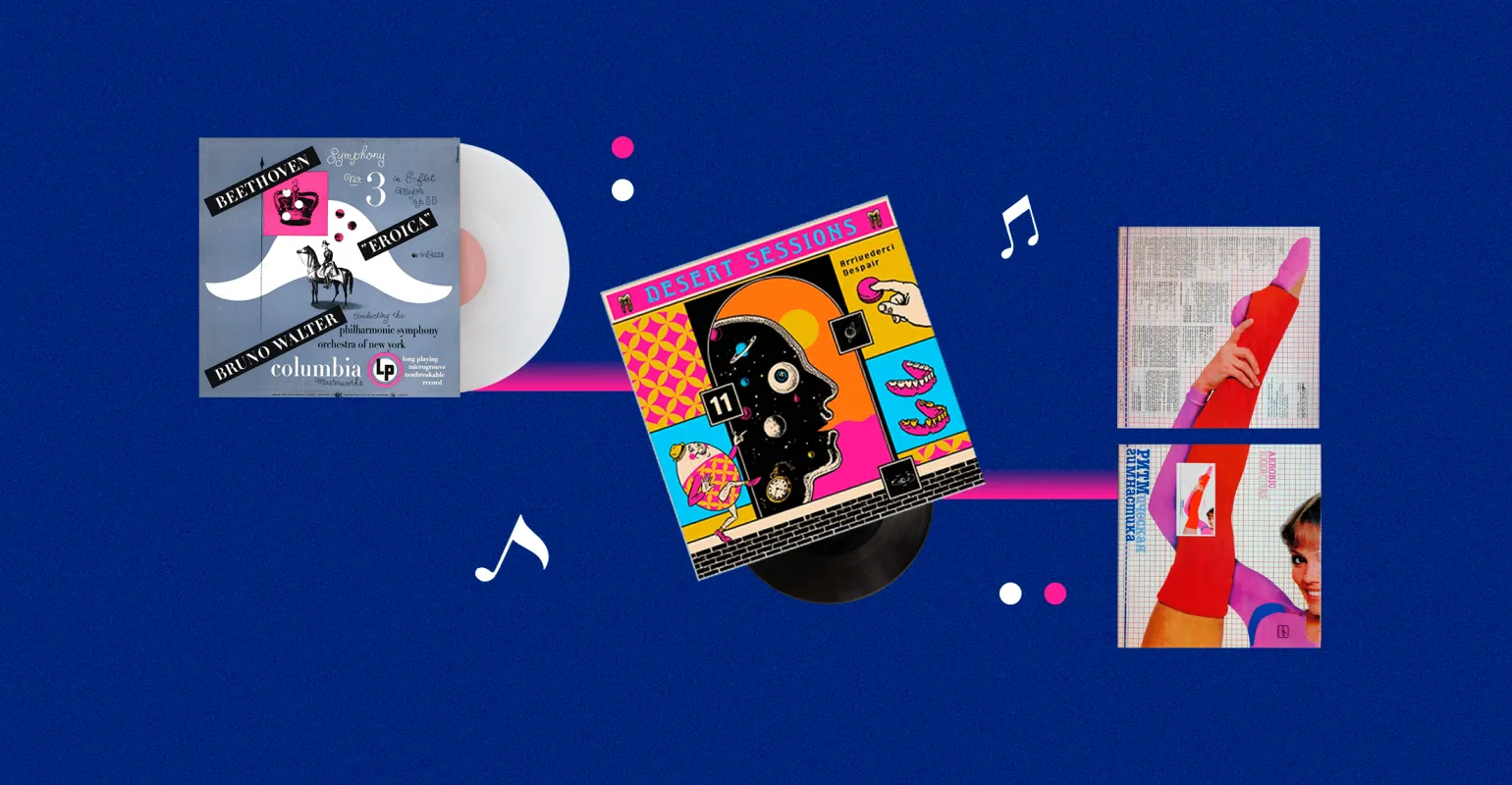
Learn moreGraphic design began to be actively used on vinyl record covers in the 1940s, when a young art director convinced Columbia Records to change their approach to packaging. Since then, the music industry has undergone two significant evolutions, and the size of record covers has shrunk to just a few centimeters on a mobile phone screen. This process reflects changes in consumer preferences and technological advancements, underscoring the importance of visual design in modern music marketing.
Technological constraints may constrain designers, but the principles that inspired 20th-century artists open up new possibilities for modern designers to realize their ideas. These principles foster strong relationships with artists and help them stand out from the competition. By leveraging the legacy of the past, contemporary designers can create unique and innovative solutions that enhance visual perception and capture audience attention.
This article will introduce you to the main aspects of this topic. We'll explore key points in detail and provide helpful recommendations. You'll gain a deeper understanding of the material and gain valuable knowledge for future use. Read on to learn more.
- Who invented the famous psychedelic fonts;
- About the Soviet redesign and translation of foreign titles into Russian;
- What helped designers stand out in the CD era;
- What animated covers look like on Spotify;
- What you should keep in mind when working on a cover;
- Where to get inspired to create a cover.
The First Designer Covers
Music records of the 1920s and 1930s were published in simple paper sleeves that had no artistic design. On their front side there were only the names of the artists and the titles of the tracks. These minimalist covers reflected the spirit of the times and focused the listener's attention on the music, rather than the visual design.

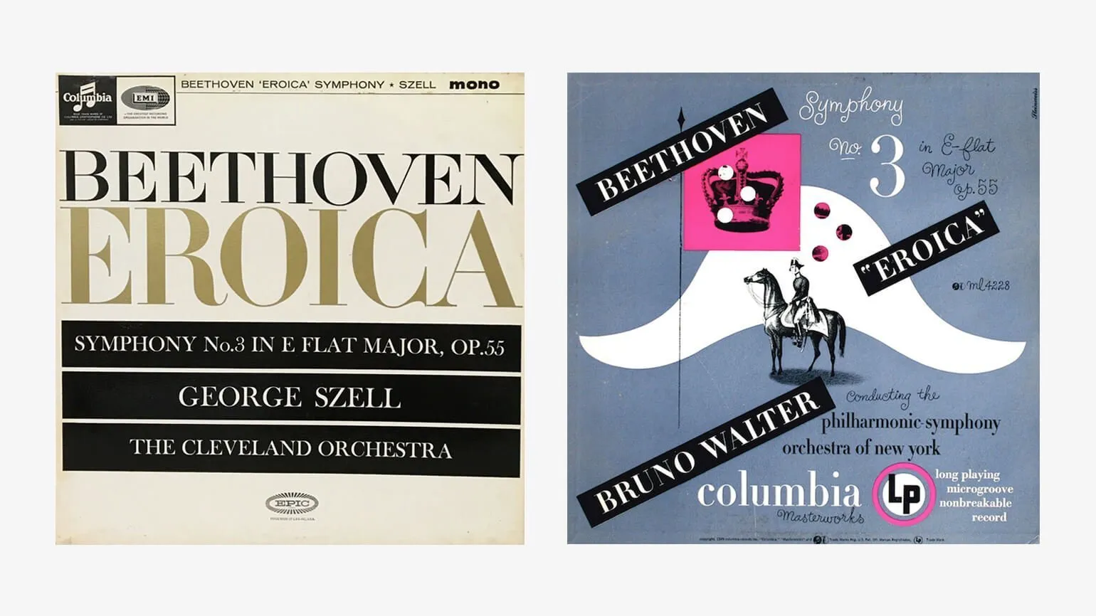
In 1938, a significant event in the world of sound recording occurred when Columbia Records, a leading label in the United States, invited the talented designer Alex Steinweiss for an interview. Steinweiss had previously worked as an intern at a small studio and, within three years, had established himself by creating posters for musicians and accepting orders as a freelancer. His creativity and skills quickly made him famous in the artistic community. This invitation became a turning point in his career and opened new horizons for the development of music design.
As art director, Alex radically changed Columbia Records' approach to music cover design. Under his leadership, the company invested in modern color printing equipment and gave him the opportunity to update the artwork of several famous albums. During the process, Alex independently selected fonts and color separations, which allowed him to create unique visual solutions corresponding to the musical content. This approach not only improved the quality of the covers but also strengthened Columbia Records' image in the industry.
The popularity of vinyl records increased significantly after their repackaging, leading to an 895% increase in sales of Beethoven's 3rd Symphony, Eroica. For the next seven years, the Steinway Company designed every record for Columbia Records. This had a noticeable impact on the vinyl market and contributed to a revival of interest in classical music.
With advances in technology in 1956, a boom in photography began. Illustrations became scarce, and designers like Steinweiss began experimenting with collages and typography. After Alex Steinweiss's passing, designer Michael Doret created the Steinweiss Script Font, a digital font in his honor that reflects Steinweiss's unique calligraphy style. This font has become popular among designers seeking to add elements of originality and artistic expression to their projects.

Record Covers as Art in the Sixties
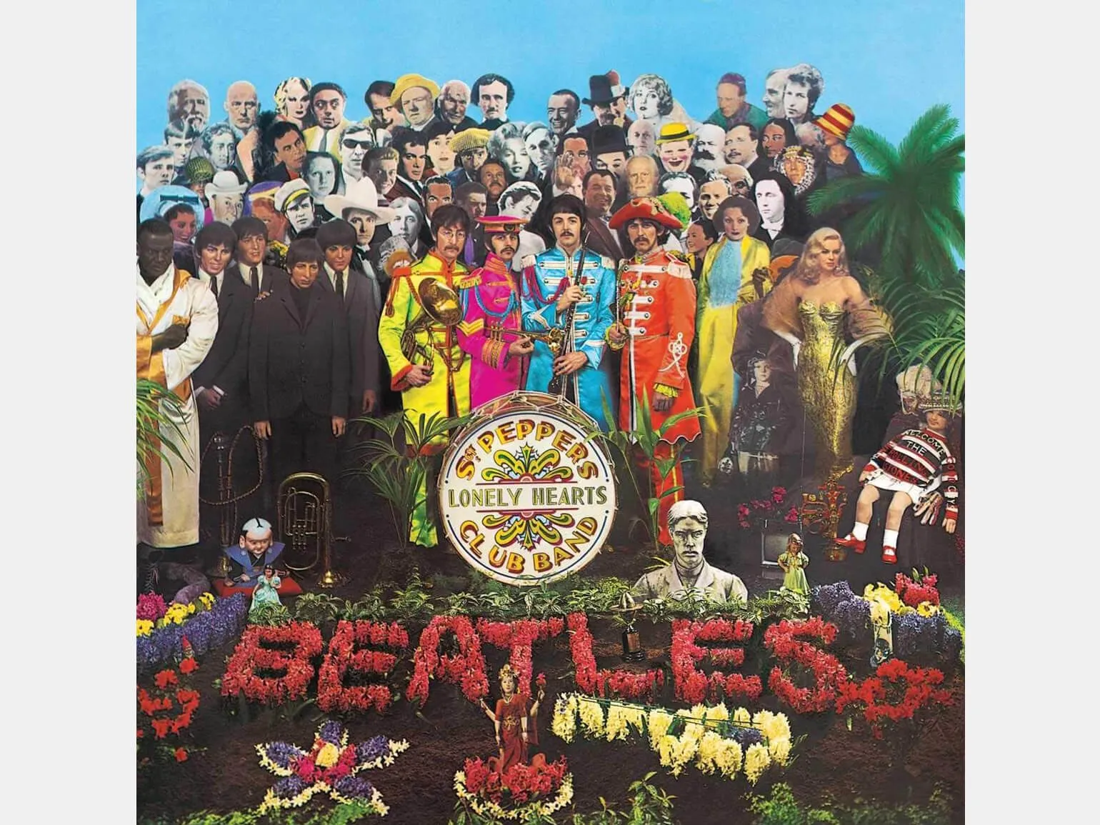
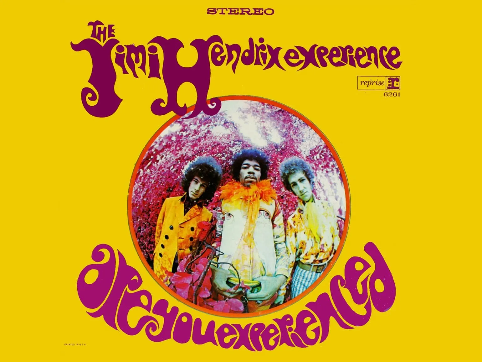
In the 1960s, graphics and fantasy collages became popular again in the music world. Fans of musicians discussed not only the sound of albums, but also their vibrant covers. Artists increasingly began collaborating with contemporary artists to create the visual design of their works. For example, the Beatles worked with renowned artist Roger Dean, the Grateful Dead collaborated with Elton Kelly, Iggy Pop and the Psychedelic Furs with Barney Bubbles, and Pink Floyd with Storm Thorgerson. The Rolling Stones also engaged Andy Warhol, emphasizing the importance of visual art in the musical culture of the time. This collaboration between musicians and artists not only enriched the aesthetics of the albums, but also became an important part of the cultural heritage of the sixties.
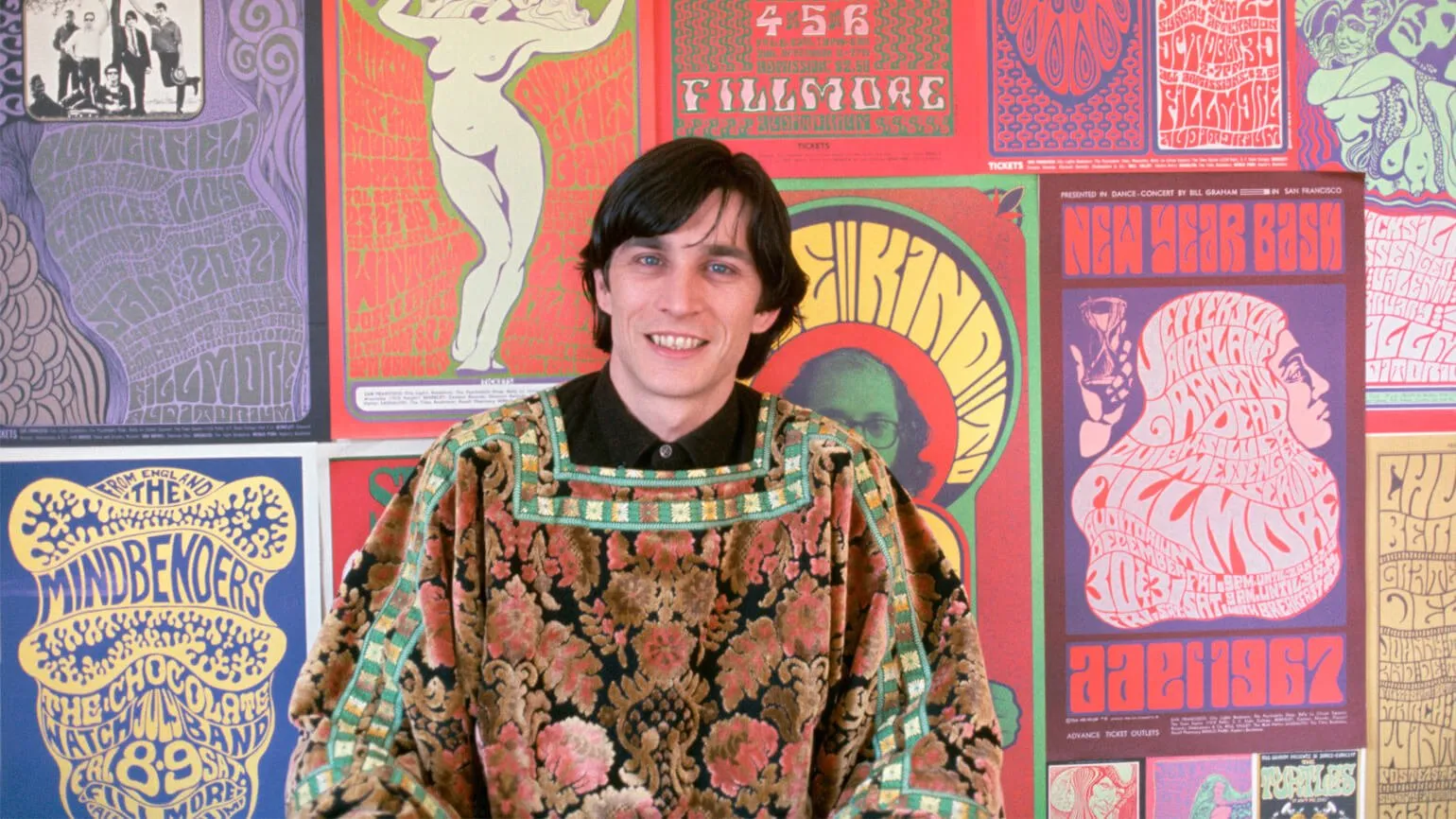
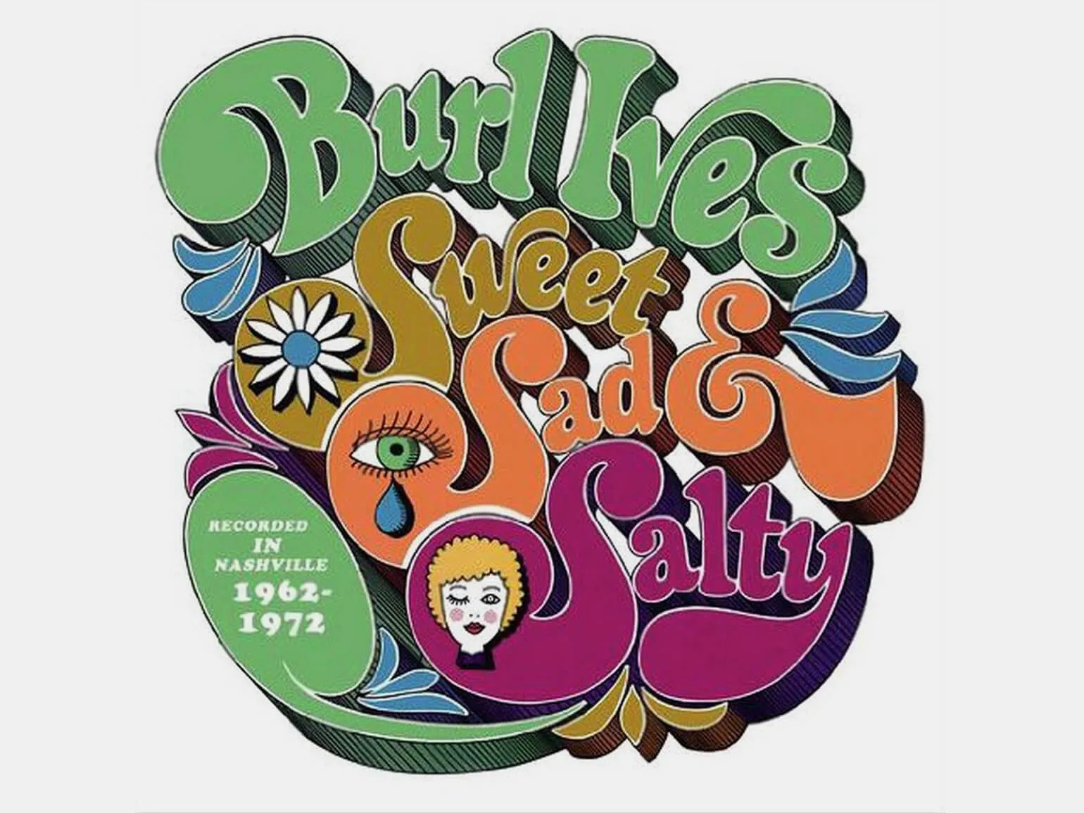
In 1965, Bob Carr, owner of Contact Printing, met artist Wes Wilson and invited him to design posters and covers. In 1967, Wilson developed unique, swirling, psychedelic fonts that soon became popular among other artists in the 1970s. These fonts had a significant influence on the visual culture of the time, contributing to the development of psychedelic art and graphic design.
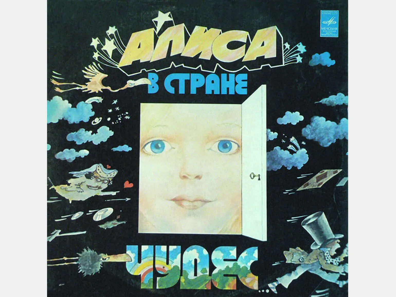
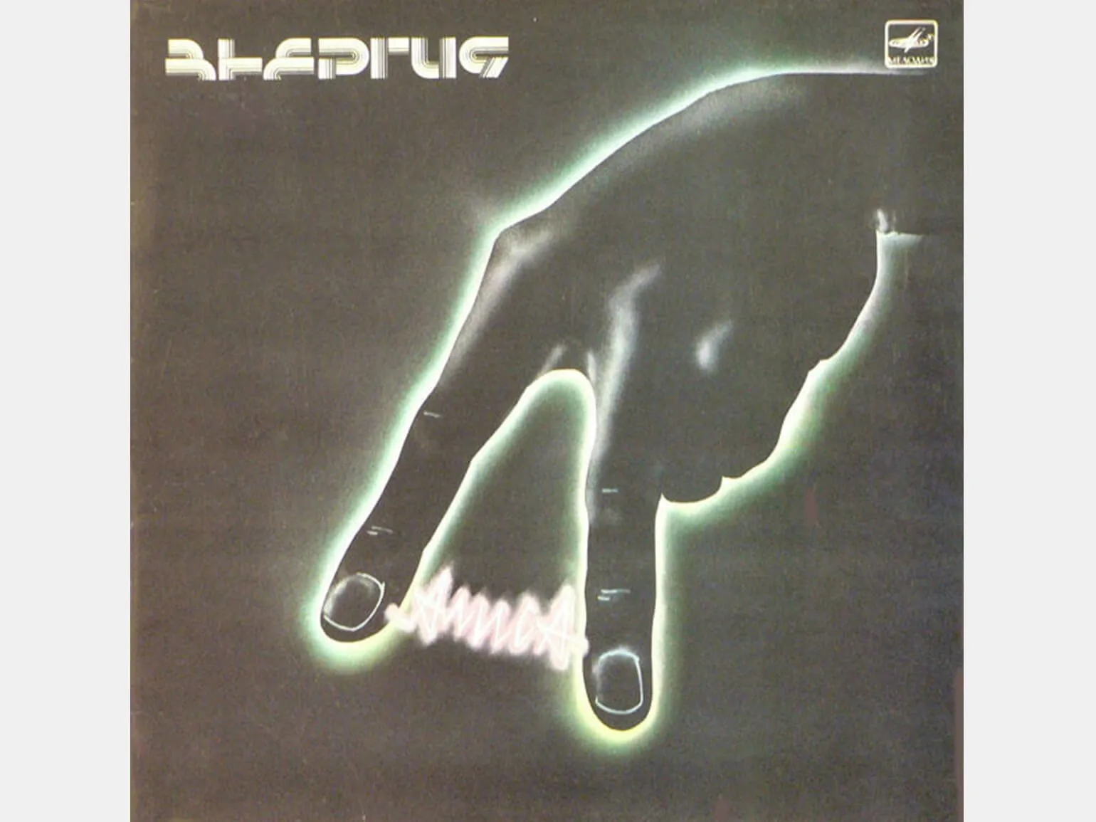
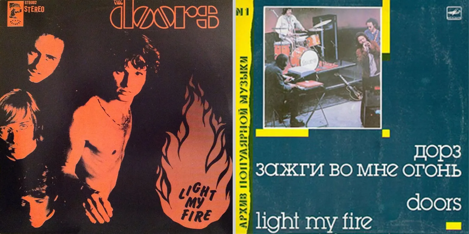
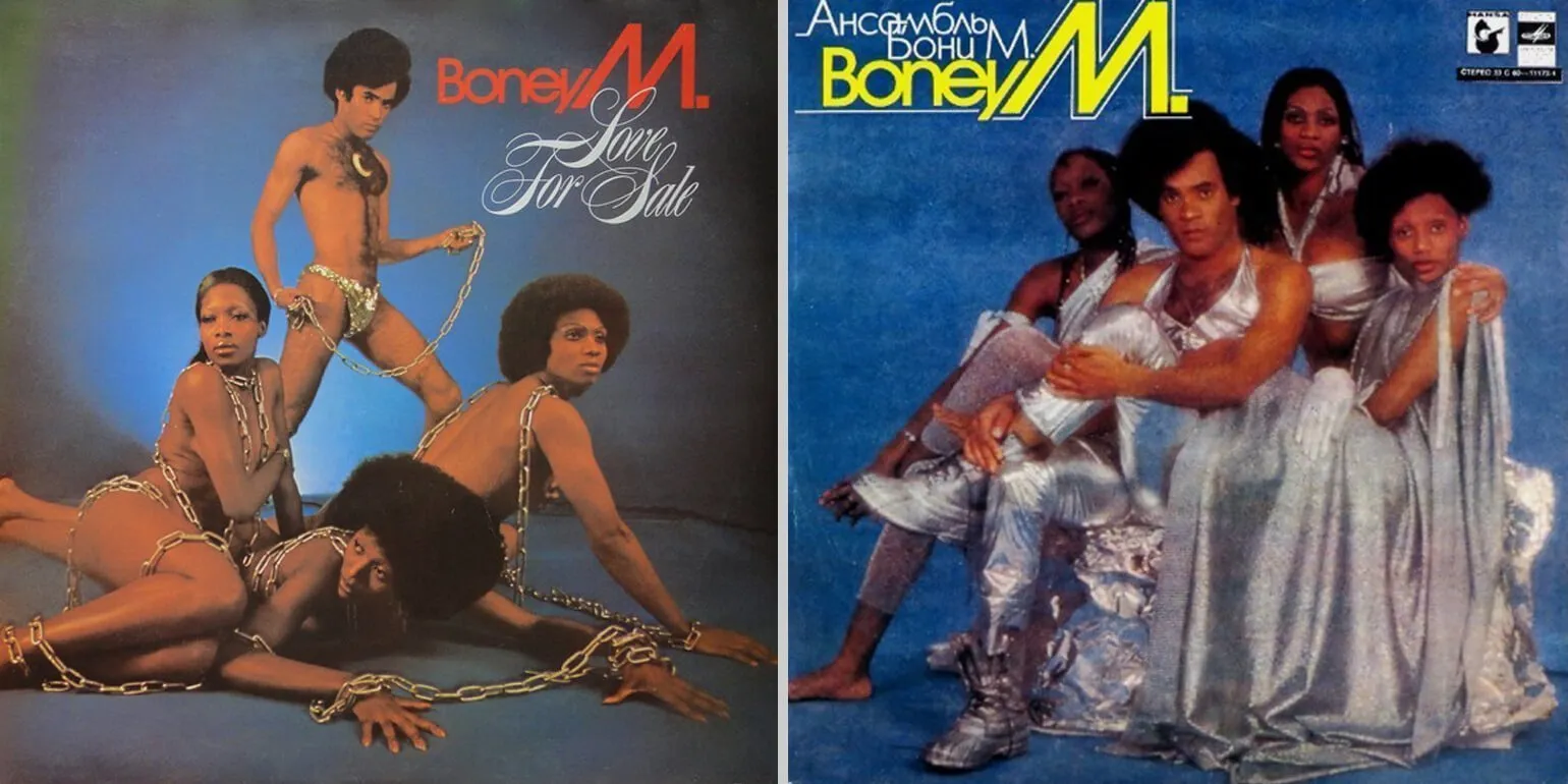
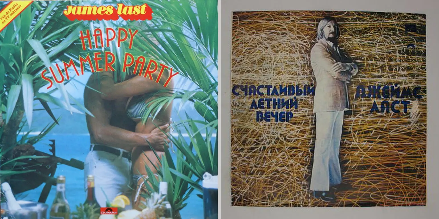
Music Covers in the Soviet Union
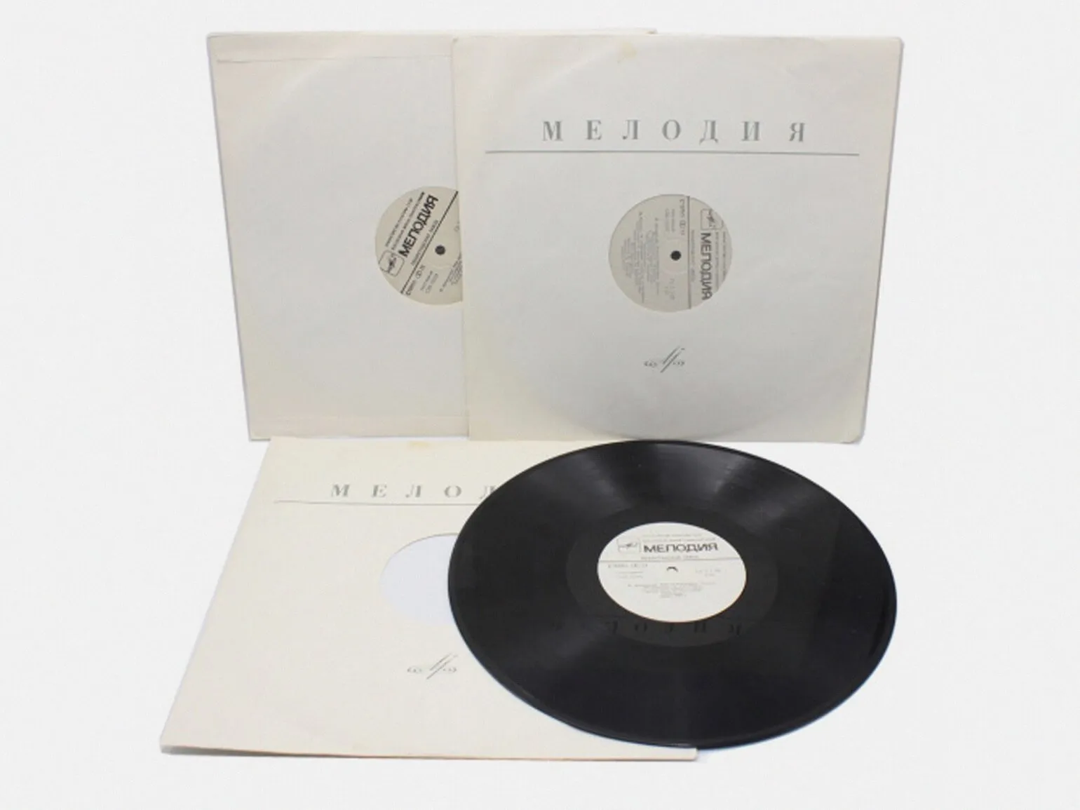
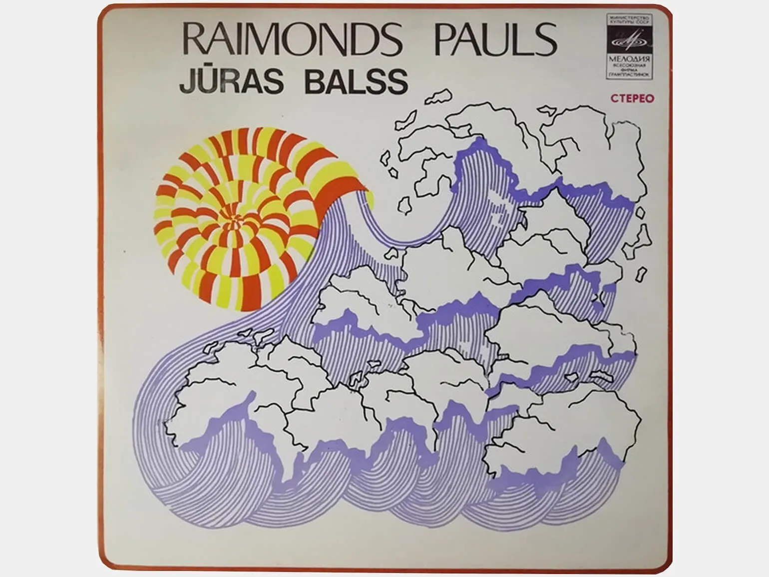
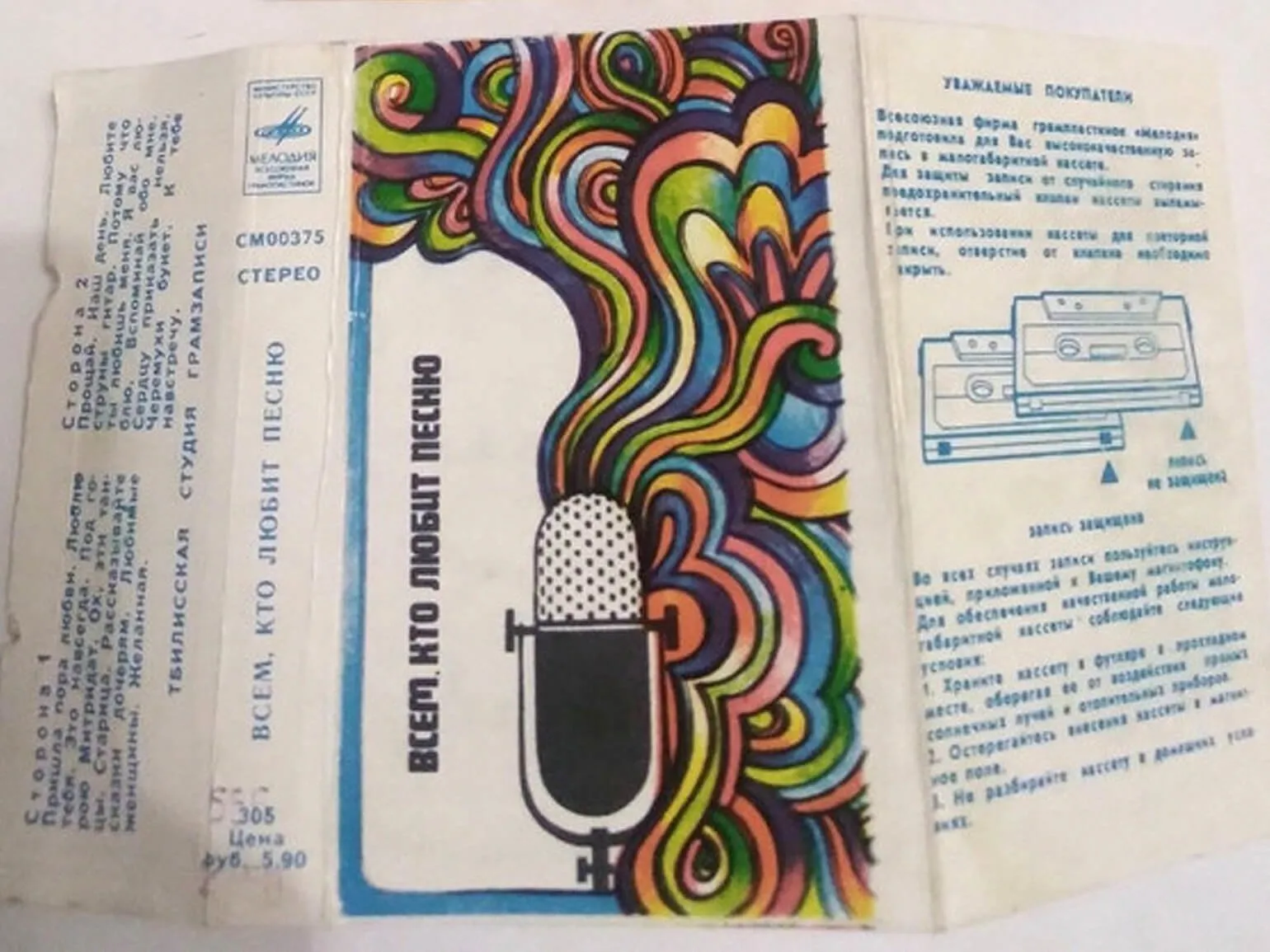
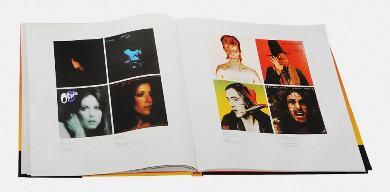
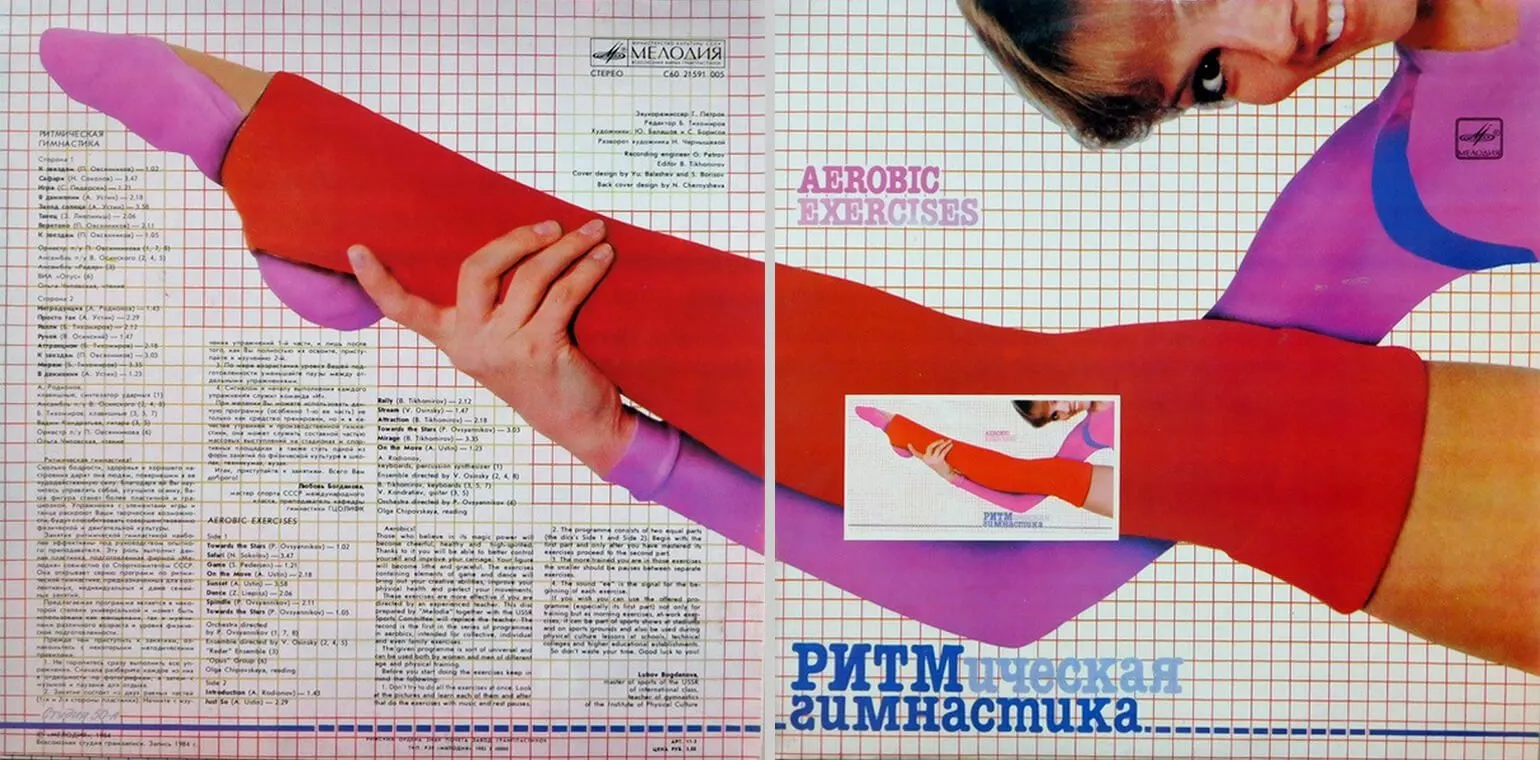
In the 1950s and 1960s, several record pressing plants operated in the Soviet Union. In 1964, they all merged to form the Melodiya recording studio. Until the mid-1970s, Melodiya released records in simple paper sleeves, similar to Columbia Records. There was no established record cover design in the USSR, which encouraged Soviet collectors to draw inspiration from foreign publications. The covers and design of foreign records became an important element of collecting and cultural exchange during this period.
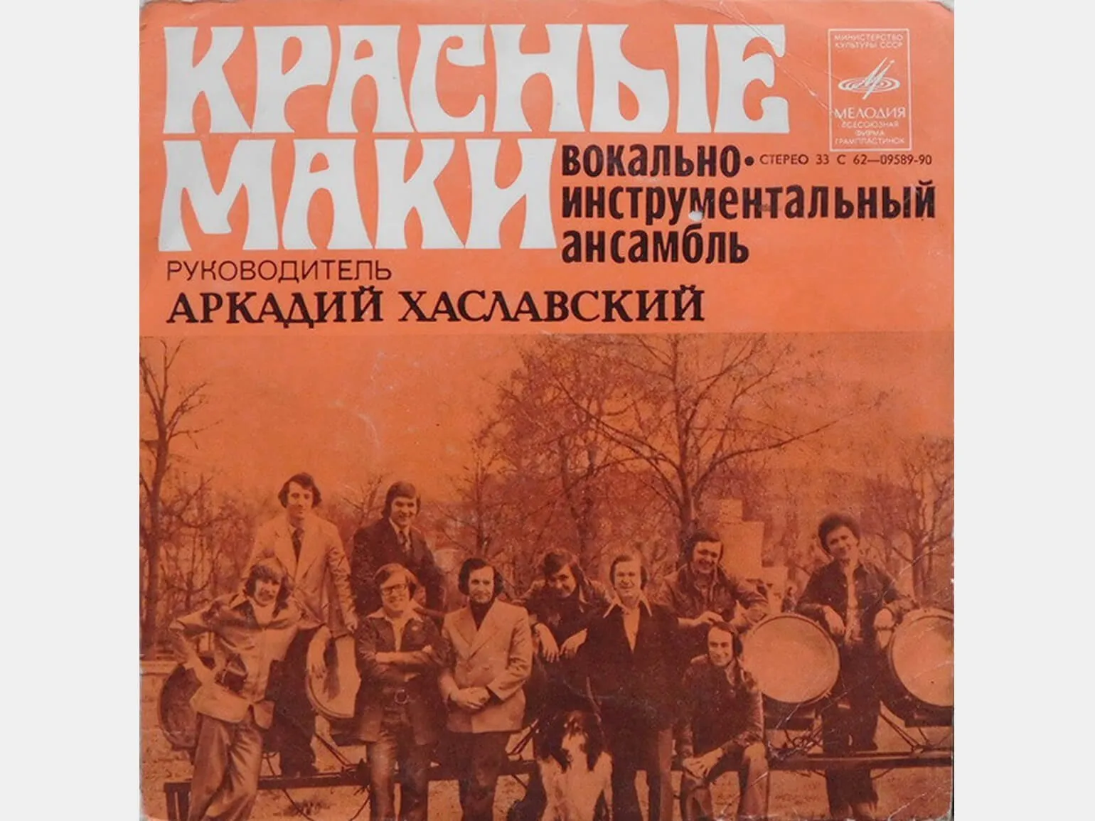
In the seventies, the Melodiya company actively developed the export of vinyl records to various countries and began to produce color covers with photographs and illustrations. The artwork was created using hand-crafted techniques, achieving unique effects using readily available materials, brushes, airbrushes, and scanning technology. This innovation transformed the covers into not only information carriers but also true works of art, contributing to the popularization of music and vinyl culture.
When the Melodiya release required covers, I provided high-quality source photographs. I created covers measuring 13x13 cm, which was ideal for reel-to-reel boxes and practically the same size as modern CDs. Enlarging the size to fit the Melodiya album format was easy. As a professional photographer, I had access to high-quality flat film, ensuring excellent image quality.
Andrey Usov is a photographer and graphic designer who brings a unique perspective to the world through his work. In an interview for Colta, he shares his thoughts on creativity, art, and the creative process. Usov emphasizes the importance of visual aesthetics and photography's ability to convey emotions and ideas. His approach to design emphasizes individuality and originality, making each of his works unique. Andrey strives to inspire viewers by creating works that evoke deep thought and emotional response. His interviews reveal not only his professional achievements, but also his personal philosophical views on art and its impact on society.
Before sending to print, the work of in-house designers was reviewed by a special artistic council. Sometimes, covers were rejected for internal or political reasons. Decisions were made internally, and musicians were often left in the dark about how their album cover would look in the USSR until the moment of the record's release. This practice created an atmosphere of uncertainty and often led to dissatisfaction among artists, who were unable to control the visual presentation of their work.
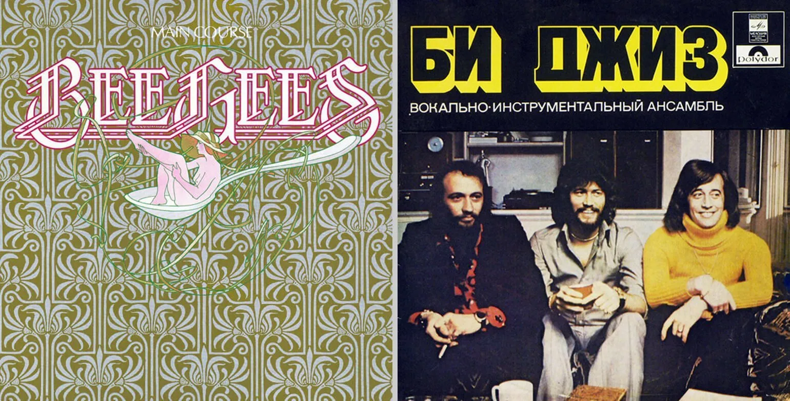
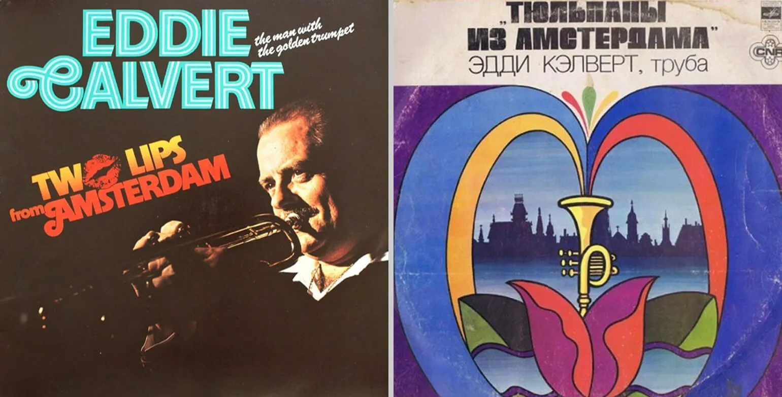
Foreign music recordings included in the Melodiya program were reissued for Soviet listeners with new, Russified covers. The artwork avoided depictions of nudity, excessive luxury, and aggressive symbolism. The titles of foreign albums were translated into Russian either directly or using transcription. This approach contributed to the formation of unique musical content accessible to a wide audience and corresponding to the cultural norms of the time.
The western Baltic republics of the Soviet Union were distinguished by a high level of graphic design development. In these regions, unlike the lyrics of musical works, album covers and other visual materials were subject to less rigorous scrutiny. This contributed to the emergence of unique and creative design solutions that reflected the cultural and artistic trends of the time.
Transformation of the Eighties and Nineties: Cassettes and Compact Discs
The first compact discs appeared in music stores in 1982 and in the nineties they practically replaced vinyl records on sale. Designers had to adapt to the new packaging format, which shrank from a square size of 30 x 30 centimeters to a rectangular size of 12.5 x 14.2 centimeters. This change had a significant impact on album design and the marketing of music products, as the compact disc became the standard for the music industry. The transition to the new format not only changed the visual aspect but also improved the sound quality, which contributed to the popularity of CDs among music fans.
Cassettes appeared on the market in the mid-1970s, and the first cassette player, the Sony Walkman, was introduced in 1979. However, over the next 20 years, cassettes accounted for only 1-4% of total production, as compact discs dominated the market. At the time, compact discs offered higher sound quality and ease of use, which contributed to their popularity. However, cassettes left a significant mark on the history of music and continued to be used by enthusiasts and collectors.
In the 1990s, photo album covers were used as actively as collages, illustrations, and minimalist graphics. However, the design style became more dependent on the musical genre than current fashion trends. Since the early 1990s, the nominees and winners of the Grammy Award for Best Album Packaging have included a variety of designs that reflect the uniqueness of the musical content. This era became significant in the development of the visual culture of the music industry.

In the CD era, one of the most effective tools for differentiation was the use of a foldout booklet and a custom-designed box. This approach not only draws attention to the product but also creates a unique, memorable visual image. Customized packaging and booklets help highlight the features of the artist's music and style, which increases interest from buyers.
Chris Billhimer is a remarkable designer who has lived through the transition from vinyl records to CDs and digital media. His career began in the late 1980s creating posters and album art. Chris became known for his unique style and ability to adapt to changes in the music industry, which has earned him a special place in the design world. His work combines elements of classical art and modern trends, making them relevant and in-demand.
When designing covers, I prefer to avoid current design trends. This helps create a timeless design that doesn't tie the project to a specific year or time, unless requested by the client. Certain graphic elements and typographic solutions can evoke associations with specific periods, which can mislead the listener about the musical content. This approach allows the cover to remain versatile and relevant over time, ensuring a more accurate perception of the musical work.
For 20 years, I have collaborated with bands such as R.E.M. and Green Day. Each year, as my knowledge of the musicians has deepened, the process of finding design solutions for new projects has become faster and more efficient. For me, as a designer, it is important to be at the center of the creative community. Even living in a small town, I have maintained contact with people from the fields of music, film, and fine art. These people are genuinely passionate about their work and inspire new ideas.
Chris Billhimer is a renowned music cover designer who creates unique visual solutions for albums across various genres. His work is distinguished by original concepts and attention to detail, which makes each cover not just an element of packaging, but a full-fledged work of art. Billhimer has collaborated with many famous artists and musical groups, thanks to which his style has become recognizable in the industry. He skillfully combines color, texture, and typography to create harmonious compositions that capture the essence of music. The designer continues to inspire new artists and contribute to the development of visual culture in the music industry.

Yuri Balashov, one of the most renowned music cover designers in the USSR, mastered cover design on his own, inspired by Roger Dean's book Album Cover Album. From 1988, he worked at Melodiya, where he studied catalogs submitted by foreign studios. In the nineties, Yuri began designing CD covers for Stas Namin's production center, which significantly expanded his creative range and strengthened his reputation in the industry.
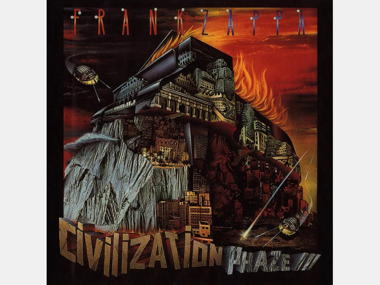
Yuri Balashov is the only Soviet artist to have won a Grammy Award for CD cover design. He met American rock musician Frank Zappa during the latter's visit to Moscow. After moving to the United States, Yuri received an offer from Zappa to create an album cover. The resulting artwork depicts the summit of Mount Everest, topped by a grand piano emitting flames. The piano is accessible only by helicopter. The process of creating this work took two months.
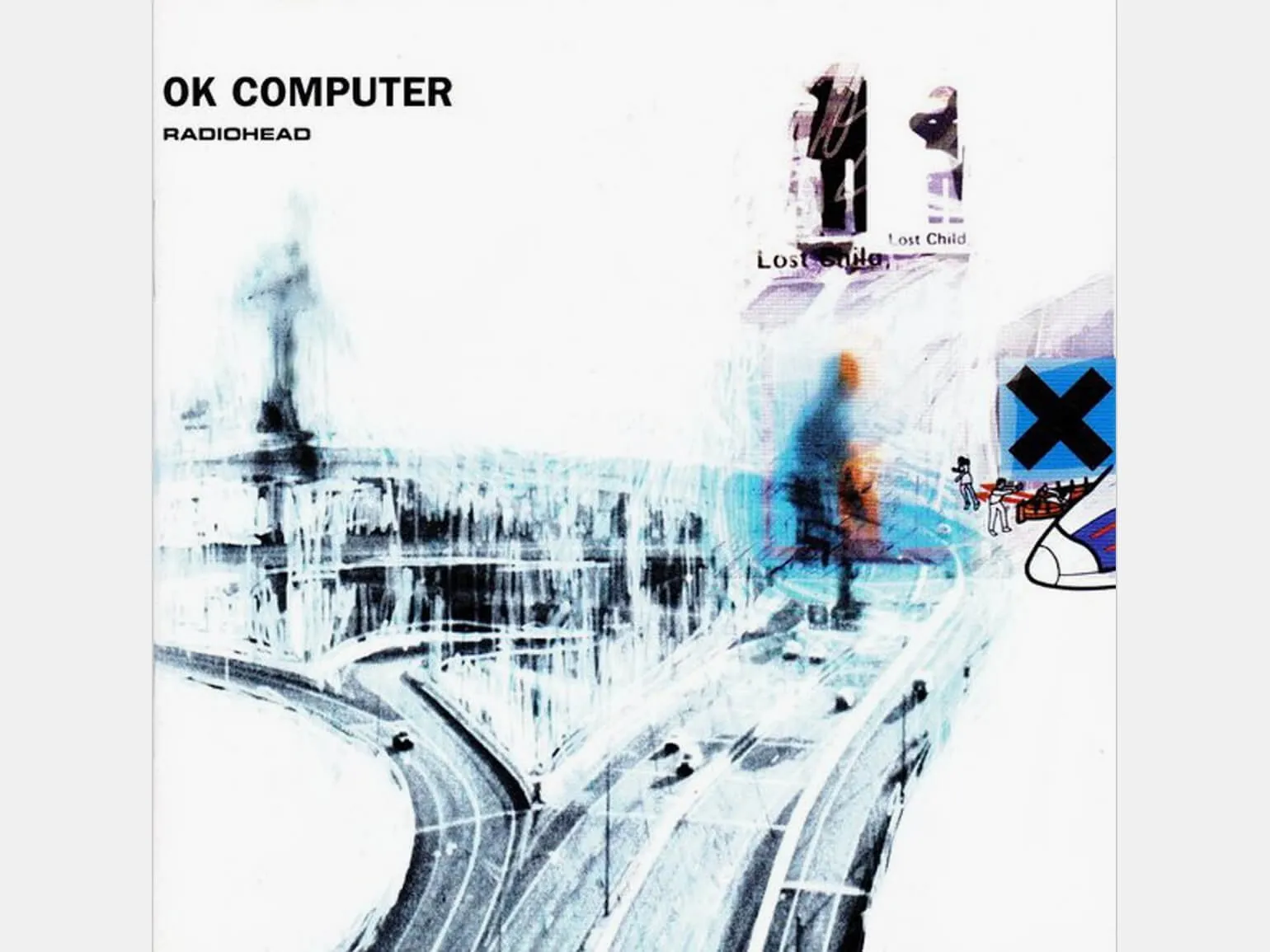
Stanley Donwood, renowned album cover designer for Radiohead, claims that digitalization has significantly simplified the design process. With the transition to digital technology, designers have gained access to a wider range of tools and capabilities, allowing them to speed up the creation and implementation of their ideas. In the digital era, it has become easier to experiment with shapes and colors, as well as quickly make changes to projects. This opens up new horizons for creativity and allows designers to collaborate more effectively with musicians and other participants in the creative process. Digitalization has not only simplified the work but also made it more accessible, providing the opportunity for further development and experimentation in the world of graphic design.
We created our projects without an undo function, which meant we only had one attempt to complete what we started. In case of serious errors, we had to completely rewrite the work. We simply hid any minor imperfections that we were unhappy with by painting over them or gluing other elements over them.
Digitalization
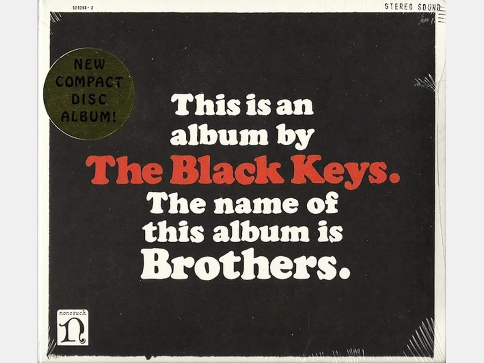
With the transition to digital formats, the size of album covers has decreased to a few centimeters. As a result, designers began to abandon fine detail, and complex, detailed album covers became rare. This change stems from the need to adapt to the new digital landscape, where visual simplicity and clarity have become a priority. Graphic cover design now emphasizes large elements and clean lines, making them more visible on various device screens.
The Black Keys' Grammy-winning 2012 album cover for Brothers is considered a key work in establishing the minimalist design trend. Designer Michael Carney, in an interview with the NYT, shared that The Black Keys and their label, Nonesuch, were initially skeptical of the idea. However, marketers convinced the musicians that there was a shortage of minimalist album covers in the market, and that this contrast would be well-received by audiences. Thus, Carney's work not only became an iconic example of minimalism but also pushed the industry to rethink the visual design of music albums.
A good cover is certainly important, but it doesn't always guarantee successful sales for an artist. However, poor art direction can significantly negatively impact commercial results. Visual design plays a key role in the perception of music and the formation of an artist's image. Therefore, it is important to pay attention not only to the cover design but also to the overall artistic direction to attract audience attention and increase interest in the product.
Sometimes I encounter situations where I have to work without full information. I've had orders from label managers who only provide the album title. However, I believe that it is crucial for a designer to establish trusting relationships not only with label managers but also with the artists themselves. Communication with musicians significantly simplifies the process of generating ideas and implementing them. This interaction allows for a better understanding of the album's concept and a visualization of its mood, ultimately leading to a more cohesive and consistent design.
Michael Carney. Interview for WNW Magazine
Michael Carney shares his views and experiences in an interview with WNW Magazine. In the conversation, he discusses key moments in his career and also shares his perspective on the future. Carney emphasizes the importance of innovation and adapting to changing market conditions. He also shares advice for young professionals, emphasizing the need for continuous learning and skill development. This interview provides valuable guidance for those aspiring to succeed in their field.
In 2021, Spotify introduced the ability to create animated covers for music tracks and albums. Using the Spotify Canvas app, users can create 8-second looping animations that add a visual element to the music listening experience. Animated covers have already been implemented on releases by artists such as Billie Eilish, Miley Cyrus, Coldplay, Kiiara, and Post Malone, among many others. However, this feature is currently unavailable in Russia.
I understand musicians' expectations well, since I play in a rock band and perform at concerts. Constant interaction with representatives of the music industry allows me to stay abreast of current trends. Currently, 3D shapes and expressive typography are gaining popularity in Europe. The ability to work quickly and efficiently with 3D design helps you stand out from the crowd of beginners, but without sufficient experience, achieving the desired result can be challenging.
Since the 1980s, a recognizable style of music covers has prevailed in Italy—they often feature the smiling face of the artist with their name written in large letters. This approach has become a symbol of Italian musical culture and continues to attract listeners, emphasizing the individuality of artists and their unique style.
There is a clear trend toward minimalism in the design of streaming app covers. Designers are gradually abandoning the use of typography in images, as artist names and album titles are easily displayed on screen. As a result, covers lose their informative function and become purely a tool for conveying mood and emotion, placing an emphasis on the visual perception of the music. This trend emphasizes the importance of aesthetics and creates unique images that can capture the attention of listeners.
Marcello Della Puppa is a graphic designer based at Produzione Atlante in Venice. He is also a filmmaker and musician. In his practice, Marcello combines creativity and technology, creating unique visual solutions and audiovisual projects. His work reflects a deep understanding of art and contemporary design, making him a leading figure in his field.

Important Factors in Creating a Music Cover
The adaptability of music cover art is an essential aspect of its promotion. Covers not only serve as presentation on streaming services but are also used in various formats. Many musicians continue to release limited edition CDs, cassettes, and LPs, making cover design relevant and meaningful. Covers are also used for media announcements, mobile, and outdoor advertising, attracting audience attention and increasing artist recognition. A well-designed cover can become a key element in a marketing strategy and contribute to the successful promotion of musical content.
Musical style plays a key role in creating an album cover, so it is important to strive for harmony between the visual design and the musical genre. A designer should study the covers of popular albums and compilations within the chosen genre, as well as carefully listen to the music to better understand its atmosphere and mood. This will allow them to create a cover that will not only attract listeners but also accurately capture the essence of the music, strengthening the artist's positioning in the market.
If a musician has approached you, it demonstrates their trust in you and your style. While you can draw inspiration from the covers and music of the genre, it is important to incorporate elements of your unique vision. This will allow you to create unique content that reflects both the artist's personality and your own creative ideas.
Marcello Della Puppa is a graphic designer based at Produzione Atlante in Venice. He is also a filmmaker and musician, making him a versatile creative specialist. His graphic design work is distinguished by a unique style and creative approach, allowing him to effectively combine visual art with cinematic projects. Marcello's musical work also inspires his artistic vision, adding depth and emotion to his creations.
Profession Graphic Designer PRO
You will learn how to create corporate identity elements and graphics for business. You will put together a portfolio that reflects your style and confirms your design skills. You can start a career in a studio or as a freelancer.
Find out more