
Contents:

Course with employment: “Profession Methodist with "from zero to PRO"
Learn moreWhy adhere to the principle of uniformity
From a student's perspective, uniformity in an online course is ensured by several key aspects. First, the course structure should be logical and consistent, allowing students to easily navigate the materials and complete assignments. Second, using the same formats and styles for all sections of the course promotes better perception of information and reduces cognitive load. Third, an important aspect is the accessibility of the materials and technologies used in the course. This includes compatibility with various devices and platforms, which allows for learning anywhere and anytime. Finally, support from instructors and the presence of clear instructions also play a significant role in creating a unified educational space. All of these elements work together to create a consistent and high-quality learning experience for students in online courses.
- Predictability. Imagine you go to a coffee shop and order a flat white. They bring you a double shot of espresso with milk. You enjoy the drink, so the next day you order another flat white. But this time, the waiter brings ginger tea with milk. At best, you'll be surprised. Now imagine an online student who sees a different multiple-choice question on the screen every time, or who can't predict the behavior of a button that works differently on different slides.
- Reduced cognitive load. As we know, cognitive load is the amount of information a person needs to hold in their working memory at the same time (that is, essentially, focus their attention on it) to complete a task. If a student has to figure out where the right buttons are on a slide every time, or why this exercise only allows one attempt when previous ones had three, it distracts their attention, and the resources available to remember new learning information are increasingly diminished. However, if the placement of elements and their functions are repeated uniformly, they become familiar to the user, allowing them to focus on the content rather than trying to figure out how a new interface works.
- Usability. Courses designed with consistency are easier to learn and use. New users adapt more quickly, and experienced users are able to effectively interact with the learning material. For example, if you place the forward/back buttons in the lower right corner of all courses and the buttons for opening the table of contents and glossary in the upper right, rather than changing their placement from course to course, users will find them easy to find.
Course developers benefit from consistency, as it significantly simplifies and speeds up the process of creating educational content. Starting with templates and patterns can significantly simplify the design of subsequent courses. Consistency in the structure and content of materials not only saves time but also promotes better student comprehension. Building courses based on predetermined standards ensures high-quality and consistent learning, which in turn increases user satisfaction.
A course can become boring and monotonous if it is built exclusively on the same templates. However, consistency does not necessarily mean monotony. Consider the analogy of designing a house: although the windows, doors, and ceiling heights in different apartments may be the same, the layouts vary. The same applies to educational courses. You can develop a UI kit and carefully design navigation elements, then use these ready-made elements to create a variety of interactive slides. You can also select several question types for assessments and apply them depending on the specific learning objective. This will make the course more dynamic and interesting for students, and will also increase its effectiveness.
In this article, we will analyze the application of the principle of uniformity at various stages of slide course development. This principle plays a key role in creating structured and understandable content that promotes better perception of information. We will consider how uniformity manifests itself in slide design, choice of fonts and colors, as well as content organization. Applying these elements at each development level helps make the course more attractive and easier to perceive, which in turn improves learning effectiveness.
How to Apply the Principle of Uniformity at the Course Structure Level
The lack of a clear and logical structure in a training course is one of the reasons for the high cognitive load on the learner. Instead of focusing on assimilating new information, a person is forced to expend energy searching for connections between individual blocks and sections. This distracts from the main learning process and significantly reduces the effectiveness of memorizing new material. Proper course organization helps facilitate the comprehension of information and optimizes the use of working memory resources, which ultimately contributes to a deeper understanding and retention of the learning material. Working memory overload can occur due to attempts to master new exercise mechanics or to guess the purpose of a character's appearance on the screen. The human brain prefers order and structure, including clearly organized information. This not only helps conserve resources but also creates predictability, providing a sense of control over the situation. The principle of uniformity is manifested not only in the visual design of courses but also in the construction of their scenario structure. Proper organization of information helps improve the comprehension and assimilation of the material, which in turn increases the effectiveness of learning and facilitates the achievement of goals. When developing the sequence of presentation of materials in a section or module, it is important to ensure consistency in the structure of all thematic blocks. It is useful to refer to non-fiction literature to see how authors apply certain principles to dividing the text into sections and chapters. This will help create a logical and consistent perception of information, which will significantly improve the quality of the content and its usability for readers. A unified structure not only facilitates better comprehension of the material but also improves its search engine optimization, making the text more accessible to the audience.
In "The Brain: A Manual for Using Brains," David Rock offers an unconventional approach to presenting information. He divides the content into actions, which are structured like theatrical scenes. In each scene, the author describes a specific situation faced by the main characters and then analyzes it from a neurobiological perspective. At the end of each scene, Rock shows how the characters, having gained new knowledge about the functioning of the brain, approach the same situations with a changed perspective. This method allows readers to gain a deeper understanding of how the brain influences our behavior and decision-making, and helps them apply this knowledge in everyday life.
Darren Hardy's "The Compound Effect" is a useful resource for those seeking to apply theoretical knowledge in practice. At the end of each chapter, the author offers a "step summary" containing recommendations and questions. These elements help readers make sense of what they read and develop concrete actions to implement the ideas in their lives. This approach promotes a deeper understanding of the material and its active application, which makes the book a valuable tool for personal growth and goal achievement.

Read also:
The structure of the training course: types and recommendations for choosing
When developing An important aspect of any course is its structure. There are different types of structure, which can significantly impact how the material is perceived and absorbed. Basic structure types include linear, modular, and blended. A linear structure involves a sequential study of topics, which is suitable for courses with a clearly structured presentation. A modular structure allows learners to choose topics in any order, which facilitates a more flexible approach. A blended structure combines elements of both types, which helps adapt the course to different learning styles.
When choosing an appropriate course structure, it is important to consider the target audience, learning objectives, and the specific nature of the material. It is also worth paying attention to the assessment methods that will be used during the learning process. The correct structure not only facilitates the process of information absorption but also increases learner motivation.
When determining the course structure, it is important to consider not only the content but also the available resources, such as time, tools, and technology. This will help create an effective and harmonious program that supports the achievement of educational goals.
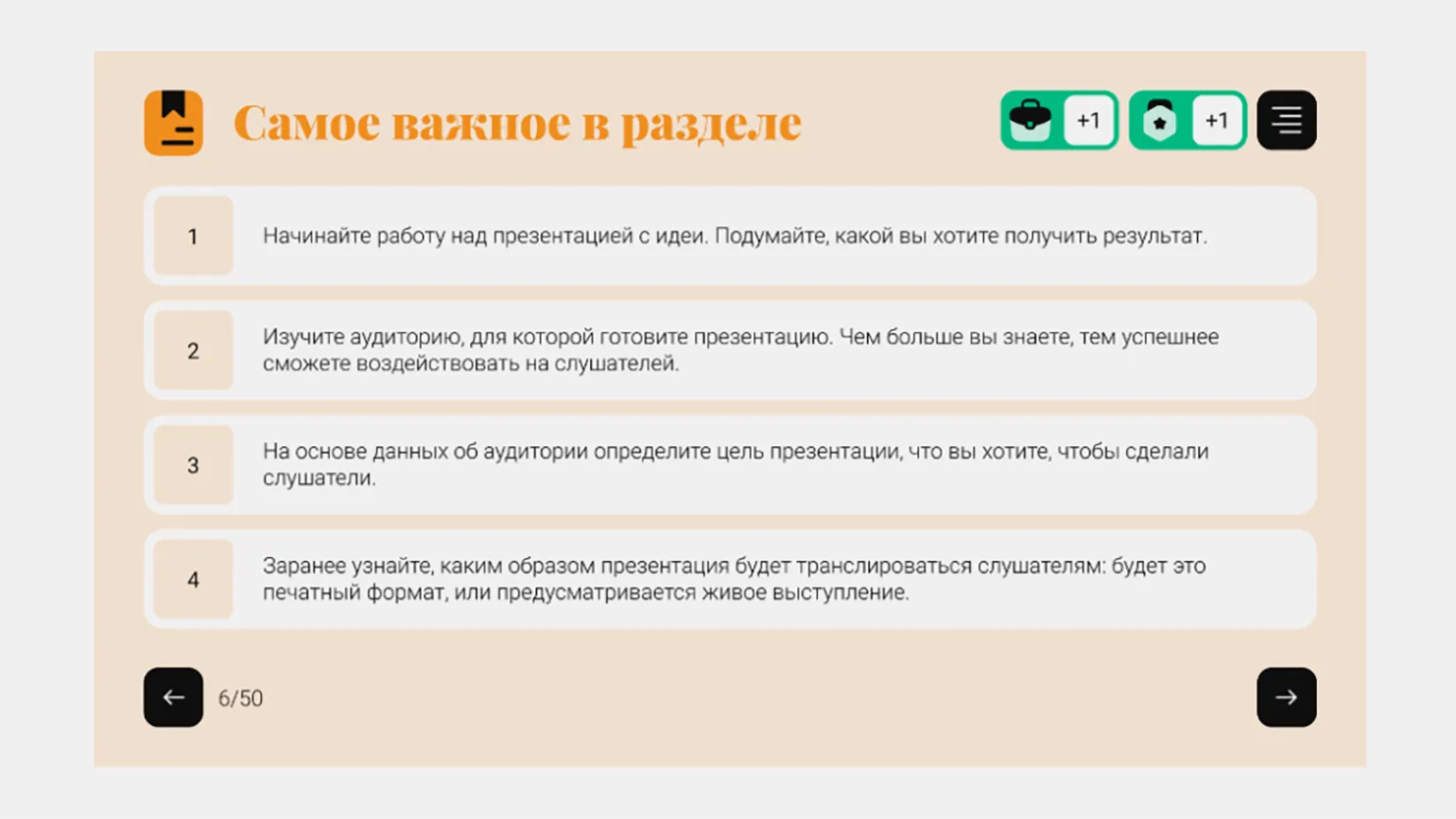
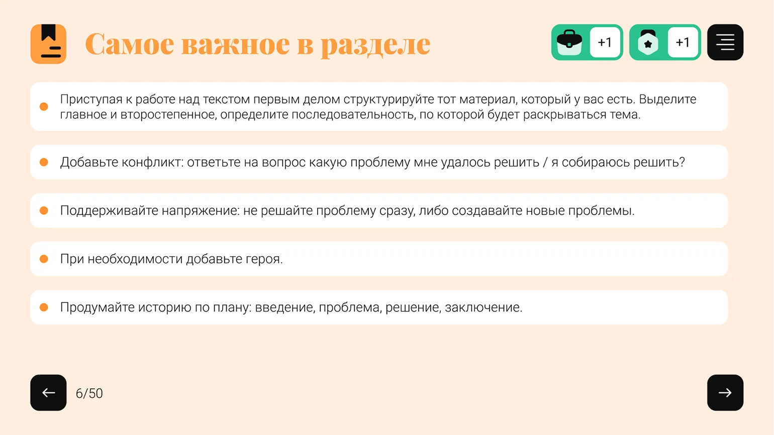
In our course, we can develop a template for each section to facilitate more effective assimilation of the material. We begin with a short assignment aimed at updating the topic, which will help students focus on key aspects. After presenting the theoretical material, it is important to ask a few questions to consolidate the knowledge. At the end of the section, we will formulate a brief summary, which will help systematize the information and strengthen the understanding of the material covered. This approach will ensure structured and consistent learning, promoting better engagement and assimilation of information.
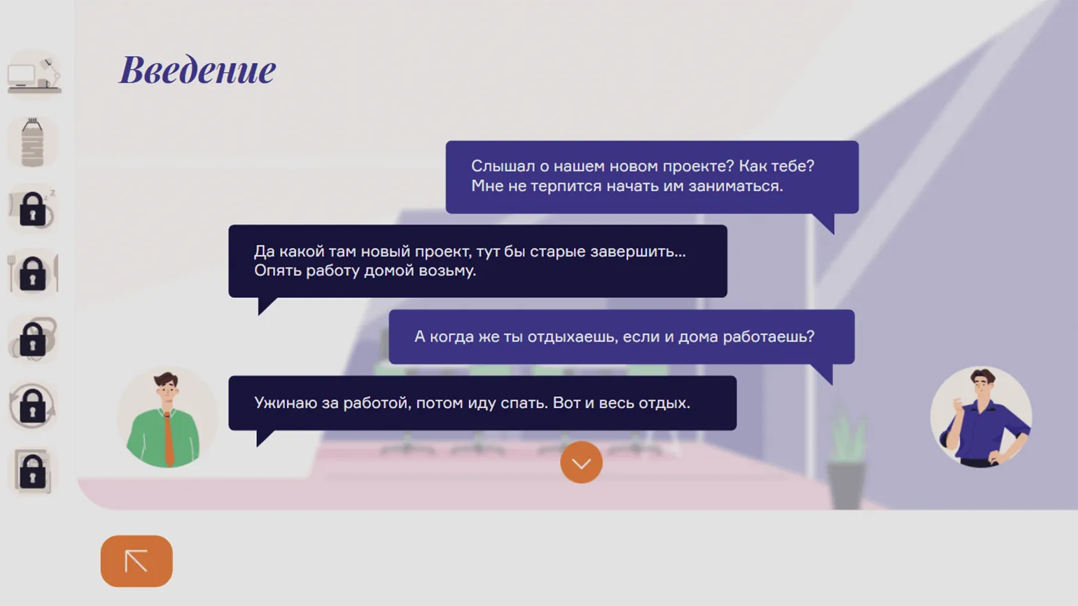
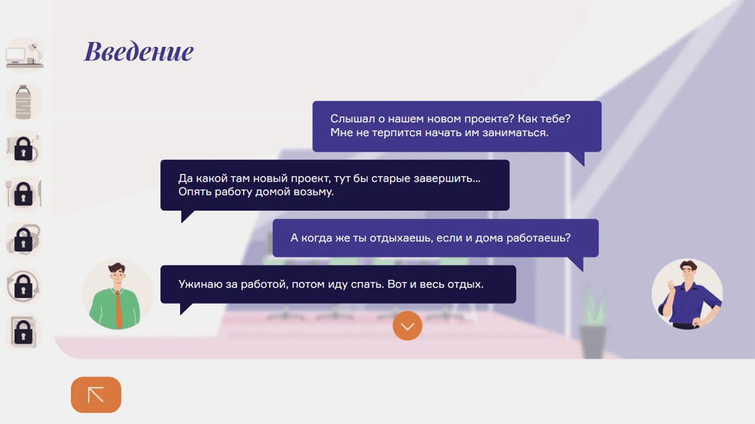
My course "Physical Health as a Component of Well-Being" features two key characters: Vasily, who lacks time and energy, and his proactive colleague Andrey, who has sufficient energy. Each section of the course begins with a dialogue between them, where Vasily shares his problems with Andrey. This approach allows students to better immerse themselves in the context, see their own difficulties in the dialogue, and, thus, more actively perceive new information. This methodical approach helps the course not only promote understanding but also improve physical health, which is an important component of overall well-being.
During the course development stage, it's essential to carefully consider standardized rules for administering tests and test questions. This will ensure consistency in knowledge assessment and improve the learning process. These rules should include question wording, assessment criteria, and testing frequency, which will, in turn, enhance the quality of the educational process and help students better absorb the material.
The course consists of three sections, each of which concludes with a quiz to assess students' understanding of the material. It is important to establish a consistent range for the number of questions in the quizzes, for example, 3 to 5 or 5 to 7. It is not necessary to adhere to a strict number, for example, four questions in each quiz, but the difference in the number of questions between quizzes should not be significant. If there are three questions after the first section, twenty after the second, and no quiz at all in the third section, this may cause confusion among students. A final quiz of 15–20 questions should be administered at the end of the course to help students assess their overall learning. This approach ensures consistency and predictability in the learning process, which promotes better retention of information.
The format of feedback students receive when completing questions, exercises, and assignments is of great importance. It is important to keep in mind that different types of feedback can be applied depending on the goals of the quiz or exercise. However, the choice of format should be based on a uniform logic to ensure maximum learning and comprehension of the material. Properly organized feedback improves the learning process and helps students acquire new knowledge more successfully.
During the course, questions and exercises are designed to help students master new material. Each assignment is accompanied by detailed feedback, explaining in detail why the chosen answer or solution is considered correct or incorrect. The final test, designed to assess student progress, provides brief feedback on each question in a "true/false" format. This approach promotes a deeper understanding of the topic and improves students' knowledge.

Read also:
Giving formative feedback in an online course must take into account several key principles. First, it is important to be specific. Feedback should include clear examples so students can understand what they are doing correctly and incorrectly. Secondly, feedback should be constructive. Instead of simply pointing out mistakes, it is important to suggest ways to correct them and improve.
The third principle is timeliness. Students should receive feedback as quickly as possible so they can apply it to their next actions. The fourth principle is to take into account the individual characteristics of each student. Understanding the student's strengths and weaknesses will help provide more personalized and effective feedback.
The fifth principle is to maintain motivation. It is important not only to point out shortcomings but also to celebrate achievements and progress. This will help maintain interest and a desire to learn. Finally, the last principle is to create a safe and open atmosphere for exchanging opinions. Learners should feel comfortable asking questions and sharing their thoughts.
Following these principles can significantly improve the learning experience in online courses and help students achieve better results.
Task mechanics refer not only to the type of question or exercise, such as single-choice, multiple-choice, or drag-and-drop, but also to the rules for interacting with the task. These include the number of attempts available, the order in which correct answers are displayed, and the scoring system. A proper understanding of task mechanics promotes more effective learning and increases user engagement.
A consistent assessment mechanics should be applied to all types of content, including memorization exercises and assessment tasks. For example, after each answer in tests and exercises, the student should be immediately provided with the correct answer and detailed feedback. At the same time, in the final test, feedback should be available to the student only after completing all questions. This will create a more structured approach to learning and improve retention.
The importance of consistency in learning is undeniable, especially when it comes to tests and exercises. If a task of one type allows two attempts, then there should be exactly two. Otherwise, it is necessary to provide a clear justification for why only one attempt is available. For example, this may be due to the specifics of the question format, which requires a choice between two answer options. This approach helps improve students' understanding of the material and improve their academic performance.

Read also:
Creating a high-quality assignment for online course students: a guide for beginning methodologists
Creating an effective assignment for an online course is a key aspect of the educational process. A good assignment should not only test students' knowledge but also contribute to their development. A crucial step in this process is understanding the learning objectives and ensuring that assignments meet these objectives.
The first thing to consider is the clarity of the wording. The assignment should be understandable and accessible to students. Use simple and concise wording, and avoid complex terms without explanation. Including examples can help students better understand what is expected of them.
It is also important to consider the students' level of preparation. Assignments should be appropriate to their knowledge and skills and stimulate them to further learning. Use a variety of assignment formats, such as essays, projects, tests, and practice tasks, to maintain student interest and motivation.
Feedback is another key element. Providing detailed comments and recommendations on completing the assignment helps students understand their mistakes and develop their skills. Regular interaction with students allows you to adjust assignments and adapt them to their needs.
Don't forget about technology. Using online platforms for creating and managing assignments can significantly simplify the process. Interactive elements and multimedia materials make assignments more engaging and promote better information absorption.
In conclusion, creating a high-quality assignment for online course students requires a thoughtful approach, considering student needs, and utilizing modern technology. By following these guidelines, you can develop assignments that will be not only useful but also interesting for your students.
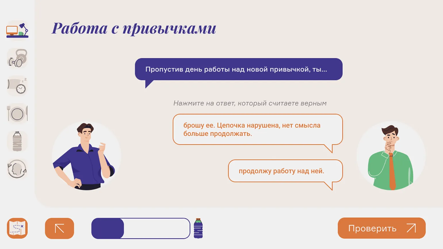
When using a character in a course scenario, it is important to define their specific role and strictly adhere to it. This will help create more engaging and understandable content for learners. A clear character purpose promotes better comprehension of the material and makes learning more effective.
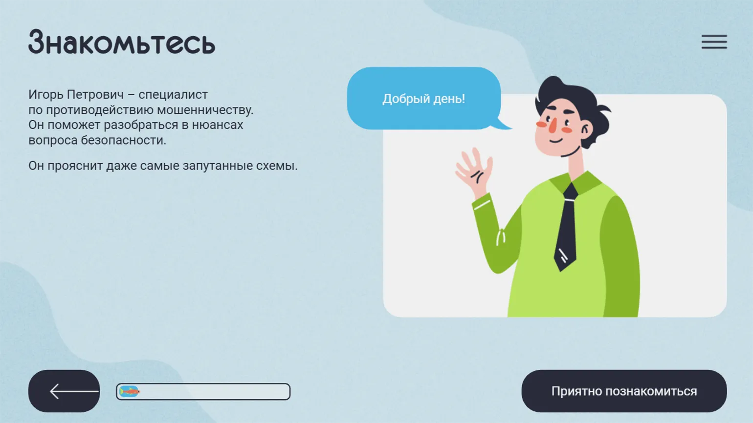
A storytelling-based course allows for a unique learning experience, where the character becomes the protagonist, walking the path alongside the student. An alternative is a mentor character, providing students with theoretical information and answering any questions that arise. A character can also serve a specific function, for example, adding elements of humor to the course, which makes learning more engaging and memorable. Using such characters not only brings the content to life but also promotes better comprehension, increasing student engagement.
It's important that the character's behavior and role remain predictable to the audience. This ensures clarity and helps viewers or readers more easily understand the motivation and development of events. For example, if a character exhibits certain personality traits, these traits should be consistent throughout the plot. This way, viewers can anticipate the character's actions, which creates a deeper connection with them. Predictability of character behavior also helps build tension and interest as the audience anticipates how the character will handle emerging conflicts. This is a key aspect in creating engaging and memorable stories.
- The information security course "How to Bypass Fraudsters' Networks" features a mentor character, Igor Petrovich, who imparts theoretical knowledge to students.
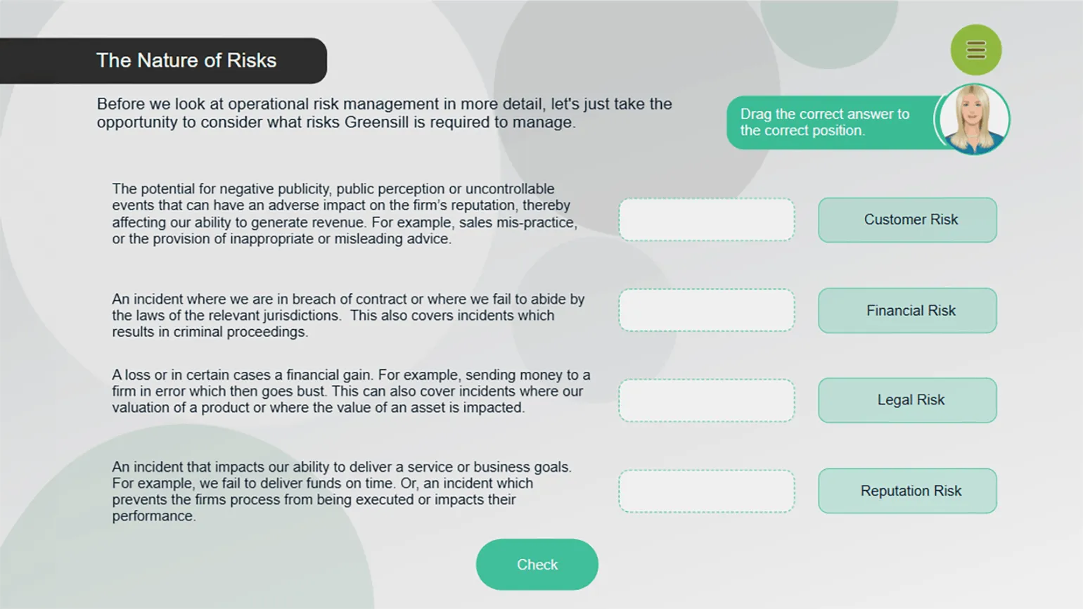
- In the Operational Risks course, a character is used as a navigation assistant, suggesting what exactly the student needs to do on a particular slide.
- In the aforementioned course "Physical Health as a Component of Well-Being," Andrey acts as an expert, helping students understand the theoretical material. And together with Vasily, students complete practical tasks.

How to Apply the Principle of Consistency in Course Design
Students, like our team, use apps and visit websites every day that are carefully designed. They are exposed to aesthetically pleasing social media influencers, which contributes to the formation of high visibility and expectations regarding the design of educational courses. This influence of modern digital solutions underscores the importance of high-quality design in educational platforms, which, in turn, increases learner interest and engagement.
Poorly designed and untidy visuals can irritate users, hindering their ability to absorb information and reducing overall course satisfaction. Design errors often arise from a lack of consistency. To avoid such problems, it's important to pay attention to the following aspects. First, ensure consistency in color palette and fonts across all pages. Second, maintain a consistent style for interface elements, such as buttons and headings. Third, optimize the use of space to ensure content is easy to read and visually appealing. Following these principles will help create a better and more comfortable experience for users, which in turn will increase their satisfaction and engagement with the course.

Reworked text:
Please consider the following guidelines and tips. These materials will help you gain a deeper understanding of the topic and expand your knowledge. We have collected useful links and resources for you that will be relevant and interesting. We invite you to explore them to deepen your knowledge and skills in this area.
Design Mistakes That Can Negatively Affect an Online Course
When creating an online course, it is important to pay attention to design, as it directly affects the perception of the material and student engagement. Here are ten common design mistakes that can ruin your online course.
The first mistake is information overload. Too much text and elements on the page are distracting and difficult to perceive. The optimal solution is to use short paragraphs and clearly structured materials.
The second mistake is insufficient contrast between elements. If the text is difficult to read against the background, this creates difficulties for students. Use contrasting colors for the background and font to improve readability.
The third mistake is the lack of responsive design. It's important for a course to display correctly on a variety of devices, including mobile phones and tablets. Responsive design ensures easy access to materials for all users. The fourth mistake is ignoring navigation. Complex or confusing navigation can lead to user dissatisfaction. Ensure navigation is intuitive and logical. The fifth mistake is using inappropriate images. Images should support the course content, not distract from it. Choose graphics that illustrate key points and help better absorb the material. The sixth mistake is lack of visual hierarchy. If all the elements on the page look the same, it makes it difficult to perceive the information. Use headings, subheadings, and highlighting key points to create a clear hierarchy. The seventh mistake is complex fonts. The font choice should be simple and legible. Avoid complex and decorative fonts that can distract from the content.
The eighth mistake is insufficient interactivity. Students learn better when they can interact with it. Include quizzes, polls, and other interactive elements to make learning more engaging.
The ninth mistake is ignoring user feedback. Feedback from students can help identify design flaws and improve the course. Collect feedback regularly and incorporate it into your revisions.
The tenth mistake is lack of a clear course goal. Every design element should support the educational goals. Identify the main objectives of the course and ensure that the design contributes to them.
By avoiding these mistakes, you can create an attractive and effective online course that will contribute to the successful learning of your students.
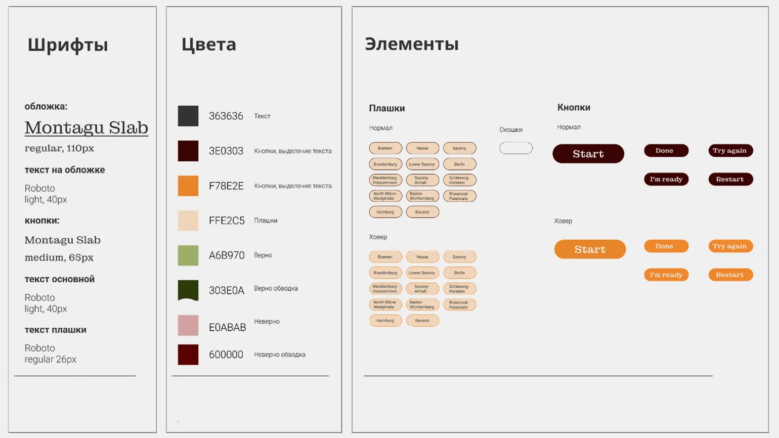
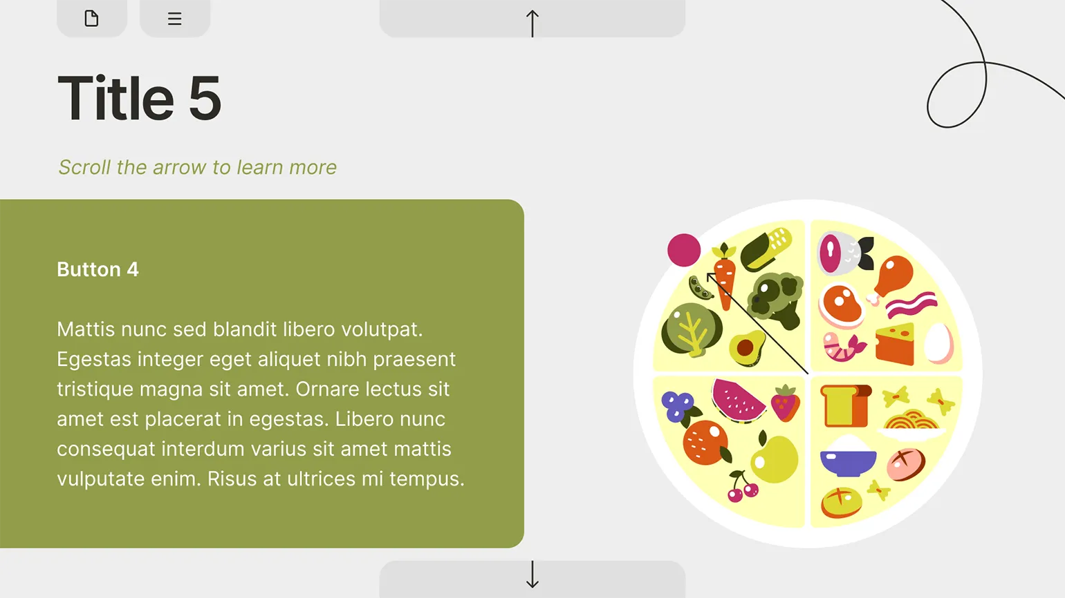
A variety of image styles in learning materials can lead to a feeling of sloppiness and a lack of seriousness. This creates visual noise, which distracts from the main content and hinders information absorption. Effective image design in a consistent style promotes better comprehension of the learning material and improves its structure. Creating a course doesn't require complex or unique solutions, but it's important to maintain a consistent style when selecting visual content, including photographs, infographics, icons, and illustrations. We recommend using ready-made icon packs that match your course's color palette and are designed in a consistent style with consistent line weights. This will create a harmonious perception and enhance the overall course design. Compare the two examples to see the difference in perception between a uniform style and a random selection of content.
It is not recommended to do the following:
Of course, please provide the text that needs to be redone.
Fonts and their sizes play a key role in the visual design of content. It is important to avoid overloading the user with a multitude of different fonts, and the font size should not change depending on the amount of text on the slide. In this context, it is worth paying attention to the design of websites and books, where the same fonts and sizes are usually used on different pages or in chapters. This creates a unified visual perception and helps the user perceive the information more easily. The correct choice of fonts and their sizes improves the readability and perception of content.
When developing a course, it is important to carefully consider the design of headings, subheadings, body text, and technical tips. It is recommended to use one font with different styles or a combination of two harmonious fonts. For each type of text, a single size, style, and color should be defined that will be used throughout the course, regardless of the amount of text on the slide. This approach will ensure visual consistency and improve the ease of perception of information.
This approach is not the right solution.
It's better this way:
A common mistake is using images of different sizes in identical blocks. To ensure a neat and harmonious layout, it is necessary to establish a uniform size for images in standard elements and strictly adhere to this standard. This will not only improve the visual perception of the content, but also increase its SEO optimization, since the uniformity of images contributes to better indexing of pages.
You should not do this:

So Better:
At the end of each section, include a short summary that highlights the key ideas for students to remember. Use a consistent style across these blocks to ensure they are easy to understand and promote learning. Using a standardized format will help create structure and order, which in turn will improve learning effectiveness.
The format for presenting information can vary. This could include a bulleted list, icons and text, or interactive cards. It's important that the chosen format be consistent across each section. Illustrations and icons may vary depending on the topic of a particular section.
At the stage of developing a UI kit, it is necessary to carefully consider a unified style for the design of buttons and clickable elements. The key is to ensure visual consistency across all slides, allowing the user to easily identify interactive elements. Clearly distinguishing clickable from non-clickable elements will significantly simplify student navigation and interaction with the content, enhancing their understanding of the required actions on each slide. This approach not only improves the user experience but also promotes more effective learning.
This should not be done:


How to Apply the Principle of Consistency in Course Layout
Layout is a key step in the course creation process, significantly impacting the positive and effective learning experience for students. A negative experience can result if the course designer neglects aspects such as slide animation, quiz mechanics, and question design. It's important to consider every element to ensure students have a comfortable experience and facilitate the acquisition of new knowledge. High-quality layout helps create an intuitive interface and improves interaction with the learning content, which ultimately increases student satisfaction.
Concentration and effective comprehension of course materials can be seriously affected by cluttered slides. When information is presented in a chaotic manner, with animations and quick transitions, it distracts from the main point and hinders assimilation. Clean and simple slide designs promote better perception and comprehension of information, allowing participants to focus on the main points. Therefore, it is important to strive for clarity and structure in the presentation of educational content. Animation variety is achieved when the designer applies a variety of animation effects and uses different animations for the same elements on different slides. For example, on the first slide, text appears on the right and an image on the left. On the second slide, the order is reversed, with the text appearing on the left and the image on the right. On the third slide, the image zooms in while the text appears on top. This approach creates a dynamic and engaging interaction, holding the user's attention. Too much animation can become overwhelming to users. It distracts attention and makes it difficult to highlight key points of the content. A balanced use of animation effects helps create a more comfortable experience, allowing users to focus on the main points. It is important to keep in mind that animation should serve as a supplement, not a distraction.

Read also:
Multimedia learning principles play a key role in creating effective digital learning content. The basic idea of multimedia learning is to combine various information formats, such as text, images, video, and audio, to enhance learning. When developing educational content, it is important to consider the cognitive characteristics of learners to maximize their engagement and comprehension.
One of the main principles is the use of multimodality, which involves the simultaneous use of different perception channels. This allows learners to process information more effectively, as they can relate textual and visual elements. It is also necessary to consider the principle of cognitive load, which indicates the importance of balancing information to avoid overloading the learner.
The use of contextual learning, where information is presented in real or realistic scenarios, helps learners better remember the material. It is also important to use interactive elements that stimulate active participation, which increases motivation and interest in learning.
When creating digital educational content, it is worth applying the principles of sequence and progression to gradually increase the complexity of the material and reinforce knowledge. At the same time, don't forget about the need for feedback, which allows students to recognize their successes and shortcomings.
Ultimately, applying multimedia learning principles to the creation of digital learning content is the foundation for developing effective educational materials that promote deep understanding and long-term retention of information.
Before starting course development, I carefully identify all typical elements, such as text, illustrations, prompts, and questions, and select appropriate visual effects for each category. For elements present on the majority of slides, primarily text, it is optimal to use neutral effects, such as "fade." This ensures a smooth and unobtrusive transition. In cases where it is necessary to emphasize important information or add dynamism to interactive slides, it is advisable to use more expressive effects, such as "fly in" or "pulse," and also to combine several effects for maximum impact. This approach improves the perception of information and increases user engagement.

The most common types of test questions include multiple choice One or more correct answers. A course may use different formats for such questions. However, it is critical to maintain consistency in design throughout the course and to use standard, internationally accepted visual elements. This not only improves comprehension of the material but also promotes more effective learning. Properly designed test questions help avoid confusion and make the knowledge assessment process more transparent.
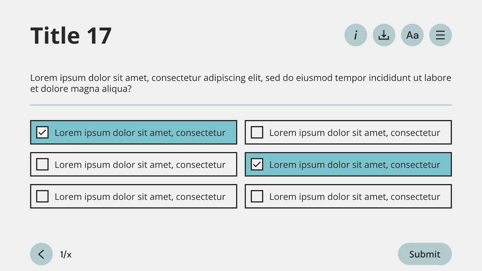
Two basic elements have long been developed for testing: radio buttons, or radio buttons, which are used for questions with one correct answer, and checkboxes, which are designed for questions with multiple correct answers. Effective use of these elements improves user interaction with tests and increases the accuracy of data collection.
An example of a multiple-choice test design is a convenient and effective way to assess knowledge. In such tests, participants are asked to select the only correct option from several options. This allows for a quick and clear assessment of the level of material assimilation. A properly structured test, including clearly worded questions and logically sound answer options, contributes to a more accurate assessment of knowledge. In addition, multiple-choice tests automate the assessment process, which significantly saves time for both teachers and students. The use of such tests in educational institutions and on online platforms is becoming increasingly popular, as they contribute to a deeper understanding of the material being studied.

An example of a multiple-choice test design is a convenient and effective way to assess knowledge. This format allows participants to select one or more correct answers from a set of options. Multiple-choice tests are widely used in educational institutions, on online platforms, and in corporate training. They help not only assess learning but also develop critical thinking. Properly formatted questions and answers in a test improve the user experience and enhance information retention. Effective multiple-choice tests should be clear, concise, and unambiguous so that participants can focus on the content of the questions.
Course design doesn't involve reinventing the wheel. The design elements used in test questions are also applicable to surveys and questionnaires that students encounter on various websites. This makes them intuitive and familiar to students. Instead of wasting time developing unique formats, it's better to adapt existing elements to the course color palette. This approach not only speeds up the design process but also improves student comprehension.
When is it okay to break the principle of uniformity?
After reading this article, you may ask: "Isn't it okay to break the principle of uniformity?" Yes, you can, but it's important to approach this decision consciously and clearly understand its purpose. Breaking the principle of uniformity should be justified and used in appropriate contexts to maintain the overall harmony and functionality of the content.
When designing a residential building, architects often decide to raise the ceiling height in top-floor apartments. This deliberate deviation from the principle of uniformity serves a specific purpose: high ceilings become a noticeable advantage that attracts the attention of potential buyers. Such a decision can significantly enhance the appeal of the property, creating a feeling of spaciousness and comfort.
The design of the course also requires attention, particularly with regard to the color scheme. We use a light background for slides containing theoretical information, which facilitates ease of perception. However, using a dark background to highlight key points can significantly enhance their significance. It is important to remember that such accents should be limited in number so that they retain their significance and do not create chaos in the course structure. Correct use of contrasts will help make learning more effective and memorable.
The Methodologist profession from scratch to PRO
You will improve your skills in developing curricula for online and offline courses. Master modern teaching practices, structure your experience, and become a more sought-after specialist.
Find out more