Table of Contents:
- New York City Subway Map of 1972
- Luxembourg's Efficient Bus System
- The History of the Paris Metro System: The 1936 National Lottery
- Los Angeles's Subway and Bus System: The Best of North America
- Stockholm's Unique Rail System
- The Evolution of the Paris SNCF Rail System
- Paris' Rapid Transit System: RER Innovations
- A Unique Scheme Odessa Trams by Art. Lebedev Studio
- Updated Berlin Transport Map
- Seoul Transport Map Review: Art and Functionality

Top 4 design professions: a free course in 5 days
Find out more
Konstantin Konovalov is a leading designer known for his unique transport route maps. He has developed the official maps of the Magistral route network and Moscow night buses. In addition, his portfolio includes an alternative metro map for Paris and Moscow, envisaged for 2030. These projects highlight his high qualifications in visualizing complex transport systems and his ability to create clear and user-friendly maps. Konovalov's work contributes to improving navigation and increasing the comfort of passengers in public transport.
New York City Subway Map of 1972
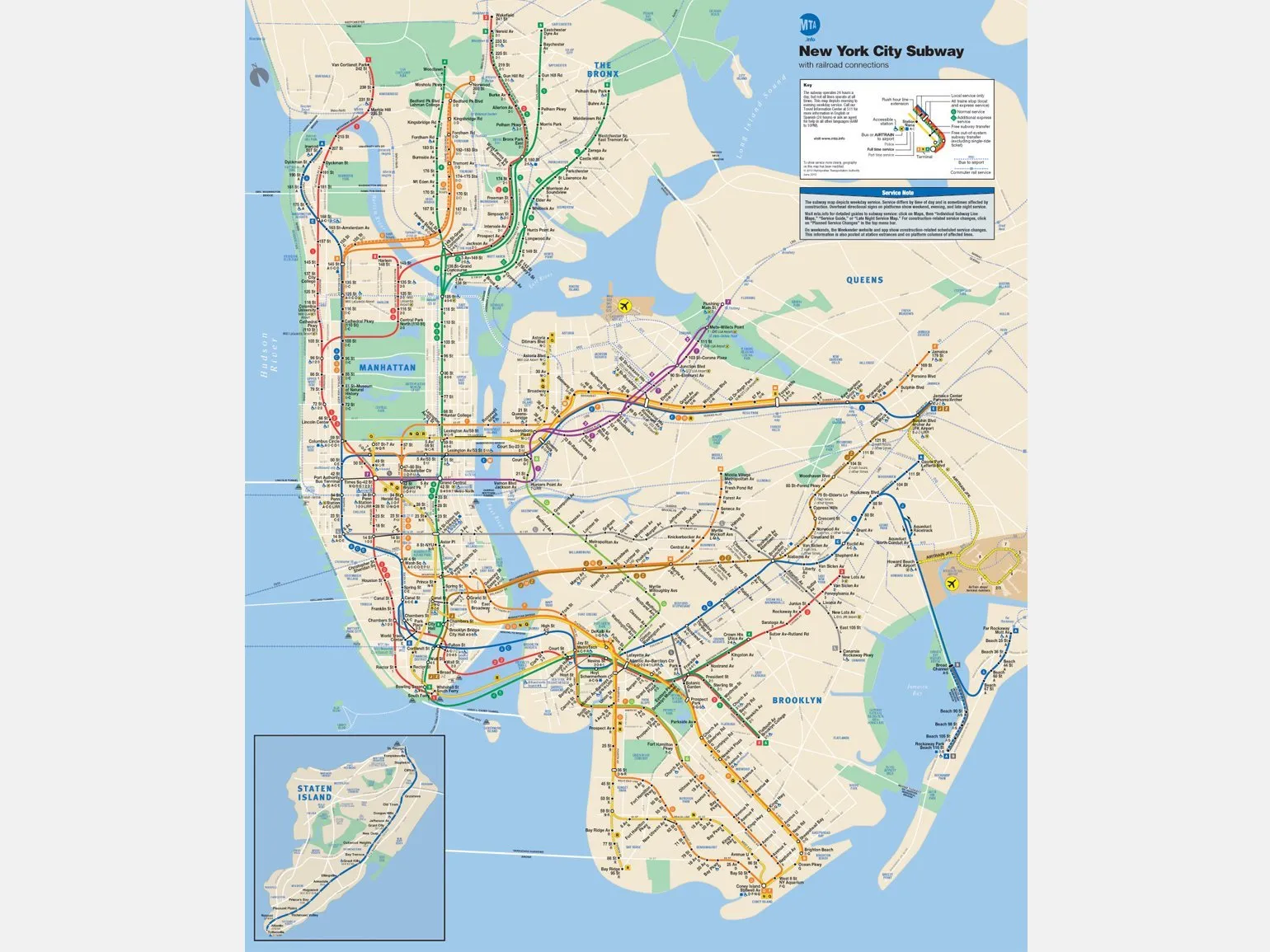
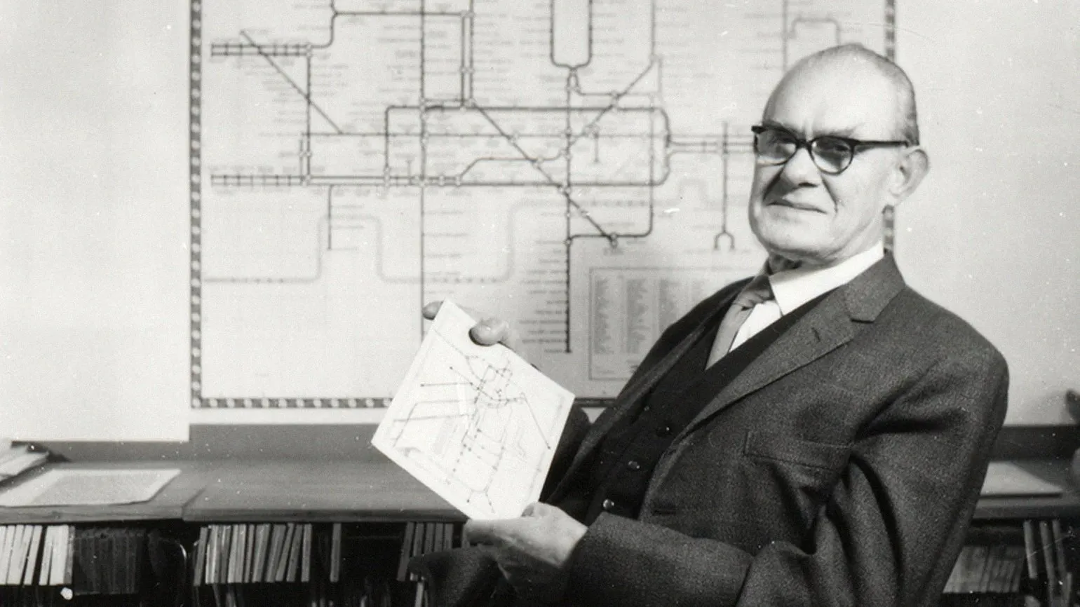
Among the various New York City Subway maps, the 1972 map designed by renowned designer Massimo Vignelli is the most controversial. This map is designed in a strict graphic style using a 45-degree grid, which gives it aesthetic appeal, but also raises controversy regarding its readability. Vignelli strove to create a design that was not only functional but also visually appealing, making this scheme one of the most notable in the history of the New York City Subway.
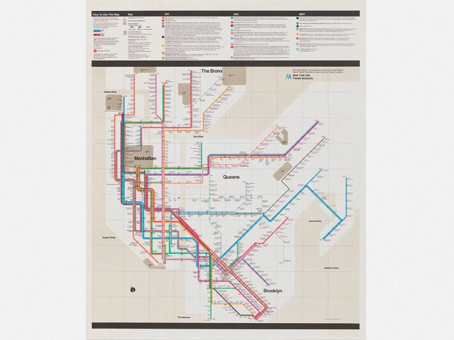
Despite its aesthetic appeal, Vignelli's scheme is not was misunderstood by New Yorkers, who found it inconvenient for navigation. As a result of public pressure, the subway management decided to abandon this scheme, which led to a return to a more traditional map. Although the traditional map better reflected geographical reality, it was less attractive and did not convey the uniqueness and atmosphere of the city.
The Vignelli diagram evokes negative reactions from many people, and users have difficulty understanding it. However, for some, it is one of the most convenient and understandable diagrams. Understanding this diagram can significantly improve navigation and information comprehension.
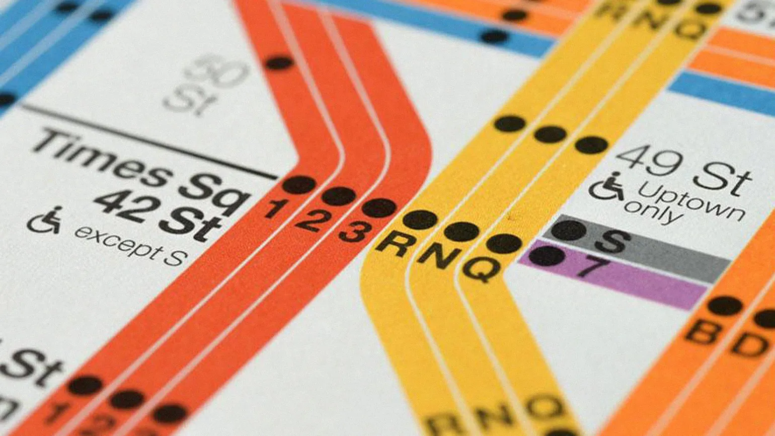
New York City officials are once again considering returning to the Vignelli map after several decades. This highlights the foresight of his design approach, which remains relevant over the years. Vignelli introduced concepts that remain significant in modern urban planning, and their use can contribute to the harmonious development of the urban environment. A return to this map could be an important step towards improving urban infrastructure and enhancing the quality of life in New York.
The possibility of returning to the Vignelli map in the MTA system is actively discussed on social media. This issue attracts users' attention due to the unique aesthetics and functionality of the map. A return to the Vignelli map could be a significant step in updating the city's transportation system, as it has historical value and is highly recognizable. Interest in this issue continues to grow, highlighting the importance of visual identity for public transportation.
Vignelli's design is ideal for modern digital interactive maps, remaining relevant in the age of high technology. This style not only provides aesthetic appeal but also improves the functionality of maps, making them more user-friendly. Using Vignelli's principles in digital design allows for the creation of intuitive and informative maps that are easily perceived and actively used in a variety of applications, from navigation to educational applications.
This example clearly demonstrates how the same design solution can be perceived differently, highlighting the importance of incorporating user input at every stage of the development process. It's important to actively engage users to create more efficient and attractive solutions.
Efficient Luxembourg Bus Map
French designer Jug Cerovic is known for his unique public transport maps, covering major cities such as Paris, New York, and Moscow. His work particularly highlights the bus maps for Luxembourg and Lisbon. These projects highlight his mastery of visualizing complex transport systems, making them more understandable and accessible to users. Cerovic continues to make significant contributions to the development of transport graphics design, improving urban navigation.
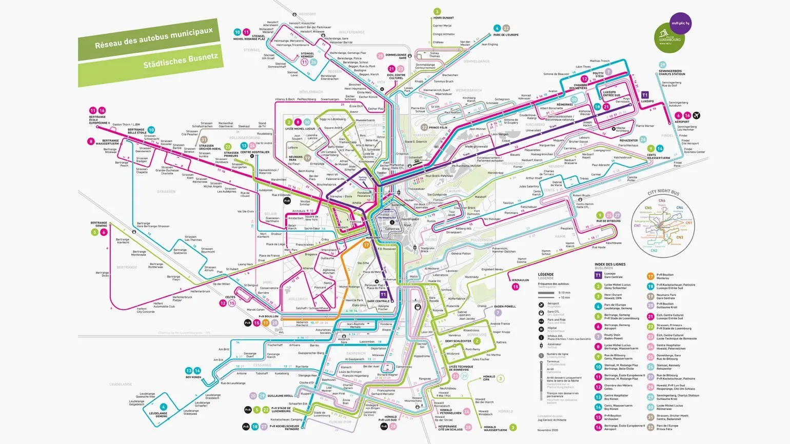
Cerovic implements modern graphic grids and skillfully uses color coding in his maps, which is especially important for cities with numerous transport routes. In his Luxembourg map, he succeeded in significantly simplifying the perception of information in the congested center, where more than 15 bus routes intersect. This approach improves wayfinding and improves convenience for passengers, which is especially important in conditions of high traffic density.
He developed a unique system where groups of routes are organized into lines, which then split into separate routes as they approach the outskirts of the city. We recommend visiting his website to get acquainted with his other projects - you will find many impressive solutions for various urban infrastructures.
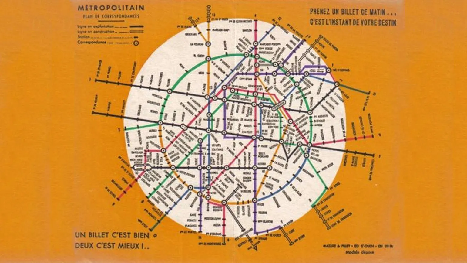
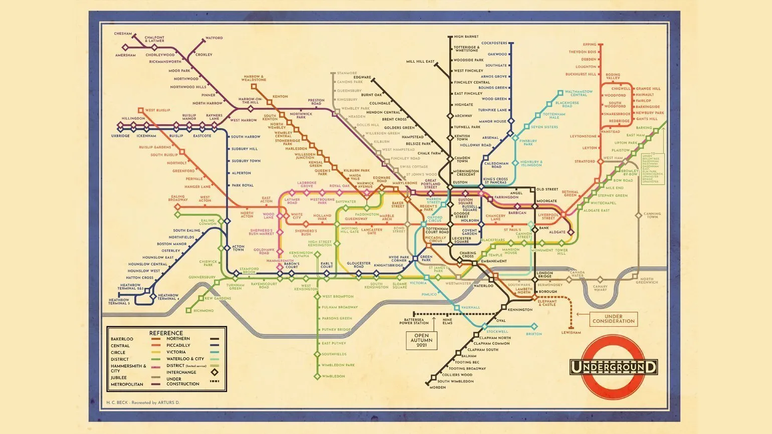
The History of the Paris Metro Map: The 1936 National Lottery
While researching the creation of the Paris Metro map, I discovered an interesting artifact - a 1936 map related to the National Lottery. In my work, I sought to combine two lines into a single ring shape, effectively emphasizing the boundaries of the city. This solution not only visually connects different districts but also improves understanding of the structure of the Parisian transportation system.
In the 1930s, an unknown designer took an innovative approach, creating a unique ring consisting of three line segments. This solution serves as a striking example of the visual thinking of the era, demonstrating creativity and originality. This design emphasizes the importance of minimalism and functionality, which have become fundamental in contemporary art and design.
Harry Beck, the creator of the first diagrammatic transport map for London, began his experiments in the early 1930s. During the same period, designers in Berlin began developing similar concepts. These innovations in the presentation of transport systems had a significant impact on graphic design and urban navigation, becoming the basis for the creation of modern public transport maps.
Inspired by early maps, the French designer developed one of the first ring lines for the Paris metro, which is considered one of the most complex in the world. Later, a similar ring line was implemented in the Moscow metro. These systems not only provide ease of travel but also serve as a model for other cities seeking to improve their transport infrastructure.
When the maps were first developed, the work completed in 1936 proved to be quite progressive and original. Unfortunately, it did not receive the attention and recognition it deserved at the time. This research laid the foundation for further advances in circuit design, but its significance was underestimated.
Harry Beck, known for his contributions to metro map design, also contributed to the Paris metro map in the 1930s and 1940s. However, his project was not realized due to excessively long sections, a consequence of the pursuit of perfect geometry. This effort highlights Beck's innovative approach to visualizing transport systems and its influence on the subsequent development of metro maps in other cities.
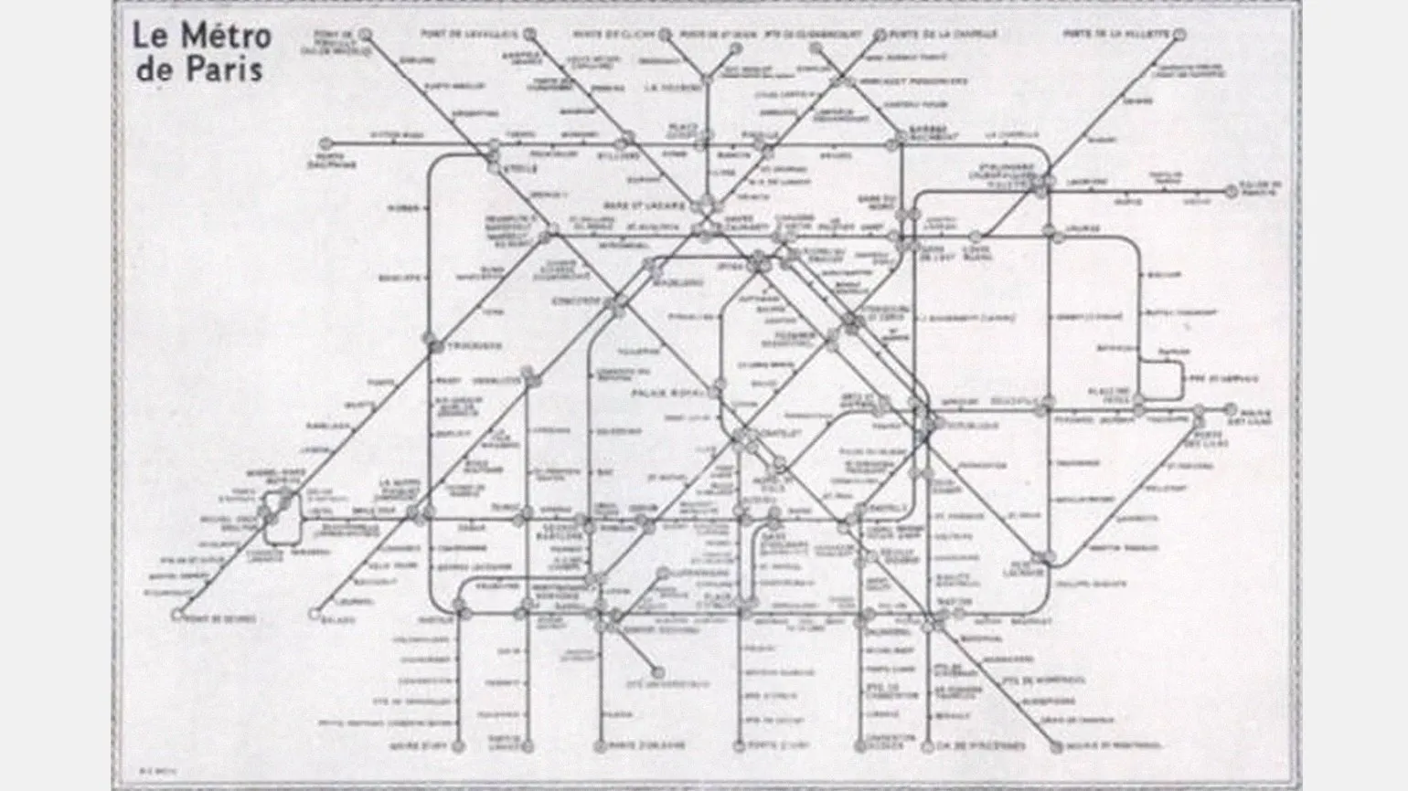
Beck's London Metro map has become a true model of successful design that continues to be used today. It adapts to new conditions, while maintaining the basic logic of its original design. This scheme not only simplifies navigation around the city, but also serves as an important element in the development of urban transport, providing convenience for residents and tourists.

Robert McConnell is a prominent graphic designer based in New York City. His interests span a wide range, including transportation design and typographic design. After completing his studies at the Rhode Island School of Design, he successfully applies his skills to the fields of technology, art, and education. Among his most famous works is the California Bus System, which showcases his skill and innovative approach to graphic design.
The Los Angeles Metro and Bus System: The Best in North America
The Los Angeles transportation system is considered one of the most efficient in North America. It includes two subway lines, the B and D, and four light rail lines, the A, C, E, and L. Two key bus routes, the G and J, also operate. The network is expected to expand in the coming years with the addition of new lines, improving accessibility and ease of travel throughout the city. Los Angeles continues to develop its transportation infrastructure, making it more attractive to residents and tourists.
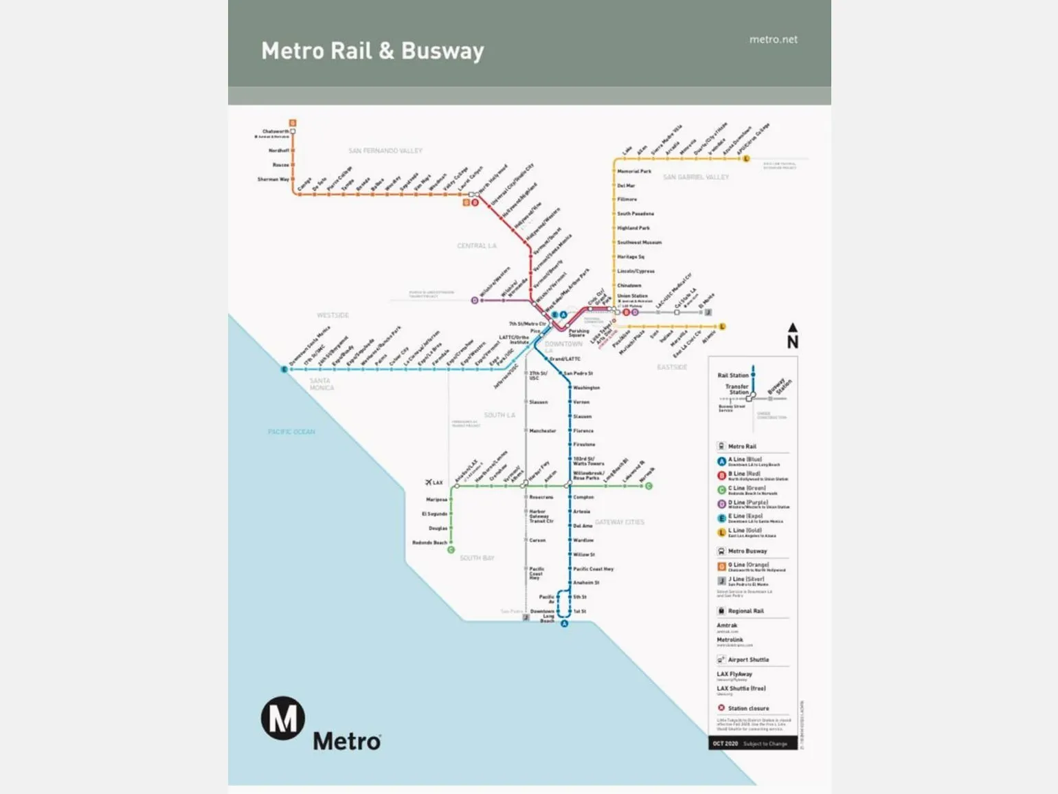
The transportation system map is characterized by its simplicity and clarity. Clear north-south and east-west axes, as well as equal distances between stations, make it easy to navigate. The route lines are not overly cluttered, highlighting the elegance and functionality of the design. This map structure facilitates easy navigation and makes traveling around the city more comfortable. Users can quickly find the routes and stations they need, significantly improving the efficiency of the transportation system.
Unlike common North American maps, which typically use fonts such as Helvetica, this map uses the FF DIN font. This decision gives it a unique style and allows it to stand out from similar projects. The FF DIN font not only brings a modern look but also improves legibility, making it an excellent choice for the design.
One of the notable features of the transportation map design is the use of different shapes to indicate stations. Train stations are displayed as circles, while bus stations are presented as squares. This approach improves the convenience of passengers, allowing them to quickly and easily distinguish between different routes and select the transport they need.
The design scheme was created with the modern corporate identity of the subway in mind, which ensures harmonious combination with the overall visual image of the Los Angeles transportation system. This attention to detail underscores the desire for unity and aesthetics in the city's infrastructure, which contributes to the recognition and appeal of public transport for residents and tourists.
Stockholm's Unique Rail Map
The Stockholm rail map features a unique dark background, making it one of the most memorable transport maps in the world. Unlike most maps, which are designed in light shades, this approach gives it a distinctive style and originality. This design not only attracts attention but also makes it easier to perceive information about routes and stations, making navigation around the city more convenient.
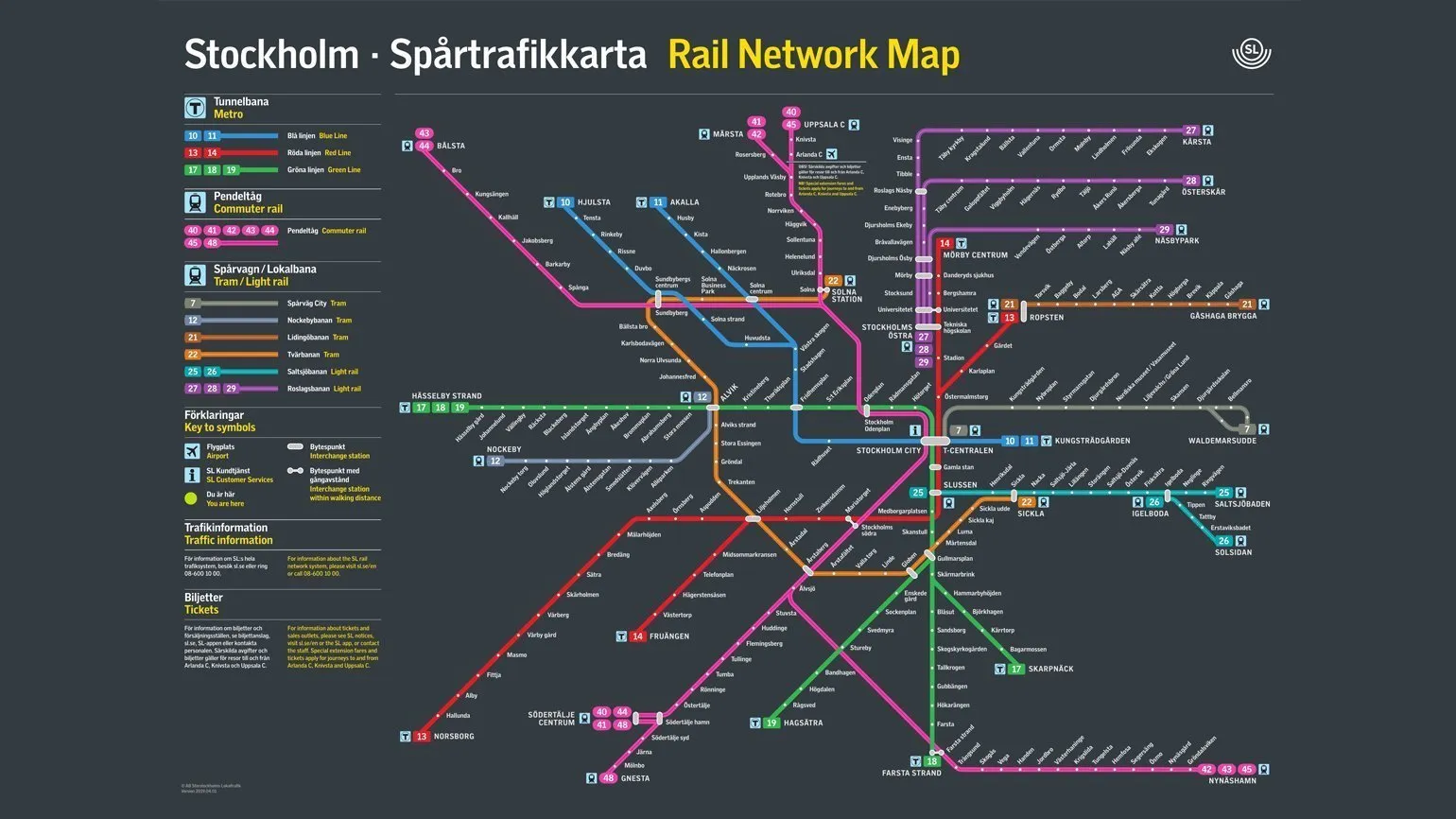
The SL Gothic font used in this map gives it a unique and modern style. Although its use on station signage is currently limited, this font makes the map more appealing to designers and graphic enthusiasts. This interesting font choice emphasizes the importance of visual identity and can serve as inspiration for new graphic design projects.
One of the map's key features is the consolidation of multiple routes into a single line. For example, the green line combines three routes: 17, 18, and 19, significantly simplifying user perception. However, this principle does not apply to the pink lines in the upper right corner of the map, which represent routes 27, 28, and 29. This approach improves navigation and makes public transport more convenient.
The map has both advantages and disadvantages. One of the main drawbacks is the lack of clear visual differentiation between lines for different modes of transport, such as the metro and trams. This can make the map difficult to understand, especially for new users who require a legend for proper understanding. Improving the visual identification of lines will help make the map more intuitive and accessible to all users.
The Evolution of the Paris Railway Map (SNCF)
The SNCF railway map, designed by Swiss designer Rudi Meyer in the 1980s, is a striking example of graphic minimalism. Clear lines arranged at 90- and 45-degree angles provide not only functionality but also aesthetic appeal. Even without geographical landmarks, the contours of Paris are easily recognizable thanks to the successful composition. This map not only facilitates navigation on the railway network, but also serves as an example of modern design and visual communication in the transport sector.
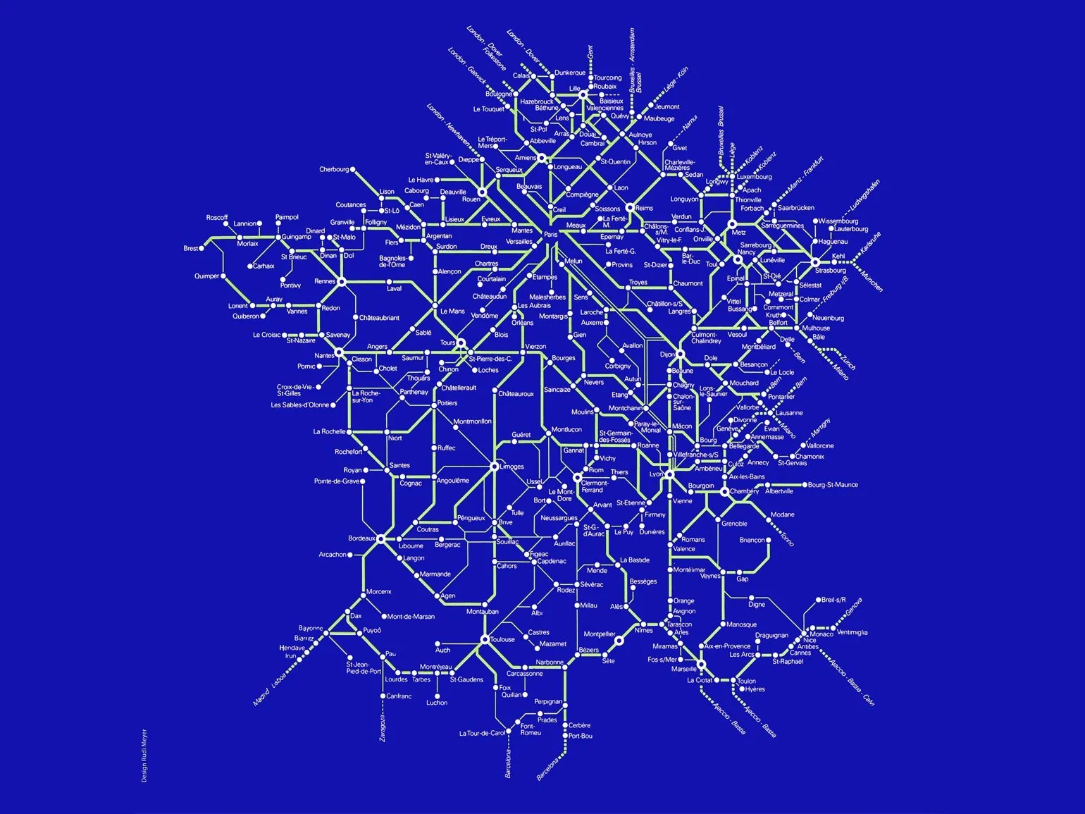
The map shows the main lines, highlighted in bright neon green, which makes them easy to distinguish. Minor routes are presented in lighter shades to avoid visual clutter. The high-speed line connecting Paris and Lyon stands out in particular, depicted by two thin parallel lines symbolizing speed and modernity. This map clearly demonstrates the infrastructure of the transport network, highlighting important routes and their importance to travelers.
The SNCF map remains an essential tool for passengers, offering a simple and convenient way to navigate the extensive rail network. It is especially useful for trip planning, making it indispensable for tourists visiting Paris for the first time. With this map, it is easy to find the best routes and departure times for trains, making it much easier to travel around the city and its surroundings.
How to buy a train ticket in Paris? Tickets can be easily purchased on the official SNCF website, from ticket machines located at stations, or at ticket offices. These are convenient methods that allow you to make a purchase quickly.
How to find the train schedule? The schedule is available on the SNCF website and in the mobile app, allowing you to plan your trips in advance. You can also find schedule information on screens installed at railway stations. Using these resources, you will always be aware of the current departure and arrival times of trains.
To learn more about the French railway system and get up-to-date information on changes to the schemes, we recommend visiting the official SNCF website. The site provides detailed information on routes, schedules, and fares to help you plan your trip around France. Official SNCF website: https://www.sncf.com.
Paris Rapid Transit Map: RER Innovations
The Paris rapid transit system, known as the RER (Réseau Express Régional), is an example of modern transport design. Rudy Meyer, one of the main authors of the RER schemes, developed unique maps distinguished by their original visual design. These maps not only simplify navigation but also make the system more accessible to users, facilitating efficient travel throughout the city and its suburbs. This approach to route visualization helps make public transportation more appealing and easier to use.
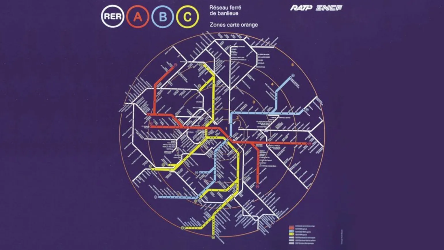
Created in 1988, the map attracts attention with its aesthetic appeal and functionality. It is distinguished by harmonious proportions and bright lines that mark the routes of commuter trams, executed in light shades. This not only improves visual perception but also makes the map more intuitive for users, facilitating easier navigation within the city's infrastructure. Effective use of color and clear route mapping help users quickly find the information they need, making this map an essential tool for residents and visitors alike. Meyer's maps are distinguished by their lack of geographic elements, allowing the focus to be on routes and lines. This simplifies understanding the transportation system and makes it more accessible to users. The use of orange circles on the map to indicate fare zones also helps passengers quickly navigate the pricing system. This approach helps to effectively plan trips and choose optimal routes, which is especially important for new users and tourists.

Egor Popov is a renowned designer who, in collaboration with Ilya Birman and Sergei Chikin, developed one of the most aesthetically pleasing maps of the St. Petersburg metro. This work not only attracted attention for its visual design but also became a model for many modern design projects in the field of transport navigation. Egor Popov's creative approach to creating a metro map demonstrates his deep understanding of aesthetics and functionality, which inspires new specialists in this field.
Unique Odessa Tram Map by Art. Lebedev Studio
Public transport maps are usually designed using a strict grid and angles, which ensure rigor and clarity. However, the Odessa tram route map created by Art. Lebedev Studio is distinguished by its originality. It uses smooth and free lines, which sometimes deviate from traditional design standards. This approach makes the map unique and more visually appealing to users. Thanks to this, passengers can more easily navigate routes and find the desired destinations, which in turn improves the perception of public transport in Odessa.
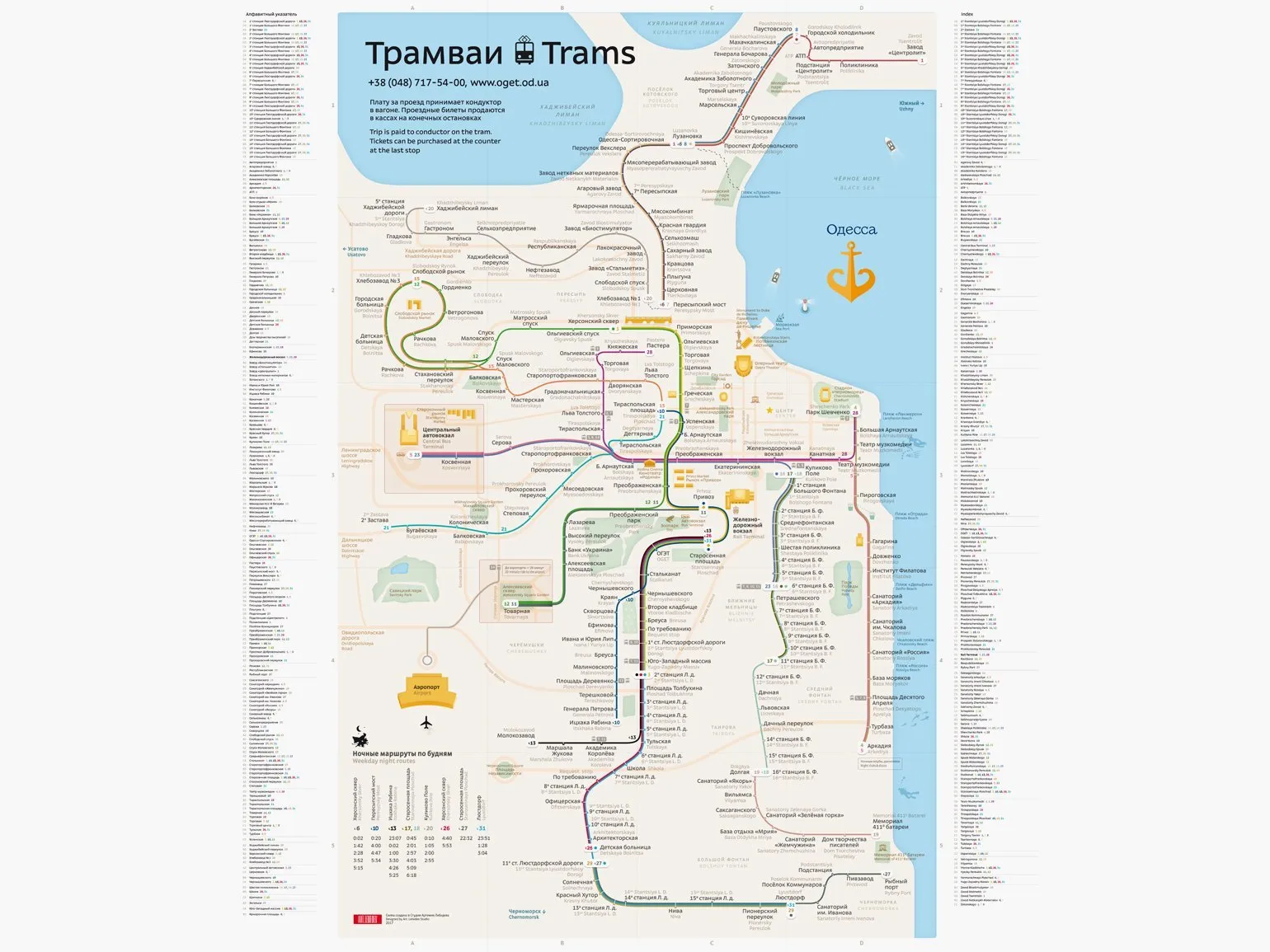
The map impresses with its meticulous elaboration of buildings, icons and details. We recommend checking out the "Process" section on the studio's website to better understand the designers' philosophy and approach. It's as captivating to read as viewing the map itself.
Berlin's Updated Transport Map
Designer Pavel Omelekhin has transformed the Berlin U-Bahn, creating a new, recognizable style. His concept includes a unique ring line reminiscent of a dog's silhouette and elegant, branching commuter train routes. The result is a map that is not only aesthetically pleasing but also functionally convenient, improving navigation and making U-Bahn travel more comfortable. The new design promotes increased interest in public transport and improves the overall perception of urban infrastructure.
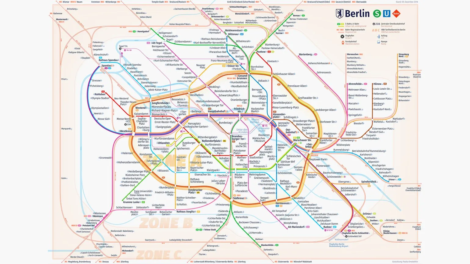
Omelokhin also created a comprehensive design system, which is presented on his official website. This project, a personal initiative, highlights the designer's high level of professionalism and creativity. The design system incorporates all the necessary elements for effective project management, ensuring a harmonious blend of functionality and aesthetics.
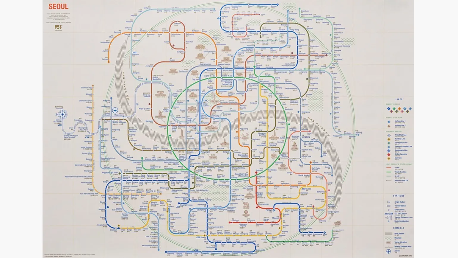
Seoul Transportation Map Overview: Art and Functionality
Seoul's transportation system is not only an efficient means of transportation within this major metropolis but also a visually appealing feature. Studio Zero Per Zero has developed a unique map that combines artistic style and practical use. This map can become not only a stylish element of your home decor, but also a convenient guide for exploring the capital of South Korea.
Graphic designer PRO: 5 steps to a successful career
Want to become a graphic designer? Learn 5 key steps to creating a portfolio and a successful career start!
Learn more