

Try 4 top design professions. Free ➞ In 5 days, you will get acquainted with illustration, UX/UI, web, and graphic design. Add 4 compelling case studies to your portfolio and decide on your next career path.
Learn MoreGraphic designers used to be trained in art schools, but today, short-term courses allow you to master the fundamentals of the profession, allowing you to combine study with work. Many aspiring designers enter this field with software skills and an understanding of branding, but lack drawing skills. It's important to note that modern graphic designers must be able to adapt to new technologies and design trends, making training more accessible and flexible.
The question of whether a designer should be able to draw is a controversial one. While it's not a requirement, knowledge of artistic techniques can significantly expand their skills and serve as a source of inspiration. Let's look at the principles of painting and drawing that will be useful when developing logos and advertising creatives. Understanding the fundamentals of composition, color, and form will enable a designer to create more harmonious and appealing visual solutions. These skills will aid not only in creating unique logos but also in developing effective advertising materials that will attract the attention of the target audience.
Tonal Contrast
Colors play a key role in creating mood and influencing the viewer's emotions. However, color alone is insufficient to accurately convey the shapes and boundaries of objects. Therefore, drawing lessons often begin with pencil work. Even in painting and color graphics, many artists prefer to sketch in monochrome to preserve the tonal contrast between dark and light shades in the final color image. This helps to better understand light and shadow and volume, which is the basis of a successful work of art.
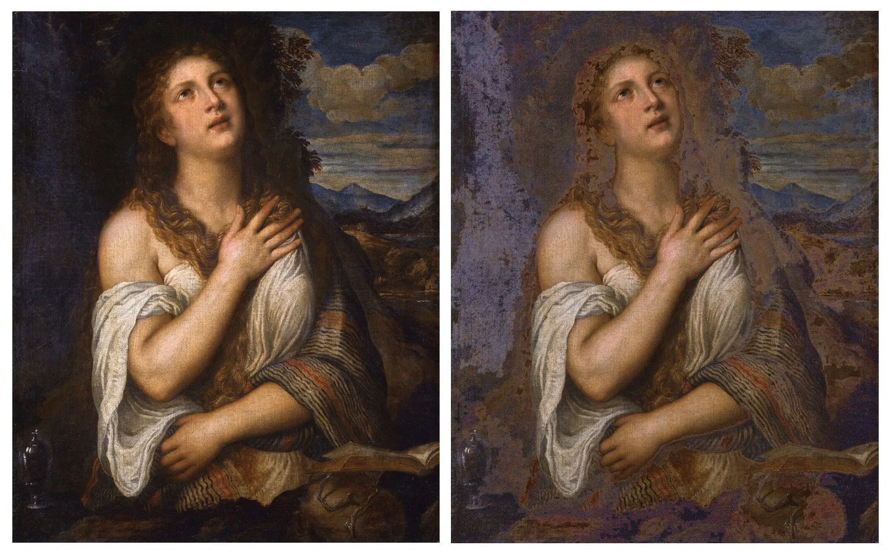
Let's consider tonal contrast in Titian's painting. On the left is the original work, and on the right is an edited version with a lightened background. Tonal contrast plays a key role in the perception of the painting, emphasizing volume and depth. Lightening the background changes the dynamics of the composition, focusing attention on the main elements. By analyzing these changes, we can gain a deeper understanding of Titian's artistic techniques and their impact on visual perception.
Titian Vecellio was a prominent Italian artist who became an important figure in the Venetian school of painting during the High and Late Renaissance. His skill and original style had a significant influence on the development of painting, and Titian's works are characterized by vibrant colors, dynamic compositions, and deep emotion. Thanks to his talent, he became one of the most famous and revered artists of his time, leaving a significant legacy in art.
Impressionist artists deliberately avoid sharp contrasts between light and dark areas. Instead, they use patches of color that are close in tone, achieving a blurred and vibrant effect. This approach helps convey the atmosphere of the moment and the emotional perception of the surrounding world. Impressionism emphasizes light and color, which makes paintings dynamic and lively.
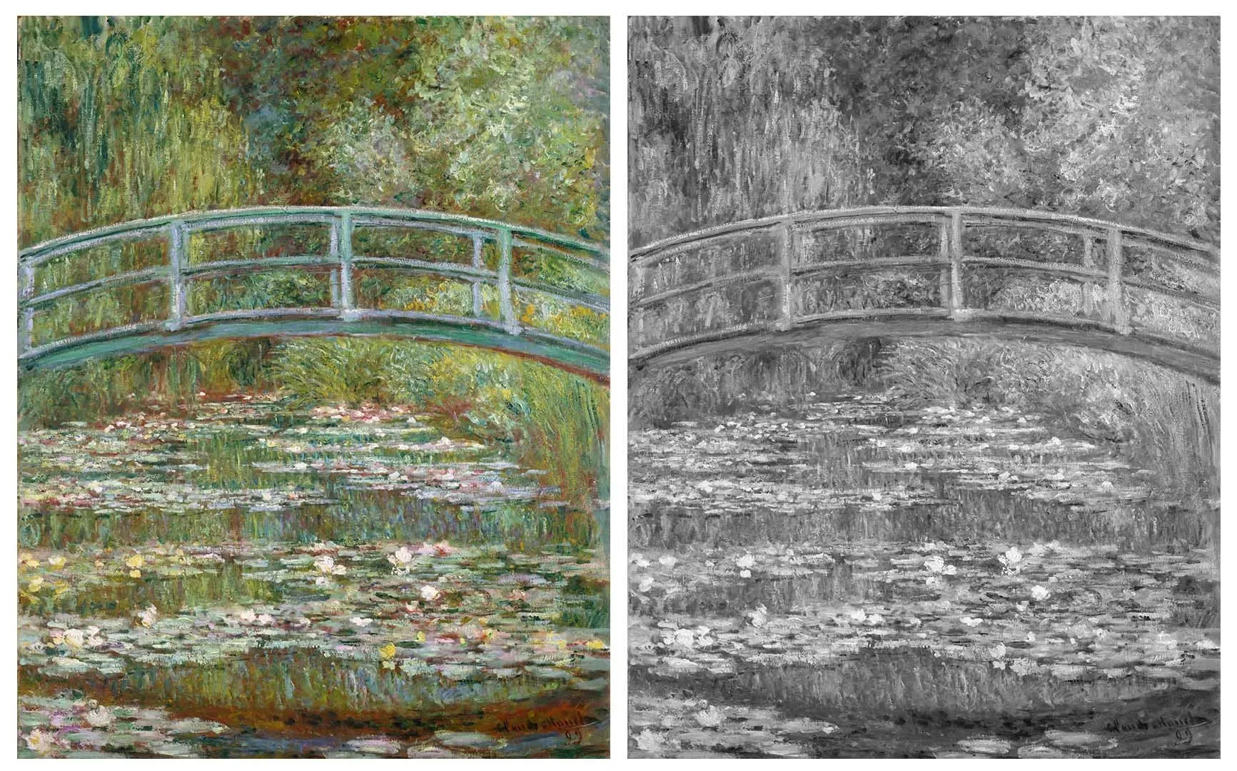
The Impressionist approach is not suitable for creating a corporate identity. First of all, the logo must remain clear and legible on black-and-white documents. It is important that the sign is designed in such a way that it can be quickly and easily recognized even from a distance. For example, the Magdalene in Titian’s painting is immediately visible, while the water lilies in the pond in Monet’s painting require careful examination. An effective logo must be simple and memorable to ensure instant brand recognition.
Oscar Claude Monet was an outstanding French painter and one of the founders of Impressionism. His work had a significant influence on the development of art, especially in the field of plein air painting. Monet is known for his unique ways of conveying light and color, which became a characteristic feature of Impressionism. His famous works, such as “Water Lilies”, and "Impression. Sunrise," demonstrate his mastery of atmosphere and emotion. Monet continues to inspire artists and art lovers around the world, and his legacy remains relevant today.
Contrast in tone plays a key role in developing an effective logo. It's best to begin the process with black and white sketches. This allows you to focus on form and composition. Furthermore, many well-known brands retain their recognition even in monochrome, confirming the importance of contrast for visual perception. Creating a logo with clear contrast helps convey a company's core values and makes it more memorable.

Reducing the contrast between dark and light shades This creates a softer visual perception. This can make an image or design more harmonious and pleasing to the eye. Reducing contrast helps avoid abrupt transitions and creates an atmosphere of calm. This is especially relevant for web design and graphics, where it's important to ensure comfortable user interaction with the content. Soft hues and smooth transitions can improve the overall aesthetic and make information more accessible.

In theory, the lack of tonal contrast in advertising design could be considered a deliberate technique. However, it is more likely to result in an image that is unclear and difficult to perceive. Traditional advertising, in this regard, is similar to classical painting, where clear distinctions between elements and their harmony play a key role in conveying the message. Effective advertising design requires a careful approach to contrast to ensure clarity and attract the audience's attention.

In some advertising photographs, the boundaries between light and shadow may be less pronounced, but become apparent when squinting slightly. This approach allows for better perception of details and accents created by the play of light and shadow, which is especially important for attracting attention to a product. Proper use of these elements in visual content helps create a deeper and more memorable image, which helps increase interest in the advertised product.

Isolating the Figure from the Background
An artist often depicts objects in the context of their surroundings, which creates a more complete perception of the painting. Most works of art feature both figures and backgrounds. For example, Titian, whom we have already mentioned, used tonal contrast to highlight the Magdalene, but there are other techniques for accentuating the main characters. This can be achieved through color contrast, compositional balance, or the use of light and shadow. Such techniques help create depth and dynamism in a work, making it more expressive and memorable.
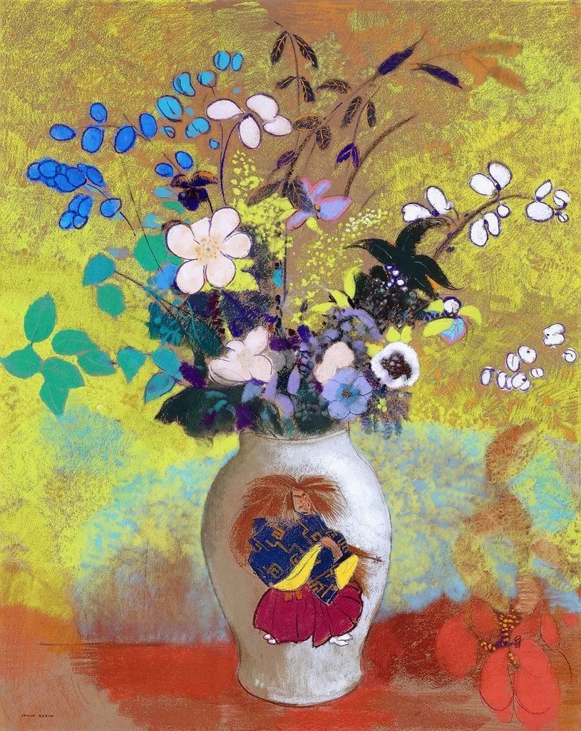
Tonal contrast plays a key role in forming a harmonious composition, but it is not the only method for highlighting an object from the background. An example is the work of Odilon Redon, where the background is executed with large and loose brushstrokes, while the vase with a bouquet is depicted with more care and clear contours. This approach not only draws attention to the object, but also creates dynamics in the work, emphasizing its significance in the overall picture.
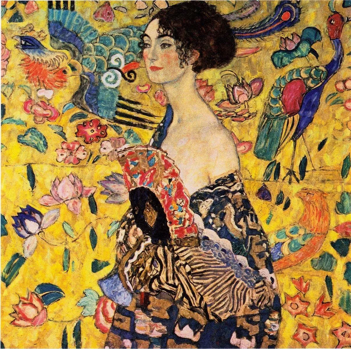
Artists often use a technique in which the background is depicted as blurred and rough, while the main object is clear and detailed. This creates a contrasting effect and helps highlight the central figure. In some works, different techniques may be used to depict the figure and background, which gives the work dynamism and depth. One striking example of this approach is a painting by Gustav Klimt, where he masterfully combines textures and styles in the depiction of the background and the main object.
Gustav Klimt is a renowned Austrian artist, considered one of the most outstanding representatives of Viennese Art Nouveau. His work is distinguished by a unique style, characteristic of the early 20th century, and profound symbolism. Klimt became known for his decorative canvases, which often explore the themes of love, life, and death. His works, such as "The Kiss" and "Girl with a Fan," demonstrate a masterful use of gold and intricate patterns, making them true masterpieces of art. Klimt's influence on modern art and design continues to be felt today, making him a central figure in the history of Austrian and world art.
These techniques remain important in design, especially when overlaying a logo on branded graphic elements. The correct combination of logo and graphic elements helps create a harmonious visual brand image. The use of transparency, contrast, and proper placement can significantly enhance brand perception. It's also important to consider the color palette and fonts to ensure the logo fits seamlessly into the overall composition. Effective use of these techniques will allow you to highlight your corporate style and increase company recognition.
Most often, a logo is a solid figure, but in advertising design, distinguishing objects from the background plays a key role. The goal of advertising is to attract attention and create a striking visual impression, so backgrounds are almost always used in advertising materials. In this context, artistic techniques become especially important. They help highlight the main object, ensuring its visibility and memorability. Effective use of background and color palette can enhance the visual appeal of advertising and increase its impact on the audience.

Photography ads are familiar and traditional, but recently, combining images with vector graphics has become increasingly popular. This combination creates a unique visual style that attracts attention and makes advertising content stand out from the competition. Vector graphics add a modern, minimalist touch, harmoniously complementing photographs. This approach not only improves the ad's perception but also helps convey the message more effectively to the target audience. Using vector elements in advertising opens up new creative possibilities and helps brands stand out from traditional advertising materials.

Profession Graphic Designer PRO
You will learn how to create corporate identity elements and graphics for business. You will put together a portfolio that reflects your style and confirms your design skills. You can start a career in a studio or as a freelancer.
Find out more