Contents:

Design profession: 4 directions in 5 days
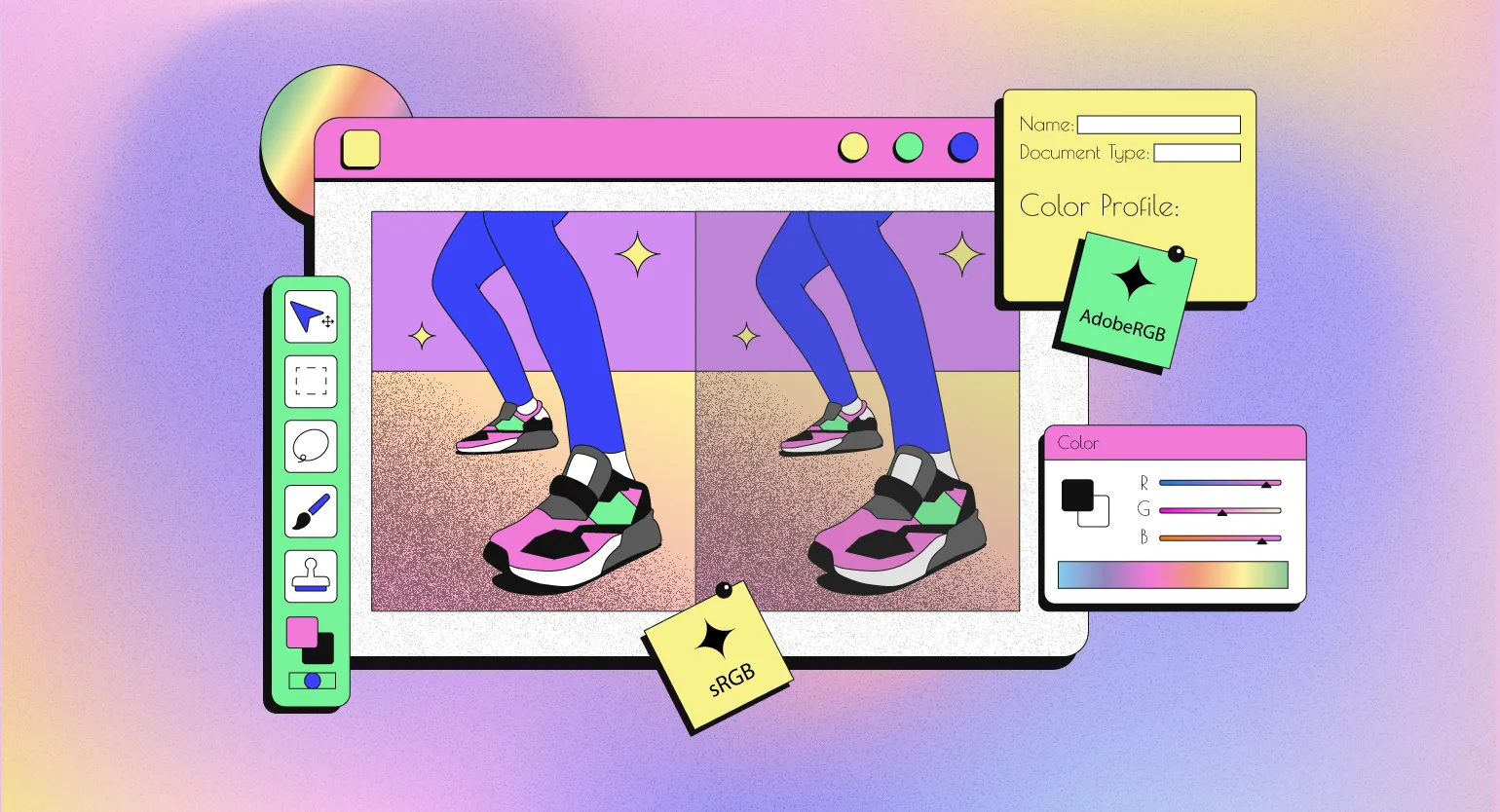
Find out moreEach device has its own characteristics of color display, which emphasizes the importance of the color gamut. Designers work to ensure that colors look identical on different screens and when printed. To achieve this, they use color profiles known as ICC profiles. These profiles contain information about the color rendering characteristics of each device, ensuring accurate color reproduction and minimizing variations between different media. Proper use of ICC profiles improves the quality of visual content and ensures color consistency.
In this article, we will examine the functioning of color profiles and their application in the work of designers. Color profiles play a key role in ensuring color accuracy across various devices, such as monitors, printers, and cameras. Designers use color profiles to achieve color consistency in their projects, which is especially important in print and digital graphics. Understanding how color profiles work allows professionals to manage colors more effectively, which directly impacts the quality of the final product.
Color Profiles and Color Spaces
Color perception is a subjective process, making it difficult to accurately capture in computer graphics. To solve this problem, color spaces—mathematical models that describe colors—were created. In such spaces, each color is represented as a point in a three-dimensional coordinate space. These models allow for more accurate color rendering, which is especially important in design, photography, and video editing. Using color spaces ensures consistency and accuracy in color display, which is critical for visual arts professionals.
The most common color models are RGB and CMYK. The RGB (red, green, blue) model is used for digital screens and is based on the mixing of light. Each color in this model is defined by three values, but brightness and hue can vary across devices. This means the same RGB value can appear differently on different screens. Unlike RGB, the CMYK (cyan, magenta, yellow, and black) color model is designed for printing and is based on light absorption. Understanding the differences between these models is critical for designers and print professionals, as choosing the wrong model can result in color distortion in the final product. The CMYK color model, consisting of cyan, magenta, yellow, and black, is widely used in printed media. This model is defined by four values that represent the proportions of each color. It is important to note that visual results can vary significantly depending on the quality of the inks and the type of paper used in the printing process. Proper selection of these parameters is key to achieving the desired end result.
Color profiles allow designers to accurately predict how an image will appear on various media, including paper and screens with different characteristics. This ensures consistency in visual perception and helps avoid unexpected results when printed or displayed on digital devices. Using color profiles is a key aspect of the design process, allowing you to achieve the best possible image quality and meet client expectations.
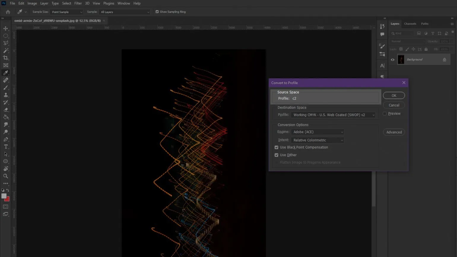
Please note the images provided:

Both photographs were processed in the RGB model, but the applied color profiles They differ. This causes noticeable visual differences: in the left image, the colors are more saturated, while in the right, they appear significantly paler. For designers working with brand colors or photographs, such differences are critical. Choosing the right color profile is key to achieving consistency in visual content and maintaining brand identity. Changing the color profile affects the visual perception of the image, but the RGB or CMYK coordinates remain unchanged. This means that despite the changes in colors, the basic values of the color components do not change.

On Both circles have the same RGB coordinates (226, 128, 29), but they look different from each other. This difference is due to the use of different color profiles, which affect color display. Color profiles can significantly change the perception of color, even if the original values \u200b\u200bremain unchanged. Choosing the right color profile is important for accurate color reproduction across different devices and environments.
Color profiles play a key role in accurate color reproduction and prediction, taking into account the characteristics of different screens and printers. They ensure consistency in color display across all devices, which is especially important in design and printing. Correct use of color profiles avoids distortions and ensures that the end result will meet expectations.
Understanding Color Profiles: How They Work
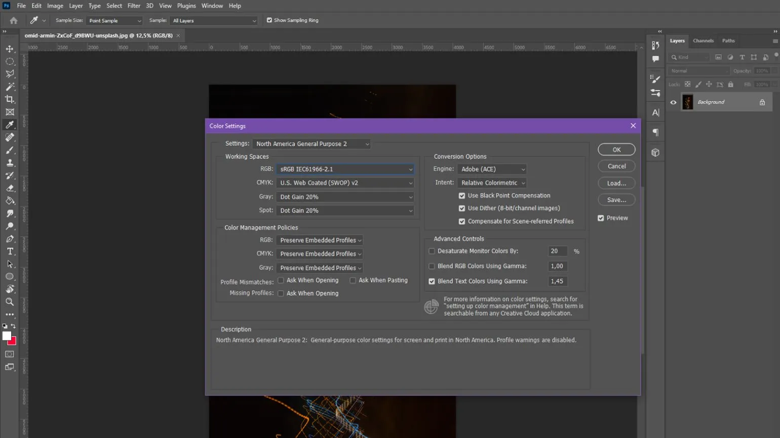
Color profiles are essential in the field of digital graphics. There are two main categories of color profiles: real and abstract. Real-world profiles accurately describe the range of colors a specific device, such as a printer or monitor, can reproduce. In contrast, abstract profiles represent average values and cover a group of devices with similar characteristics. This makes abstract profiles more convenient for designers, allowing them to work with colors confident that their work will display correctly on a variety of devices. Understanding the differences between these profiles helps avoid color rendering issues and ensures accurate visual representation.
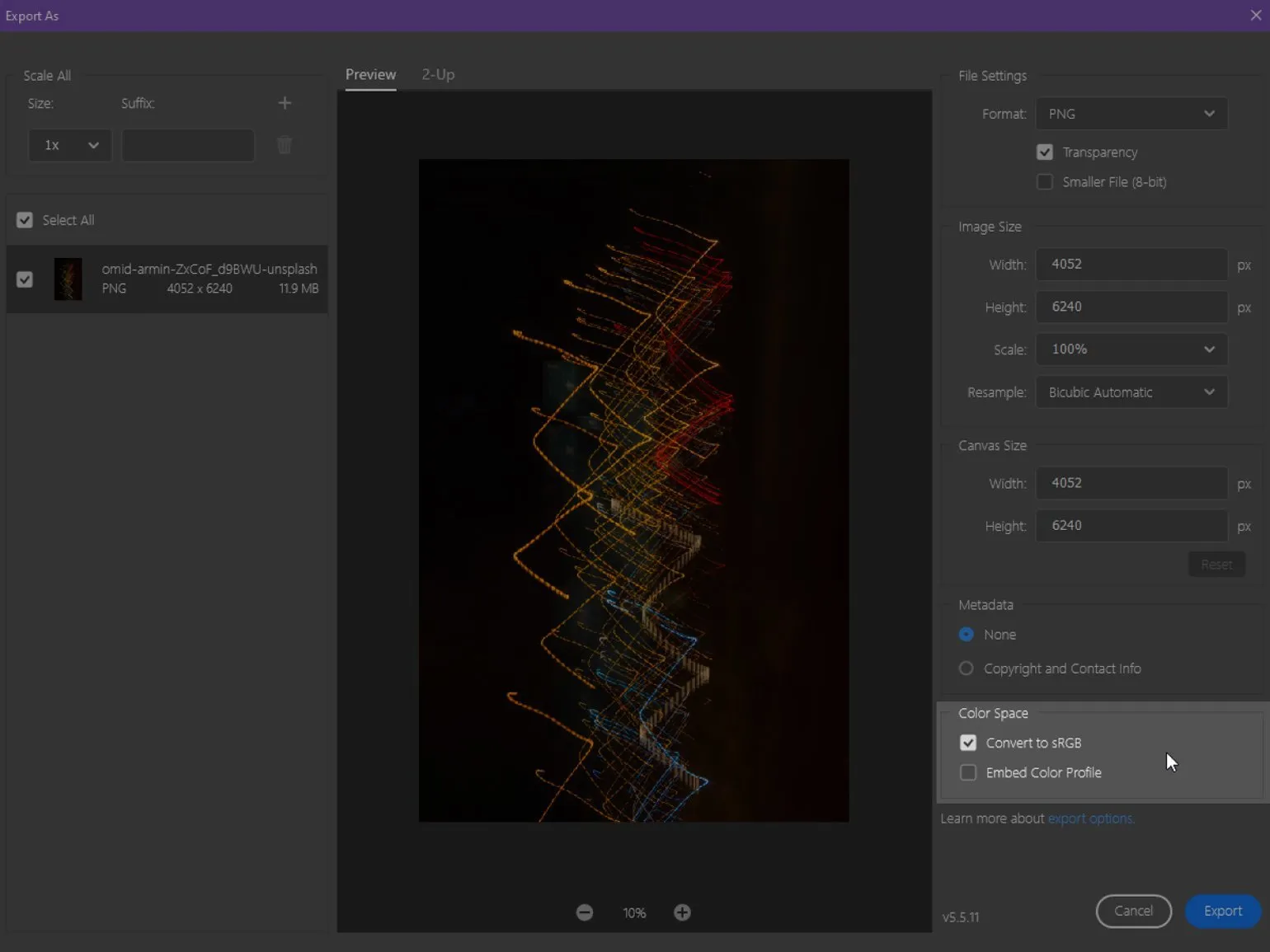
When discussing color profiles, it's important to note that they can be embedded directly into image files. This is a standard practice that helps preserve the original colors of graphics. For example, when loading images from the internet into Photoshop, most files already include their own color profile. This ensures accurate color display and simplifies the editing process, especially in professional graphics work. Understanding and using color profiles correctly is critical to achieving high-quality results in design and photography.
Embedding a color profile into a file ensures hardware color independence. This means the color information remains unchanged when opening or editing the image on different devices. This approach ensures accurate color reproduction and minimizes possible distortions, which is especially important for professional designers and photographers working with graphics. Using color profiles helps ensure consistency of visual perception across different screens and in printed materials, which in turn improves work quality and increases customer satisfaction.
In graphics editors such as Photoshop, users have the option to choose a color profile for saving the image they create or leave it unprofiled. If the image doesn't contain a color profile, its display will depend on the capabilities of the device being used. When opening such a file in a graphics program, the colors will automatically be adjusted to the working area profile. This is important to ensure color accuracy and image compatibility across devices. Choosing the right color profile helps preserve original colors and improve the quality of your image work.
Changing the color profile of an image is possible without much effort, which makes it possible to adapt the file for both intermediate work and final saving. This feature is especially useful for graphic design and photography professionals to ensure color accuracy and standards compliance.
Most Commonly Used Color Profiles in Design
Designers actively use various color profiles to optimize their projects and achieve high-quality visual results. In this article, we will consider the most popular color profiles that help designers work effectively with color and create harmonious compositions. Choosing the right color profile can significantly improve visual perception and the quality of work.
- sRGB is a standard profile that provides optimal color representation on most PC monitors. It is widely used in web design and mobile applications.
- Adobe RGB - this profile has a significantly wider color gamut, which allows for greater accuracy and color saturation, which is especially important for printed products.
- Apple RGB - a profile that reflects the average color rendering characteristics of Mac monitors, and it is close to sRGB, but with some differences, which is important to consider when working with Apple devices.
- ProPhoto RGB - this profile provides the widest range of colors among all listed, making it an ideal choice for professional photo processing and working with high-quality images.
If you want to learn about color profiles used in printed materials, we recommend checking out our detailed analysis. We'll cover the main color models and their impact on print quality, as well as provide recommendations for choosing the right profiles for your projects.
Prepress: Key Aspects of Preparing a Layout for Print
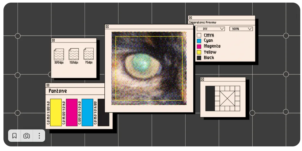
Prepress is an important stage in the printing process, which includes a series of actions necessary to prepare a layout for production. This process ensures high quality of the final product and minimizes the likelihood of errors. Key aspects to consider when preparing a layout include color correction, image resolution, and page size compliance.
Color correction is critical because different devices display colors differently. Therefore, it is necessary to ensure that the colors used comply with printing standards to avoid unexpected results. It is also important to consider that the printing process can alter color perception, so it is worth using color profiles that will help achieve the necessary accuracy.
Image resolution plays a significant role in the quality of the final product. The recommended resolution for printing is at least 300 dpi. This will ensure clarity and detail in images, which is especially important for graphic elements and photographs.
Page sizing is another important aspect. It's important to pay close attention to the layout dimensions to avoid cutting off important information. Setting margins and safe zones will help keep important elements on the page and prevent them from being accidentally removed during the printing process.
Ultimately, carefully preparing the layout for printing at the prepress stage minimizes errors and ensures high-quality finished products. Understanding these key aspects will help designers and printers work more efficiently and achieve the desired results.
The Benefits of Using Color Profiles in Design
Color profiles are an essential tool for designers, as they ensure accurate and predictable color rendition across various devices. As technology advances, manufacturers are constantly updating and creating new profiles that can be used with both professional equipment and universal solutions. Choosing the right color profile helps avoid distortions and improve the quality of visual materials, which is especially important in graphic design, web design, and printing. Adapting color profiles to specific tasks helps achieve optimal results and meet client requirements.
- The first advantage is the ability to see how an image will appear on devices with different color gamuts. This is especially critical in printing, where it is important to consider the characteristics of the printing press and the type of paper. Selecting different profiles allows designers to evaluate how the image will change depending on these parameters.
- The second advantage is color preservation. By embedding a profile in an image, designers can confidently transfer their work to devices with a narrower color gamut. For example, when editing on an older screen, colors may appear less saturated, but when returning to a modern monitor, they will sparkle with vibrant hues again.
- The third advantage is the use of abstract profiles with a wide RGB color gamut for image editing. Vibrant colors help to better distinguish details and midtone transitions, which is especially important for professional color correction and retouching.
Want to deepen your knowledge of design and receive practical advice? Subscribe to our Telegram channel to stay up-to-date on the latest trends and receive valuable recommendations.
Additional resources for designers provide valuable tools and platforms that assist in the creation of high-quality and creative content. These resources include graphic editors, font libraries, stock photos and icons, as well as training materials and courses. Using such resources allows designers to expand their skills, find inspiration, and optimize their workflows.
An important aspect is the availability of online platforms where designers can share experiences and receive feedback. Communities and forums dedicated to design facilitate the development of professional networks and the exchange of ideas. It's also worth paying attention to specialized blogs and webinars that offer current trends and tips for improving skills. Don't forget about software that helps with project management and collaboration, which significantly speeds up the design process. Using these additional resources will help designers stay relevant and improve the quality of their work.
- 5 Key Principles of Effective Design
- Simple Guidelines for Mobile Typography
- 7 Online Services for Choosing Font Pairs
- What is Design Thinking and When to Use It?
- Understanding Itten's Color Wheel
- Tips for Effective Communication with Clients
Graphic Designer PRO: 5 Steps to a Successful Career
Want to become a graphic designer? Learn 5 key steps to creating a successful portfolio and starting your career!
Learn more