Contents:

Try 4 top professions in design. Free ➞ In 5 days, you will get acquainted with illustration, UX/UI, web, and graphic design. Add 4 cool cases to your portfolio and decide which direction to develop in.
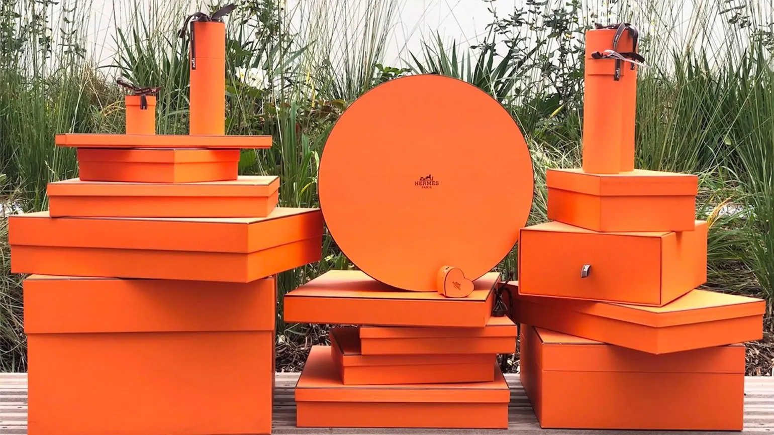
Learn moreMixing yellow and red results in orange—one of the brightest and most noticeable hues in the color spectrum. Orange is often associated with energy, warmth, and joy, making it a popular choice in design and art.
Color is an important element in psychology and culture, possessing a variety of meanings. In psychology, each color evokes specific emotions and associations, making it a powerful tool in communication. For example, blue is often associated with trust and calm, while red symbolizes energy and passion. Within culture, the meanings of colors can vary depending on traditions and context; For example, white symbolizes purity in some cultures, while in others, it symbolizes mourning.
Well-known companies actively use color in their brands to create a specific image and attract target audiences. For example, green is often used in the branding of companies related to ecology and health, as it is associated with nature and harmony. Red, on the other hand, can attract attention and stimulate action, making it a popular choice for restaurants and entertainment services.
Thus, understanding the meanings of colors in psychology and culture, as well as their application in branding and marketing, is key to successful customer engagement.
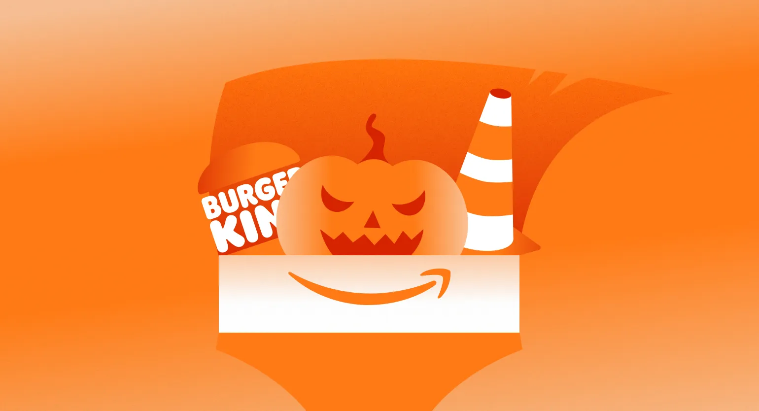
- Amazon — for friendliness;
- Burger King — for audacity;
- Nickelodeon — for enthusiasm;
- Harley-Davidson — for adventurism;
- Fanta — for playfulness.
Orange in Psychology and Culture
Orange has a significant impact on the human psyche and mood. Its impact is complex and multifaceted. For some people, orange symbolizes energy and optimism, creating an atmosphere of joy and warmth. For others, it can be associated with melancholy and sadness, evoking more gloomy feelings. Thus, orange is capable of evoking a wide range of emotions, making it an important element in design, art, and everyday life. When used correctly, orange can help create a desired mood and atmosphere. Research conducted by R. W. Burnham, R. M. Yanes, and C. J. Bartleson in 1963 demonstrated that orange is one of the most sought-after colors among people of all ages, including children and adults. Participants noted that orange brings them feelings of energy and joy, promotes a comfortable and cozy atmosphere, and imbues a space with harmony. This color is often associated with positive emotions and activity, making it a popular choice in interior design and fashion.

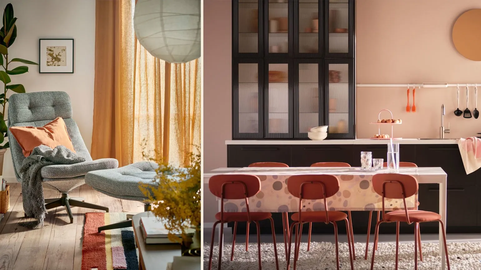
Orange is associated with warmth and comfort, creating an atmosphere of welcome and safety. Unlike red, which signals fire and danger, orange fills the space with harmony and comfort. This palette is often used in interiors and design to create an environment conducive to relaxation and communication.
In 1993, researchers Mariam Rice and Laura Lerner conducted an experiment that showed that warm colors like orange are perceived by people as more social and active. These colors are associated with energy and youth, which makes them popular in design and marketing. Warm shades can evoke positive emotions and promote active interaction, which can be especially useful in the service industry and social events. Understanding the influence of color palette on perception helps to create attractive and effective visual solutions.
Orange is perceived as more energetic than pure yellow. Goethe claimed that this bright shade attracts people with an active lifestyle. Children especially like bright orange, evoking feelings of admiration and wonder. This color is associated with joy, warmth, and optimism, making it a popular choice in design and interiors.
Orange can evoke both positive and negative emotions. In the context of seasons, it is often associated with autumn, which can give rise to associations with cold and melancholy. Autumn landscapes painted in orange hues can remind us of the approaching winter and the passing of warm days, evoking feelings of sadness and melancholy.

Bright orange can be associated with flashiness and vulgarity, as well as rudeness and impudence. Its brightness attracts attention, and many perceive it as intrusive. Therefore, using this color in design or advertising requires a special approach to avoid negative associations and create a harmonious visual image.
Warm peach shades, close to beige, have a calming effect. These colors are considered peaceful and are often used to create a feminine and harmonious look. Using peach tones in interior design or fashion helps create an atmosphere of coziness and warmth, making them a popular choice for those seeking the perfect combination of style and comfort.
The color orange has diverse cultural meanings. It symbolizes creativity, as supported by a study published in the Journal of Environmental Psychology in 2018. This study found that exposure to shades of orange promotes creative thinking. This finding resonates with concepts in Eastern philosophy, where orange is associated with Svadhisthana, the second chakra. This chakra is responsible for sexuality, creativity, pleasure, and joy, emphasizing the importance of orange in the context of emotional and creative self-expression.
In Eastern cultures, orange has deep religious significance. In Buddhism and Hinduism, orange is associated with spirituality and enlightenment. Buddhist monks dressed in orange robes symbolize simplicity and the rejection of material attachments. In Hinduism, orange represents fire, purification, and higher knowledge. This color is also considered a symbol of transformation and spiritual growth, which emphasizes its importance in Eastern traditions.

In the West, orange is associated with Halloween, the main symbol of which is glowing carved pumpkins. Orange vegetables symbolize a bountiful harvest, as well as fire and light shining through the darkness of night. Halloween, celebrated on October 31st, has become not only a holiday but also a cultural phenomenon, where orange plays a key role in creating atmospheric decorations and traditional ornaments. Pumpkins carved into various shapes not only attract attention but also represent the transition from light to darkness, reflecting ancient beliefs and traditions.
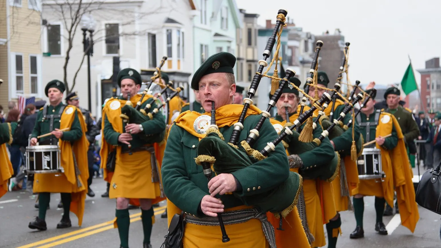
City dwellers associate orange with safety and high visibility. This color is often used in warning signs, high-visibility vests, and traffic cones, making it a symbol of caution and attention on the roads. The brightness of orange attracts attention, which is especially important in urban environments, where the safety of pedestrians and drivers is paramount.
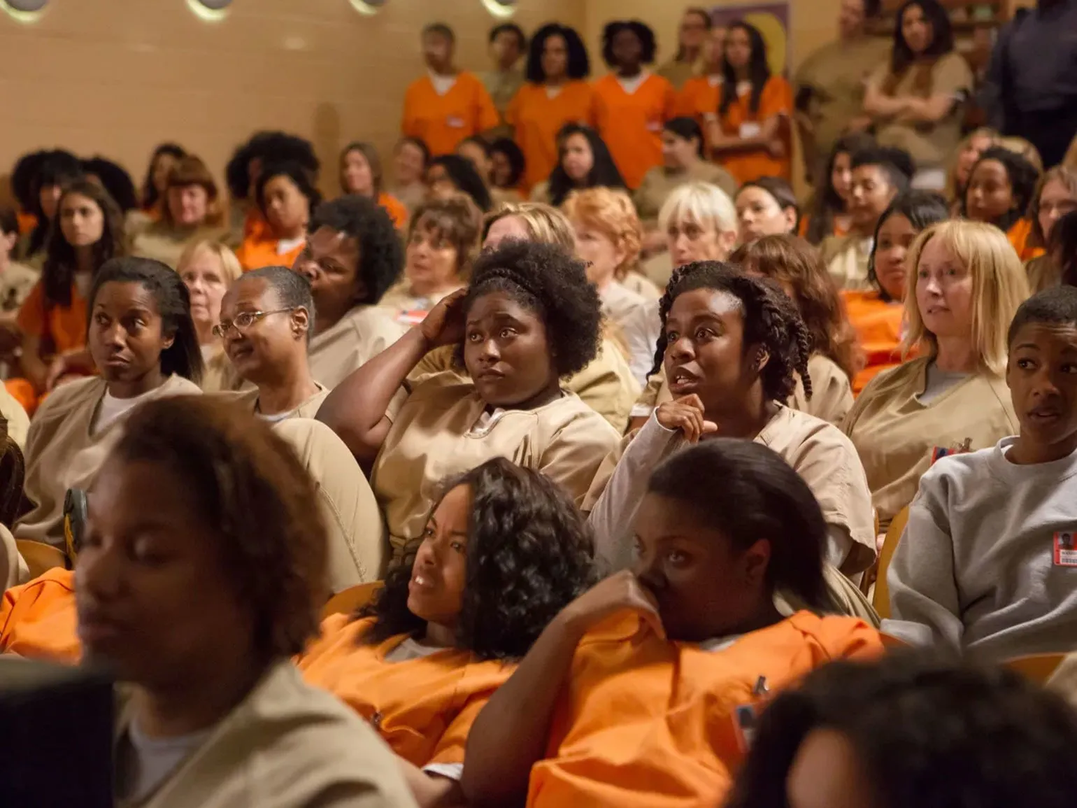
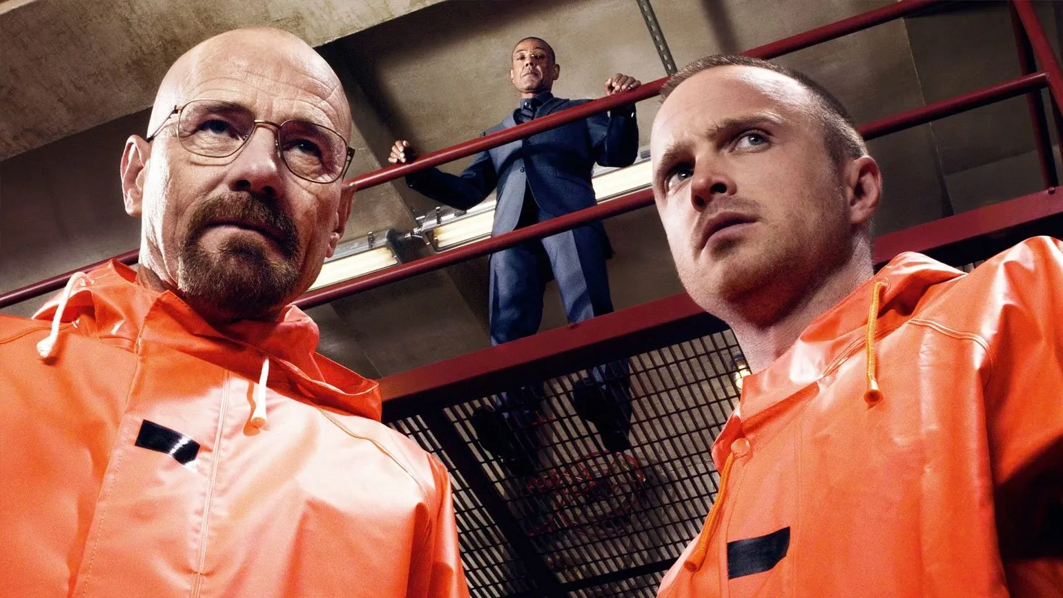
In a cultural context, orange can have negative associations. It has become a symbol of crime and punishment, especially in American prisons, where inmates wear bright orange uniforms. This practice is intended to make prisoners easily visible to guards and prevent them from escaping. Thus, the color orange is associated with lawbreaking and control, emphasizing its ambiguous meaning in society.
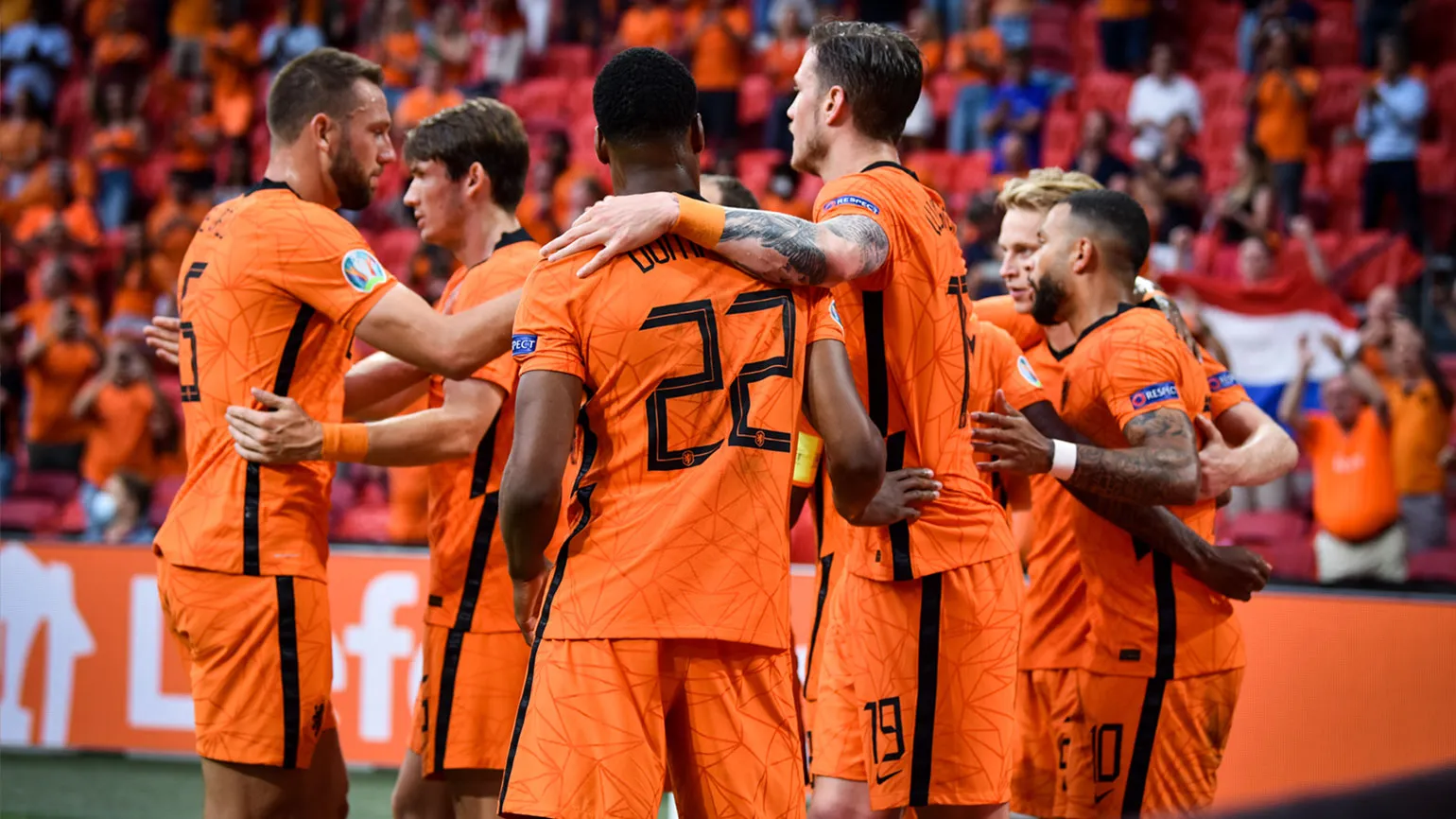
The color orange occupies an important place in world politics. In the Netherlands, it is associated with the royal family, known as the House of Orange, and serves as a symbol of national unity. This color is often used in public holidays and events, emphasizing its significance in the cultural and political life of the country. Orange has become a symbol of pride and unity, uniting people in their quest for prosperity and stability.
In Ireland, the orange color, present in the national flag, was added in 1848. It symbolizes the Protestant community, which strives for peaceful coexistence with Catholics, represented by the color green. This flag embodies the importance of unity and harmony between the country's various religious groups. The use of these colors emphasizes Ireland's desire for harmony and a shared future.
Orange plays an important role in art and design, creating semantic accents and evoking strong emotions. Impressionist artists like Vincent van Gogh used orange to convey warmth and vibrancy in their works. This color has the ability to attract attention, enliven a composition, and evoke a sense of joy. In design, orange is often used to create dynamic and energetic images, making it ideal for advertising and branding. Using orange can significantly enhance visual appeal and emotional connection with an audience.

Modern large companies actively use orange in their logos and marketing materials. Orange is associated with energy, creativity, and positivity, making it attractive to brands seeking to stand out in the marketplace. This color is often used to attract attention and create a sense of dynamism. Companies that use orange, such as Fanta and Nickelodeon, successfully convey a mood of playfulness and friendliness, which contributes to a positive image. It is important to consider that orange can evoke different emotions depending on the context, so clever use in logos and advertising helps create the desired atmosphere for the target audience. Thus, the color orange becomes a powerful tool in the arsenal of marketers and designers, contributing to the successful promotion of a brand.
Innovation and Energy: Amazon
Amazon is a leading global technology company, founded in 1994. Initially, it began as an online bookstore, but over time it has transformed into a large-scale omnichannel ecosystem. This ecosystem actively tests and implements innovative solutions, which allows the company to remain at the forefront of technology and meet the needs of customers around the world.
Amazon outperforms its competitors in various market niches thanks to the constant introduction of innovations in its products and services. The company is actively developing its own logistics network, which ensures fast and efficient delivery of goods. In addition, Amazon offers a streaming service that attracts users with a variety of content. This strategic combination of technology and services allows Amazon to occupy a leading position in the market and stay one step ahead of its competitors.
The orange arrow in the logo, directed from the letter A to Z, represents a wide range of products and services: "everything from A to Z," with a guarantee of on-time delivery. This symbolizes our commitment to quality and variety, allowing every customer to find exactly what they need.
In Amazon's visual communications, the arrow is used as a separate branding element, symbolizing the company's mission to become "the most customer-centric company on earth." This visual mark emphasizes Amazon's philosophy of focusing on customer needs and high-quality service.
The Amazon logo has undergone significant changes since its inception. Originally, it consisted of the company name with the addition of ".com," emphasizing its status as an online retailer. The modern version of the logo we know today was introduced only in 2000. This evolutionary process reflects the company's growth and commitment to innovation in the e-commerce space.
Boldness and positivity: Burger King
Burger King is one of the largest international fast food chains, founded in 1953. The key feature of their dishes is the distinctive smoky flavor achieved by cooking their burger patties over an open flame. This unique cooking technique makes Burger King burgers especially appealing to lovers of flavorful and rich food.
Burger King and McDonald's have been leading global fast food brands for many years, constantly competing with each other in marketing strategies and advertising campaigns. Unlike McDonald's, which emphasizes a family-friendly atmosphere with children's play areas and special offers for children, Burger King targets a more adult audience, offering a diverse menu and unique gastronomic offerings. This difference in positioning allows each brand to attract its target audience and remain relevant in the market.
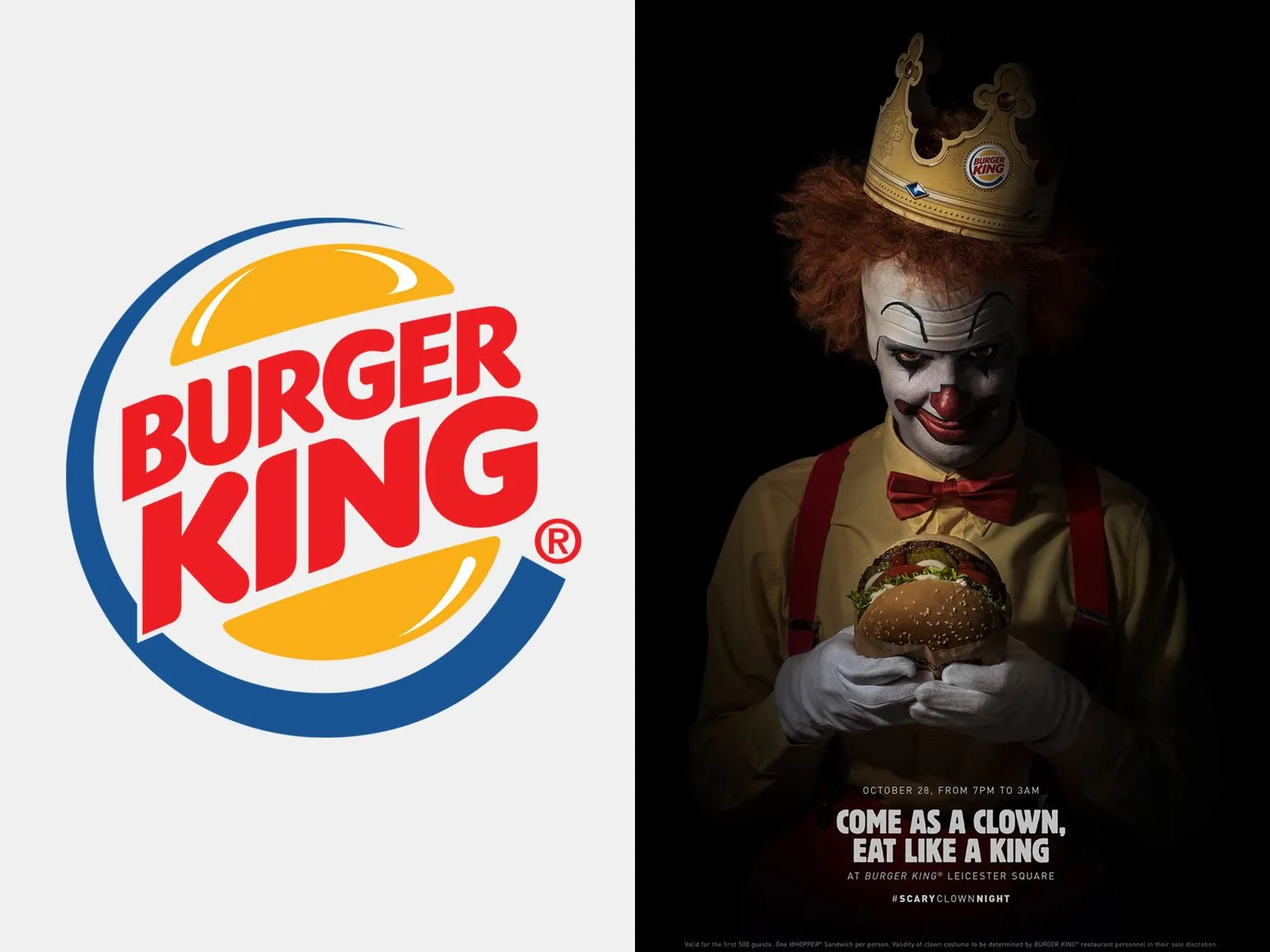
Burger King takes a bold and provocative approach in its communications, including sharp jokes not only at the expense of competitors but also the entire food service industry. This style allows the brand to stand out from the crowd and attract consumer attention, creating a memorable image.
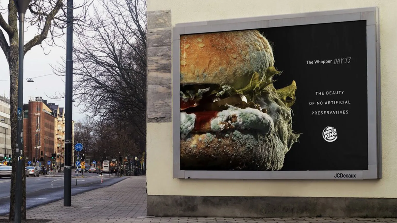
The commercial featuring a moldy burger, filmed in time-lapse mode, became one of the most talked about videos of 2020 and subsequently won three Grand Prix awards at the Epica Awards, a prestigious award for creative advertising. The company chose this unconventional approach to showcase the naturalness of its burgers in a surprising way. Using such contrasting imagery attracts consumer attention and differentiates the product from competitors, emphasizing its quality and freshness.

For a long time, the BK logo has used three key colors: red, yellow, and blue. Red symbolizes appetite and passion, yellow represents friendliness and joy, and blue is associated with reliability and trust. These colors not only attract attention, but also create positive emotions in consumers, which helps to form a strong connection between the brand and its customers.
In 2021, the company underwent a significant rebranding, changing its logo to a more modern version that includes only red and orange elements. This color choice is deliberate and reflects a new approach to brand positioning. Rebranding was an important step to improve recognition and create a fresh image, which will allow the company to better engage with the target audience.

Reading is an important aspect of our lives that brings many benefits. It develops thinking, improves vocabulary and expands horizons. Regular reading of books, articles and other materials helps improve concentration and memory. In today's world, where information is available in any format, it's important to choose quality sources. Explore a variety of genres and authors to find something that truly interests you. Reading not only enriches your knowledge but also helps you relax, making it the perfect way to spend your free time. Don't forget to share your reading experiences with friends and discuss books on forums to gain new recommendations and insights.
In 2021, many major companies updated their logos, marking a significant step in their visual identity. Designers sought to create a more modern and minimalist style, reflecting current trends in graphic design. Refreshing logos allowed brands to emphasize their relevance and adapt to changing consumer preferences. An analysis of 11 new logos reveals how identity changes impact brand perception and its connection with audiences. These transformations help companies not only stand out from the competition but also create a more harmonious image in the digital space. Improving the visual appeal of a logo also helps build trust and customer loyalty.
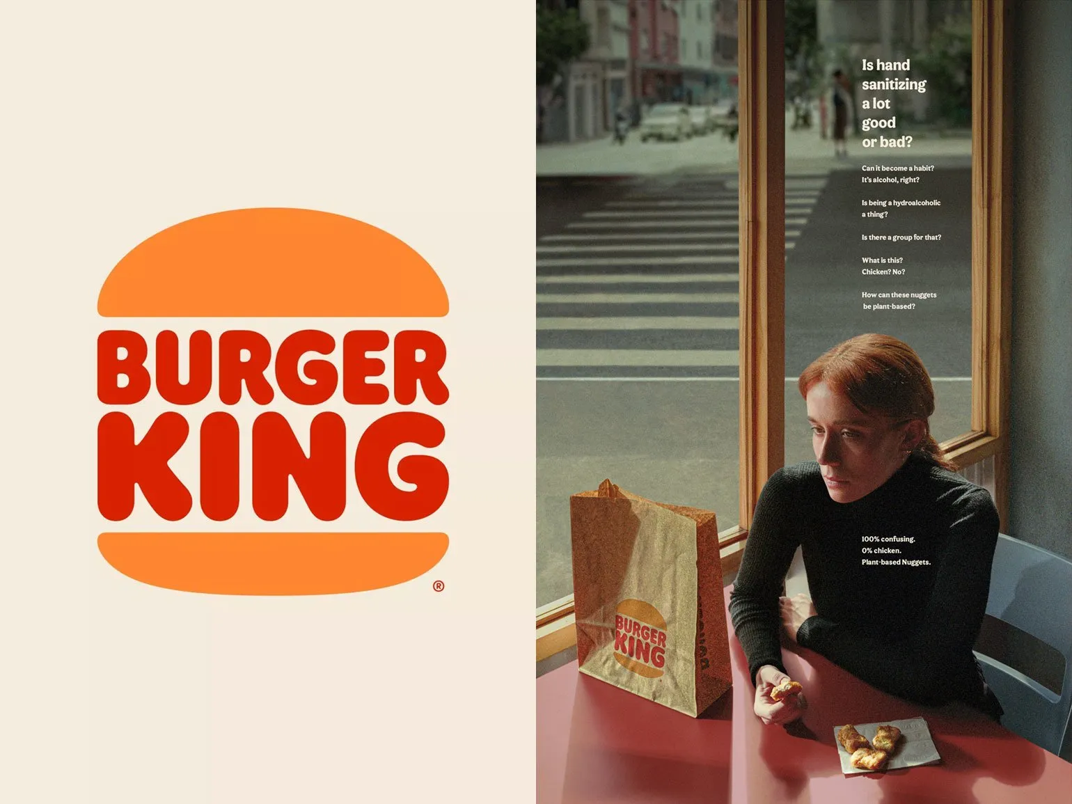
The red color emphasizes the appetizing effect Products, which plays a key role in the fast food industry. Orange symbolizes the brand's boldness and cheerfulness, adding elements of liveliness and warmth to the logo. These colors contribute to the creation of an attractive image that can attract customers and increase sales. The correct use of red and orange in brand design helps effectively convey its values and attract the target audience.
This explosive and warm color scheme perfectly reflects Burger King's core ideals and values. The brand positions itself as adaptable and fun, offering affordable and delicious burgers. These vibrant colors symbolize friendliness and openness, creating an appealing image for consumers. Burger King strives to be not only a place where you can eat delicious food, but also a brand that gives positive emotions to its customers.
Creativity and Uniqueness: Nickelodeon
Nickelodeon is an American children's television channel aimed at children and teenagers. In Russia, the channel began broadcasting in 1997 and continued broadcasting until 2022. Nickelodeon offered viewers a variety of entertainment programs, cartoons, and series that became popular among young audiences. Over the years of operation in Russia, Nickelodeon has managed to earn the trust and love of viewers, providing high-quality content that develops the imagination and creativity of children.
Nickelodeon was the world's first cable television channel aimed at children. It was here that "SpongeBob SquarePants" debuted, which became the longest-running and most successful animated series in history. Nickelodeon also hosted popular shows like Winx Club, The Angry Beavers, and Avatar: The Last Airbender. These shows have left a lasting cultural imprint and influenced generations of viewers, shaping their childhood memories and preferences. Nickelodeon continues to delight children and adults with high-quality content that fosters creativity and imagination.
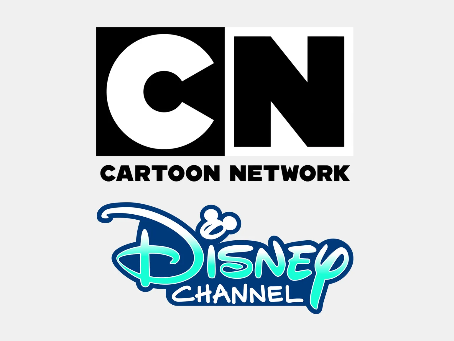
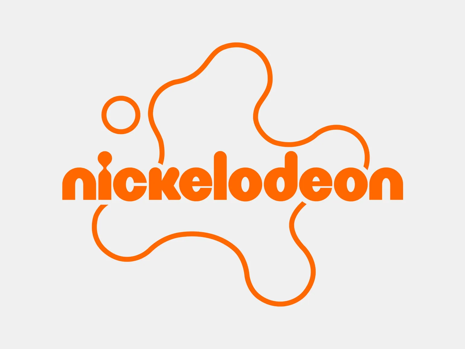
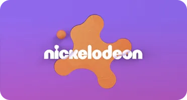
The orange color in Nickelodeon's identity distinguishes the channel from other well-known children's television channels, such as Disney and Cartoon Network, which prefer softer, more neutral tones. The vibrancy of the orange, combined with the blob-like shapes of the logo, emphasizes Nickelodeon's creative and free-spirited approach to content creation and broadcasting. This bold choice of colors and shapes creates a unique image that attracts the attention of children and their parents, making the channel recognizable and memorable.
According to the basic principles of graphic design, excessive Using contrasting colors can be distracting and visually overwhelming. However, Nickelodeon successfully breaks this rule, creating unique and memorable visuals. Their style is vibrant and vibrant, effectively engaging audiences and standing out from the competition. This approach demonstrates how bold use of color can be a powerful tool in attracting and holding viewers' attention.
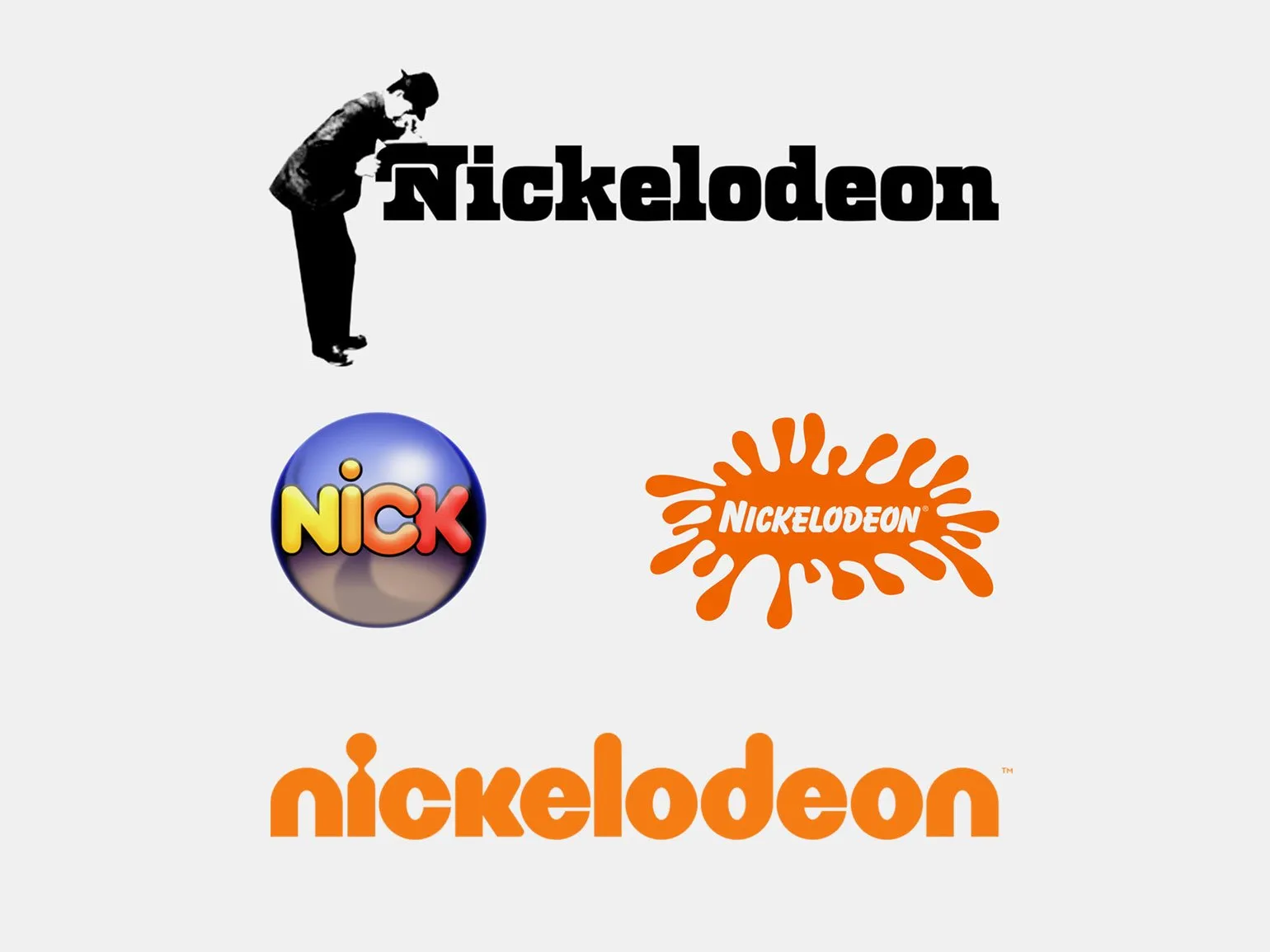
The 2009 rebranding aimed to update the logo, making it more modern, and to create a unified visual style for the entire Nickelodeon network of channels and brands. By that time, Nickelodeon had already grown into a large corporation with entertainment centers, stores, and an extensive network of television and online channels. The orange color has been transformed, becoming cleaner and more modern, emphasizing the brand's digital focus.
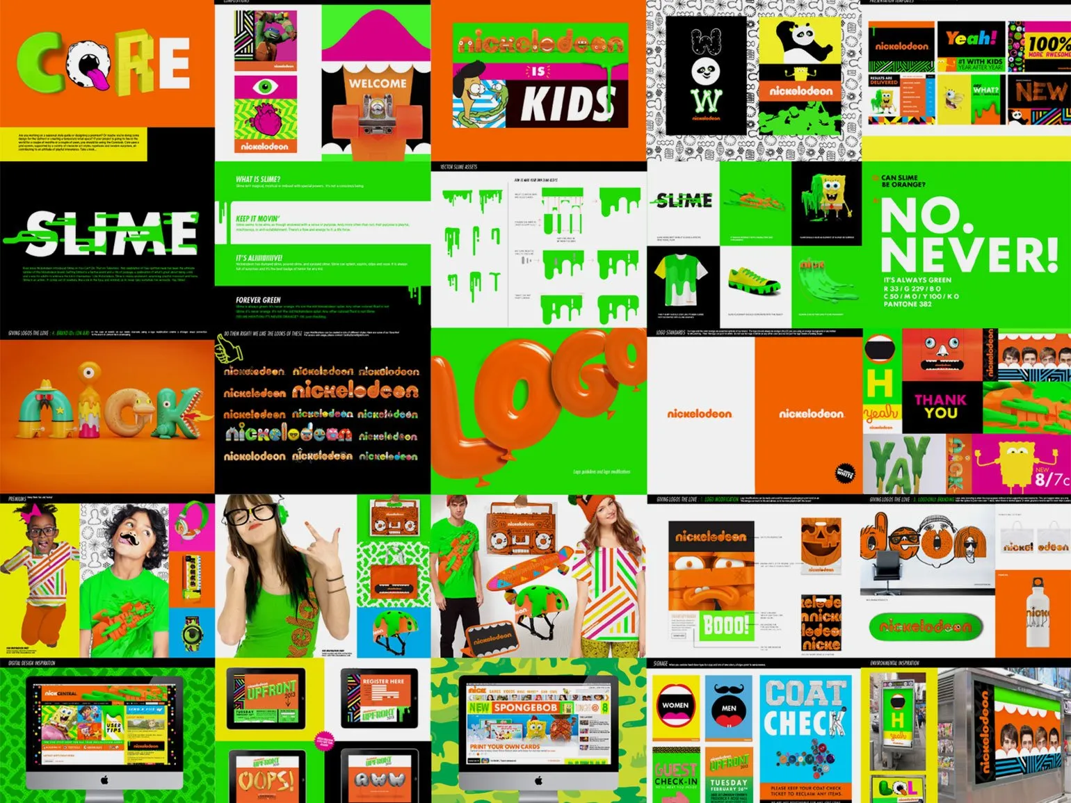
To create a more user-friendly look for the logo, rounded and smooth letters were used. Particular attention was paid to the shape of the letter «i», which now resembles a keyhole. This detail emphasizes the openness and accessibility of the brand, attracting attention and creating a positive first impression.
Read also:
The Nickelodeon logo has changed its shape. This updated blob logo design reflects modern trends and the channel's commitment to innovation. The new logo emphasizes the creative and dynamic nature of Nickelodeon, while maintaining its recognizability. The logo's redesign better aligns with current visual standards and attracts audience attention. Nickelodeon continues to evolve, and the updated logo is a shining example of this process.
Nickelodeon's color scheme actively promotes creative thinking and imagination in children. The orange color used in the design symbolizes the enthusiasm and joy that comes from watching favorite TV shows and cartoons. This bright and cheerful approach helps create an atmosphere of fun and inspiration, making Nickelodeon content even more appealing to young audiences.
According to color psychology theories, children's color preferences are determined by the energetic properties of shades. Research by V.S. Mukhina (1981) showed that preschool and primary school children often choose bright, light, and pure shades for their drawings. These include yellow, orange, red, and green. These colors are associated with positive emotions and activity, reflecting children's inner state and their perception of the world around them.
Adventure and Passion: Harley-Davidson
Harley-Davidson is one of the oldest and largest motorcycle manufacturers in the United States. The company is known for its heavy cruisers, but its model line is diverse. The Harley-Davidson range includes classic, powerful motorcycles with a distinctive engine sound, as well as modern models, including VRSC, street bikes, and electric motorcycles designed for children. Harley-Davidson continues to symbolize freedom and adventure, attracting riders of all ages and riding styles.
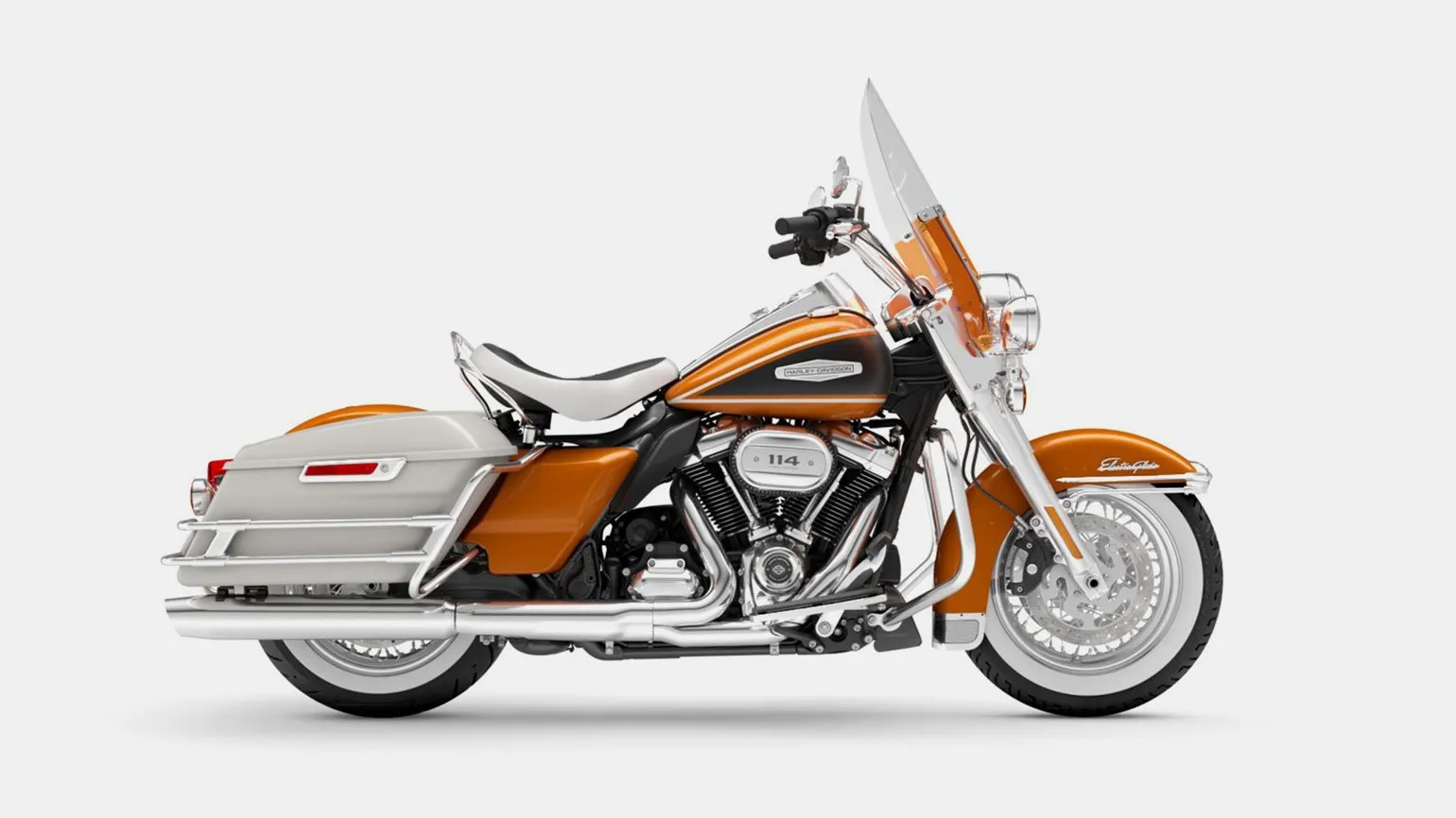
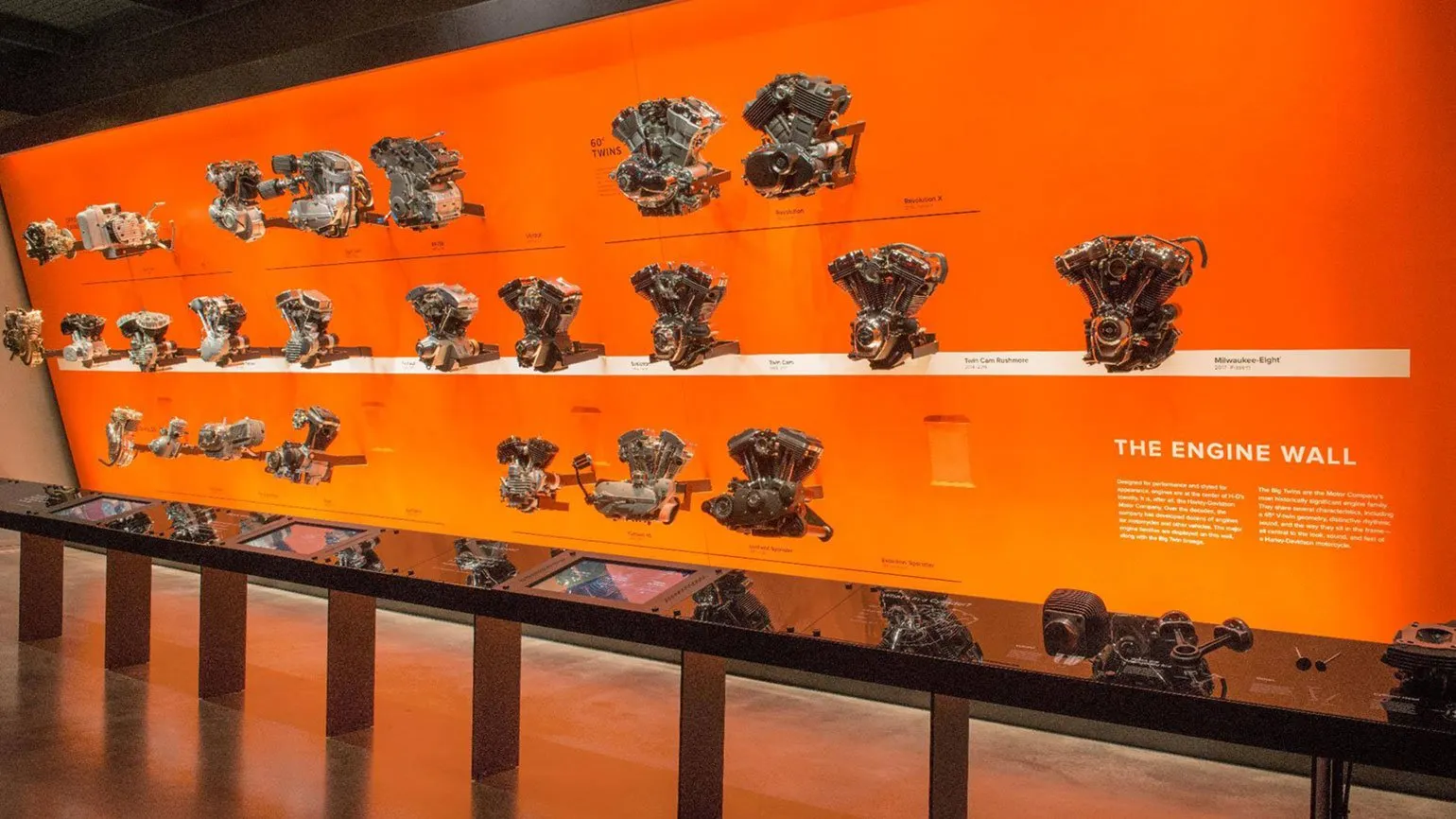
Harley-Davidson Bar & The shield is one of the most iconic symbols in the world, even among those unfamiliar with motorsports. It was introduced in 1909, and the classic color palette of orange, white, and black was introduced in 1922 and has remained unchanged ever since. This logo embodies the spirit of freedom and adventure associated with Harley-Davidson motorcycles and continues to attract the attention of both fans and new interested parties.

The orange color in the Harley-Davidson logo represents energy, passion, and adventurism, which is completely consistent with the character of this brand. Harley-Davidson motorcycles are perceived as more than just a means of transportation; they symbolize freedom and rebellious spirit. They attract attention not only with their power but also with their unique culture, which unites motorcycle enthusiasts and active lifestyle enthusiasts. The choice of orange in the logo emphasizes the brand's desire for adventure and independence, making it recognizable and appealing to the target audience.
The black color in the identity symbolizes strength and elegance, emphasizing the brand's grandeur and status. At the same time, the white creates a contrast, making the logo more noticeable and appealing. An effective combination of these colors helps to create a memorable visual image of the company, promoting its recognition in the market.

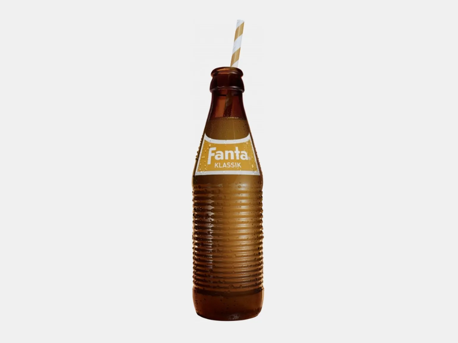
Fresh and Joy: Fanta
Fanta is an international brand of carbonated beverage owned by The Coca-Cola Company. Fanta's history began in Germany in the 1940s, when the Nazi navy blocked supply routes during World War II, making it impossible for Coca-Cola to obtain ingredients from the United States. To stay in business, the company developed a new drink using ingredients readily available at the time, such as leftover apples and buttermilk. Since then, Fanta has gained popularity in many countries around the world, offering a variety of flavors and a unique consumer experience, making it one of the most recognizable brands in the soft drink segment.
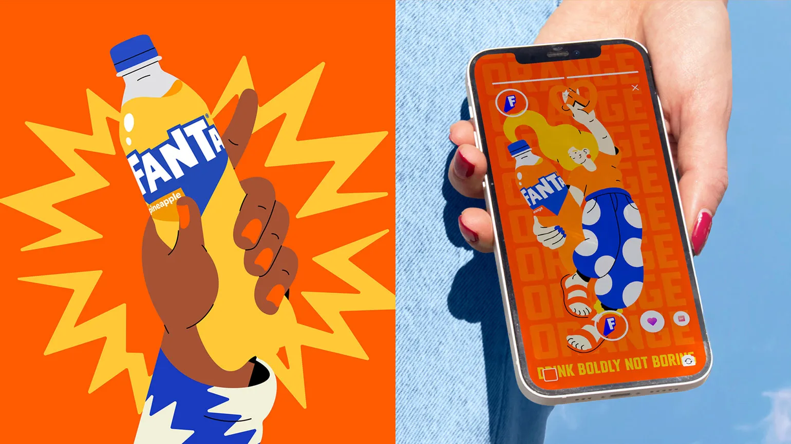
The name Fanta comes from the word "fantasy," reflecting the concept of limitless possibilities that exist only in our imagination. This refreshing drink has become a symbol of creativity and diversity, representing not only a unique taste but also the spirit of innovation. Fanta offers a wide range of flavors, each evoking vibrant moments in life, emphasizing the importance of imagination in creating unique experiences.
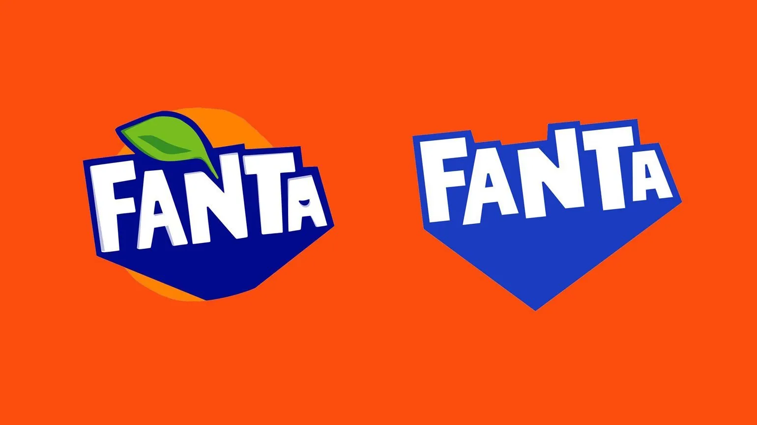
The logo has undergone many changes, becoming increasingly expressive and vibrant. In the 1980s, the first color version of the logo was introduced, using a contrasting composition. Blue text was harmoniously complemented by orange minimalist elements symbolizing oranges and a green leaf. This update marked an important step in the brand's visual identity, emphasizing its freshness and dynamism.
The brand maintains its uniqueness despite design changes thanks to its unchanging primary color—sunny orange. This color is present in all logo and packaging variations. The only exceptions are designs dedicated to alternative flavors, such as berry or tropical fruit. Sunny orange highlights the brand's energy and cheerfulness, creating a bright and memorable image.
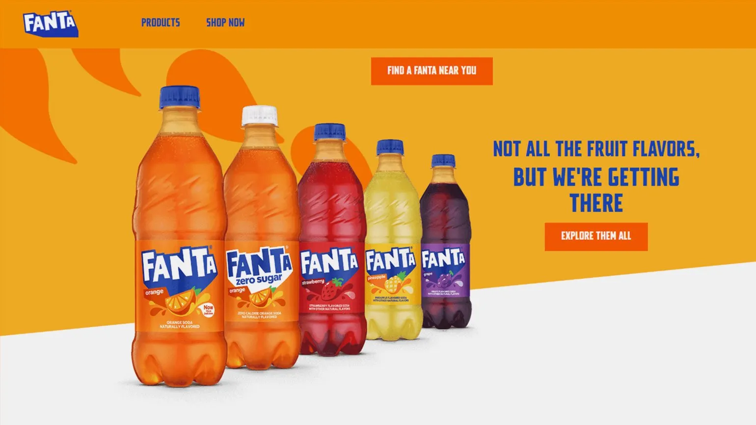
The Coca-Cola Company categorizes its products according to their target audience. For example, Sprite is aimed at teenagers and students, while Coca-Cola is a universal drink suitable for the whole family. The Fanta consumer profile includes preschoolers and primary school children, who are active and energetic. These children are eager for new experiences and are ready to enjoy every moment of their lives. Each of these brands is aimed at meeting the needs of its audience, which allows Coca-Cola to successfully compete in the soft drink market.
Learn more about design by subscribing to our Telegram channel. There you will find the latest news, tips, and inspiration in the world of design. Don't miss the opportunity to expand your knowledge and follow the latest trends.
- Provocative pink: sweetness, tenderness, and childhood
- Cozy brown: luxury, stability, and simplicity
- Friendly green: ecology, freshness, and safety
- Pure white: elegance, laconicism, and kindness
- Reliable blue: trust, peace, and masculinity
- Selling red: challenge, victory, and passion
Profession Graphic Designer PRO
You will learn how to create corporate identity elements and graphics for business. You will put together a portfolio that reflects your style and confirms your design skills. You can start a career in a studio or as a freelancer.
Find out more