
Contents:

Try 4 top design professions. Free ➞ In 5 days, you'll get acquainted with illustration, UX/UI, web, and graphic design. Add 4 cool cases to your portfolio and decide which direction to take next.
Learn moreOn April 12, 1961, Yuri Gagarin made a historic flight into space, becoming the first person to orbit the Earth. More than fifty years have passed since then, and interest in space exploration has not waned. We eagerly follow space missions, monitor the flyby of the International Space Station (ISS), and the launch of SpaceX satellites. Space continues to inspire humanity, and new technologies open horizons for further exploration and the discovery of new worlds.
The identities of space corporations often remain in the shadow of their remarkable achievements. However, the logos of these companies can reveal many interesting things about their history and philosophy. In this review, we will consider the most memorable logos of space corporations and reveal their meaning, as well as the stories behind their creation.
Roscosmos Corporation

The first organizations involved in space exploration in the Soviet Union were created in 1955. In 1960, these structures merged into the Main Directorate of Missile Weapons. After the collapse of the Soviet Union, this organization was transformed into the Russian Space Agency, and in 2004 it was named Roscosmos. This agency became the successor in the field of human spaceflight, playing a key role in the development of Russian cosmonautics.
The organization did without a logo for a long time, and one was not developed until 1992. In 2004, the first redesign took place, in which the red arrow was retained, but the logo acquired a more modern look. The current logo, created in 2018, also includes a red arrow, symbolizing a rocket, and an ellipse, representing the Earth's orbit. The current logo emphasizes the organization's dynamism and innovation while retaining elements that distinguish it from its competitors.
International Space Station

The International Space Station (ISS) is a continuation of the work of the Mir station, which was sunk in the Pacific Ocean in 2001. Launched in 1998, the ISS currently serves as a platform for space missions from 14 countries. Astronauts from Russia, the United States, Canada, and Japan, as well as representatives of the European Space Agency, work aboard the station. The primary purpose of the ISS is scientific research, making it an important tool for space exploration and technological development. The station promotes international cooperation in science and technology and provides unique opportunities for experiments in microgravity.
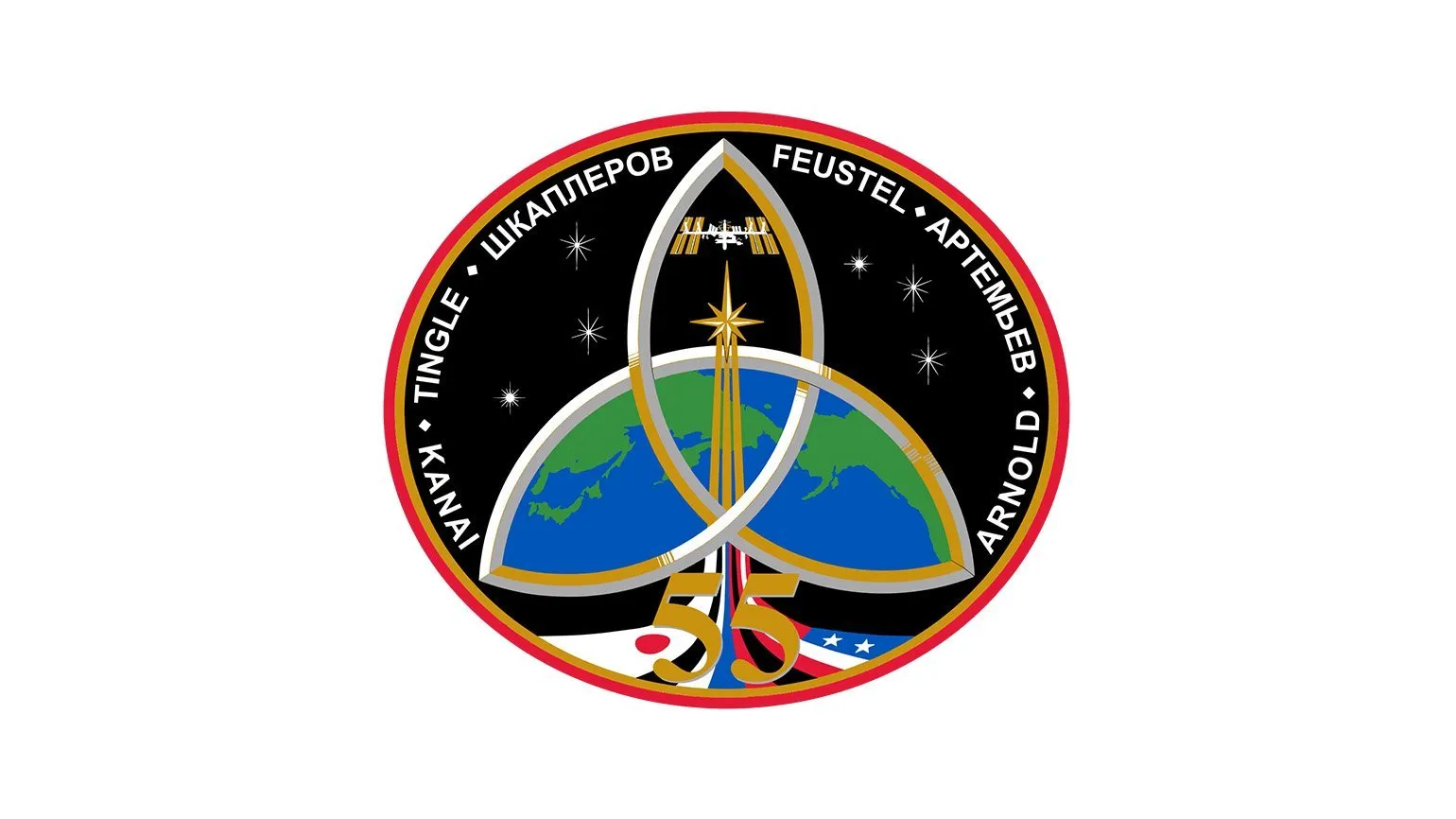
The logo of the International Space Station (ISS) has not been officially updated since its launch. However, unique emblems are developed for each mission and expedition to the ISS. This year, as part of the ALPHA mission, a French astronaut from the European Space Agency (ESA) will travel to the ISS aboard the SpaceX Crew Dragon spacecraft. It will stay at the station for six months before returning to Earth.
NASA Space Agency

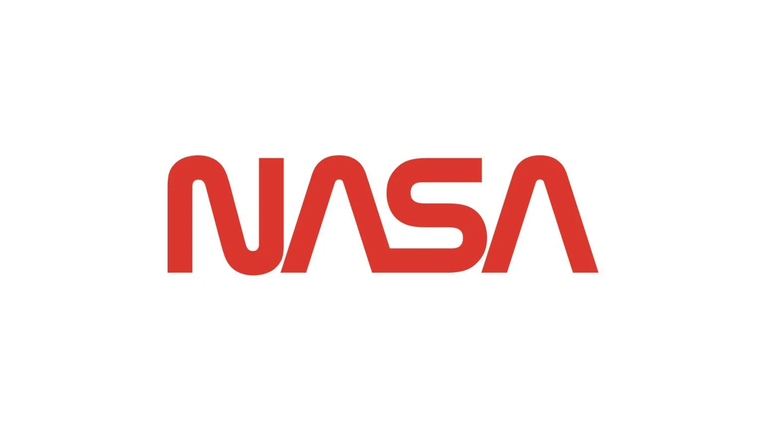
The main US space agency, the National Aeronautics and Space Administration (NASA), was founded in 1958. Among NASA's most significant missions are the first human landing on the Moon, the exploration of Mars using the Curiosity rover, and the sending of the interstellar station Voyager 1. This station is notable for the fact that it carries a gold-plated disc, the Golden Record, containing information on the location of humanity in space. NASA continues to actively conduct research and development in the field of space technology, which helps expand our knowledge of the Universe.
The emblem used by the American space agency was designed in 1959. In 1975, the logo underwent an update, which was carried out by the Danne & Blackburn studio. This version of the logo remained in use until 1992 and was popularly known as the "worm." The reason for the change was that the original 1959 image had too many details, making it difficult to apply to various media.
In 1992, the federal agency decided to return to the round symbol, as it more authentically reflects NASA's crowning achievement—landing a man on the moon. Nevertheless, it was the "worm" symbol that became popular in popular culture as a symbol of American astronautics. Since 1992, it has been used exclusively on merch and in media, but its influence on the perception of the space program remains significant.
In 2020, the US Space Force reintroduced its symbol, which was used on a rocket. This logo became part of the branding of the SpaceX Falcon 9 rocket, which carried NASA astronauts. The revival of this symbol highlights the importance of cooperation between the private sector and government space agencies and showcases advances in space technology.
European Space Agency ESA

The European Space Agency (ESA) was founded in 1975 and has been actively developing space technologies since then. ESA's core areas of work include meteorology, telecommunications, and navigation. In the coming years, the agency plans to expand its capabilities and begin overseeing human spaceflight, which will open new horizons in space exploration and flight safety. ESA continues to make a significant contribution to the development of space science and technology, drawing attention to the importance of international cooperation in this field.
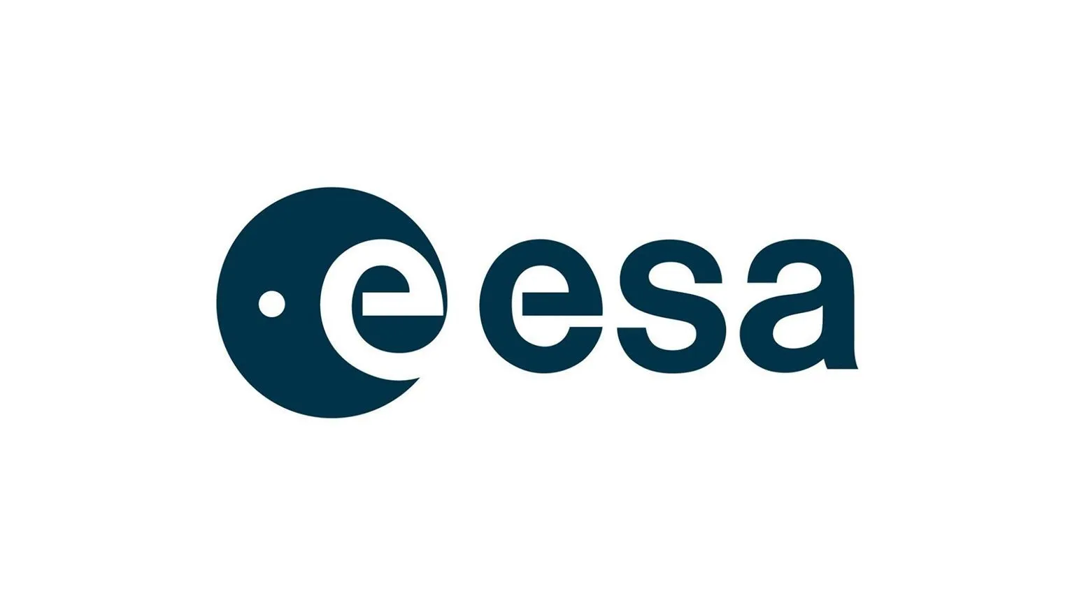
The agency's logo is simple and attractive. The blue circle represents the Earth, and a small round dot symbolizes a satellite against it. As for the text content, the letter "E" stands for "European," and the other three symbols remain unchanged for all European countries participating in the program. The first version of the logo featured the orbits and the position of the Earth's axis, but over time, a decision was made to move to a more simplified and uncluttered version.
It is important to note that the inscription on the logo cannot be used separately from the accompanying symbol. Both elements must be published exclusively in combination.
UK Space Agency


For many years, space exploration in the UK remained at a low level of development. Since the creation of the UK National Space Centre (BNSC), only one satellite has been launched, and no manned spacecraft have been built. This demonstrates the lack of attention to space research and technology in the country, which has limited opportunities for further progress in this important field.
In 2010, BNSC was disbanded, leading to the creation of a new government organization – the UK Space Agency. The establishment of this agency was driven by the UK’s serious intention to develop the space industry and increase its share of the global space technology market. The UK Space Agency actively works to promote space research and innovation, which helps strengthen the country’s position in the global space industry.
While government agencies often adhere to a traditional visual style, the UK Space Agency decided to create a unique logo, which was designed by Folio Creative. The new logo is distinguished by its originality: an upward arrow is integrated into the design of the national flag. This symbolizes not only Britain's pride in its achievements in space, but also its commitment to new heights in scientific and technological research.
Japan Aerospace Exploration Agency JAXA

The Japan Aerospace Exploration Agency (JAXA), known as the Japan Aerospace Exploration Agency, was founded in 2003. It was formed by the merger of three specialized organizations: NASDA, responsible for practical spaceflight, ISAS, focused on scientific missions, and NAL, focused on aeronautics. JAXA is actively involved in the development and implementation of aerospace projects, including lunar and Mars exploration, satellite launches, and the development of space exploration technologies. The agency plays a key role in international space programs and collaborates with other public and private organizations around the world.
Today, the agency collaborates with Mitsubishi Heavy Industries on rocket development, is actively involved in scientific research, and plays a key role in the International Space Station project. The agency's logo has been in existence for almost 20 years and has remained unchanged. It symbolizes the bright glow of the stars and the dynamism of the rocket during takeoff, which emphasizes the organization’s commitment to innovation and high technology in the space sector.
SpaceX Company

SpaceX is a leading private spacecraft manufacturer with its own spaceport. Founded in 2002 by Elon Musk, the billionaire founder of Tesla Motors, the company quickly gained a reputation as one of the most significant players in the space industry. Musk, a media personality, has become a symbol of modern space exploration, along with such legends as Yuri Gagarin and Neil Armstrong.
SpaceX's main goals include the development of a unique reusable cargo spacecraft, the Dragon 2, which is currently one of the most advanced in its class. The company has an ambitious goal - sending humans to Mars, which could change the perception of humanity's capabilities in space exploration. The recent launch of the 11-satellite Starlink constellation captured the attention of viewers around the world, showcasing the company's innovative achievements and its impact on global satellite communications.
The company's current logo was designed by the American studio RO Studio, known for its work on the identities of projects such as Tesla and the Falcon launch vehicle. The first version of the logo, created in 2002, went largely unnoticed due to its failure. That same year, the New Jersey studio introduced a new logo, which became widely known and recognizable throughout the world.
Private space agency Virgin Galactic
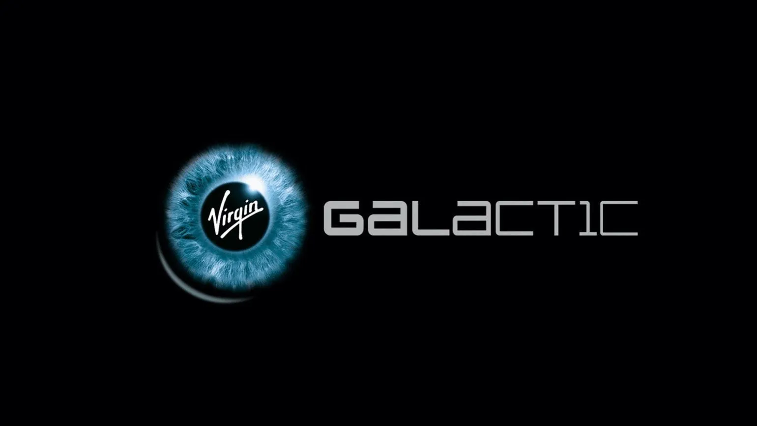
Virgin Galactic is a subsidiary of the Virgin Group Ltd holding company, founded by Richard Branson in 2004. The main goal of the company is to organize space passenger flights. Virgin Galactic strives to make space tourism accessible to a wide audience, offering a unique experience of traveling outside the Earth's atmosphere. Every year, the company is actively developing the technologies and infrastructure necessary for the realization of its ambitious plans.
Throughout its history, the company has undergone several minor changes to its logo, but its basic concept has remained unchanged. This logo can be called unique: it retains the circle, which symbolizes an eye directed into the endless cosmos. At the same time, it is difficult to reproduce it on printed materials due to the combination of photographic material, small elements in the style of the sixties, and a modern font. This approach not only makes the logo memorable but also reflects the evolution of design and a commitment to innovation.
Learn more about design by subscribing to our Telegram channel. We share current news, helpful tips, and inspiring examples from the world of design. Don't miss the opportunity to stay up to date with the latest trends and receive high-quality content.
Profession Graphic Designer PRO
You will learn how to create corporate identity elements and graphics for business. You will put together a portfolio that reflects your style and confirms your design skills. You can start a career in a studio or as a freelancer.
Find out more