Contents:

Try 4 top professions in design. Free ➞ In 5 days, you'll get acquainted with illustration, UX/UI, web, and graphic design. Add four compelling case studies to your portfolio and decide on your next direction.
Learn More
In Typography Essentials, author Robert Bringhurst details the key principles and rules of typography that contribute to the creation of clear and attractive text. This publication will become an indispensable guide for professionals seeking to deepen their knowledge of text formatting and high-quality design. Covering important aspects such as font selection, spacing, and text structure, the book is a valuable resource for designers and typographers. Studying Bringhurst's material will help improve your typographic skills and enhance the quality of the information you present.
Publisher: Dmitry Aronov.
Robert Bringhurst is a renowned Canadian poet, typographer, and translator who is also the author of an influential book on design and typography. His works focus on the importance of type and its role in visual communication. Bringhurst explores how typography influences the perception of text and the aesthetics of the printed word, making a significant contribution to modern understanding of design.
In his book, Robert examines the basic principles of typography in detail, deepening the reader's understanding of such important aspects as text styles and alignment, creating the illusion of movement, and typographic traps. This book will be an indispensable resource for those seeking to improve their design and layout skills.
This material will provide you with information on key aspects of the topic, which will help you better understand the subject matter and apply the acquired knowledge in practice. We will cover the basic principles, current trends, and tips that will be useful for your further study. This text will help you deepen your knowledge and develop skills in this area. Read on to learn more about the most important points and recommendations.
- how to think about typography in a text so that it complements the semantic part;
- how to create a work plan for the text;
- letter spacing, line spacing, hyphenation - instructions and a checklist.
Keep in mind that these recommendations are not a strict guide. Check out Robert Bringhurst's recommendations and implement them wisely in your practice.
Why Typography Matters
Typography is an important element that influences the reader's perception of the text, regardless of its content. The correct choice of fonts, their size, line spacing, and other typographic parameters can significantly improve readability and overall perception of information. Effective typography helps attract attention, facilitates perception, and creates a harmonious visual series, which is especially relevant in the context of modern content. Therefore, it is important to pay attention to typographic elements when creating texts to ensure better communication with the audience.
Typography, like oratory, music, and calligraphy, plays a key role in the creation of expressive and aesthetically pleasing content. Proper use of typography can not only clarify and ennoble the content but also confirm its significance or, conversely, hide the shortcomings of the text. Effective typography helps attract the reader's attention, improve information comprehension, and make the text more readable. Therefore, mastery of typography is an essential tool for achieving successful communication and conveying ideas.
Font plays a key role in the perception of text. It must be easy to read to ensure comfortable perception of information. It is important that the font conveys the emotional tone of the text and attracts the reader's attention without distracting from the main content. The correct choice of font contributes to an improved user experience and increases the time the reader spends on the page.
Product packaging plays an important role in the perception of the product, not distracting the buyer's attention from its core features. Although a product can exist without packaging, its value is significantly reduced. Likewise, typography serves as an important addition that highlights the features and quality of the product, enhancing its visual presentation and perception in the marketplace. Proper packaging and competent typography can increase consumer interest and contribute to successful sales.
Typography should confidently navigate the familiar environment, avoiding banality. It must adapt to changing conditions, offering fresh solutions without irritating the reader with its excessive originality. The main goal of typography is to create comfortable conditions for the perception of text and to earn recognition for its functionality and aesthetic design.
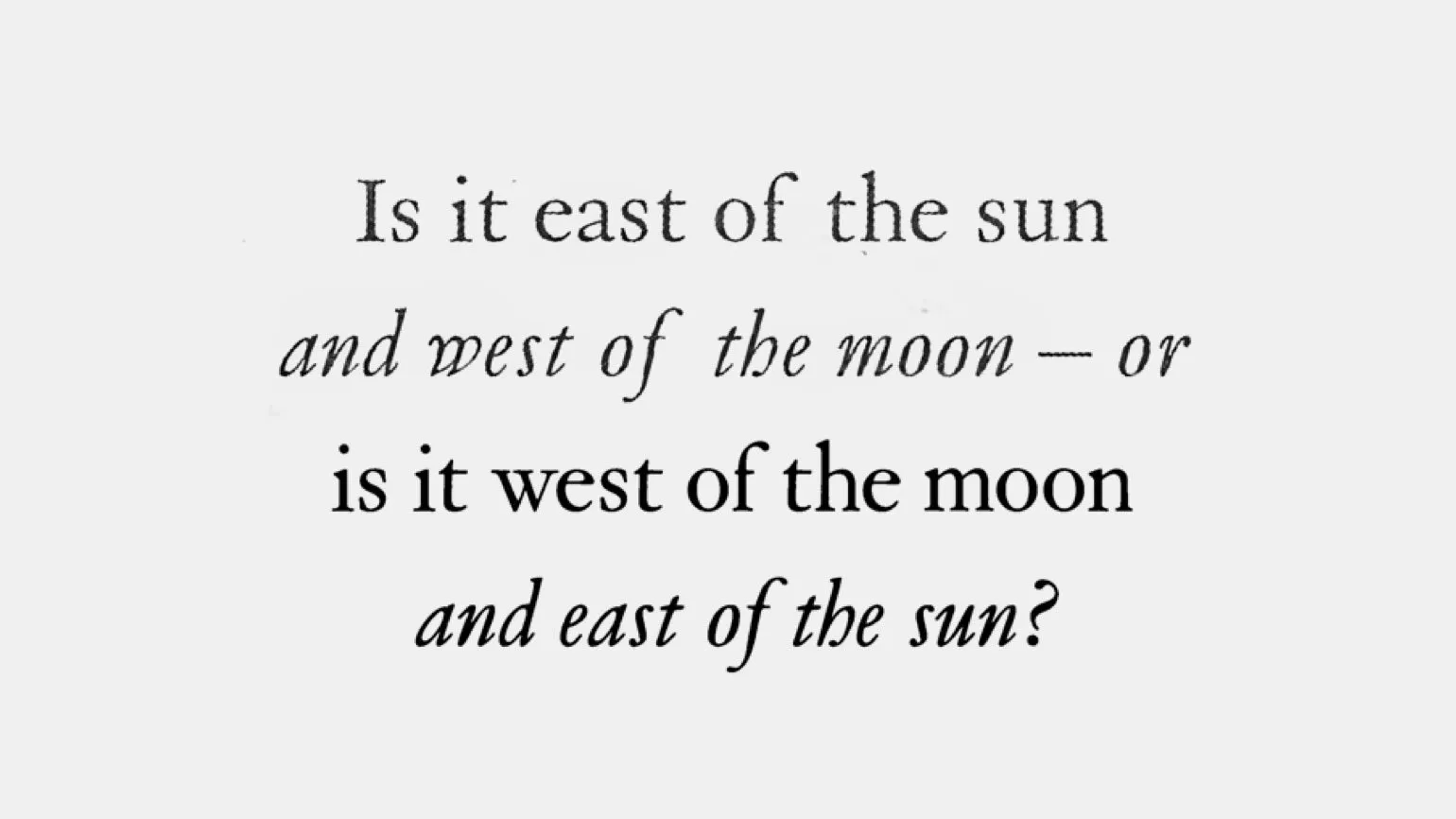
Is it to the east of the Sun? This question is intriguing and requires deeper analysis. East is the direction in which the sun rises, and in this context, it's worth considering what object or location we're referring to. When it comes to planets or celestial bodies, their positions relative to the sun change over time. In astronomy, it's important to consider orbital motions, which affect the apparent position of objects in the night sky. Therefore, for an accurate answer, it's necessary to provide a specific time and date for the observation.
and closer to the Moon—or perhaps to the stars. This quest for celestial bodies has inspired humanity for centuries. Space exploration opens new horizons and opportunities for scientific progress. Questions about how we can travel the vast expanses of the Universe remain relevant. Technological advances in astronomy and astrophysics allow us to better understand both the Moon and other planets. We continue to ask questions about life beyond Earth and how our existence is connected to the cosmos. Each new discovery brings us closer to unraveling the mysteries of the Universe and inspires further exploration.
To the west of the Moon lies a mysterious expanse that attracts the attention of both scientists and amateur astronomers. This place represents not only physical distance but also symbolizes humanity's desire to understand the unknown. Research in this area allows us to gain a deeper understanding not only of our planet but also of the entire solar system. The nature of the Moon and its influence on Earth are becoming important topics of study, opening new horizons in astronomy and astrophysics. Each new discovery on the Moon can change our understanding of the cosmos and its nature.
East of the Sun is a mysterious direction associated with myths and legends. Various cultural and historical aspects are often mentioned in this field, which shape the unique perception of the east as a place full of secrets. Research shows that the east represents not only a physical direction, but also a person's spiritual quest. Interest in Eastern philosophy, art, and architecture continues to grow, underscoring the importance of this region in world culture. East of the Sun also symbolizes new beginnings and hopes, making it relevant in the modern context.
Where to start working with text?
Before starting work on typography, Robert Bringhurst recommends conducting thorough research of the material. This will allow you to better understand its structure and identify key points that should be emphasized. Research helps not only grasp the logic of the text but also create a more effective visual presentation of information, which in turn improves reader comprehension.
Understanding the content of the text is a key aspect that designers often ignore. However, this step is crucial for successfully working with text elements. Without a clear understanding of the semantic load of the material, it is impossible to create a harmonious and effective visual presentation. Therefore, to ensure high-quality design, it is necessary to pay attention to the content of the text from the very beginning of the process.
Robert Bringhurst argues that a typographer should treat text with the same attention to detail as a theater director treats a play or a musician treats a score. To achieve a high-quality result, a typographer must deeply understand every line or note of their work, making reading an integral part of their work. A professional approach to typography requires an understanding of the text's essence and visual design, which ultimately influences reader perception.
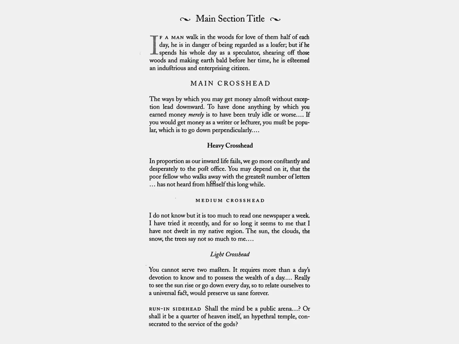
Typography plays a key role in the perception of a text and can significantly improve its readability. When working with text, it is important to consider fonts, sizes, line spacing, and alignment. Proper use of typographic elements helps emphasize the structure and logic of the presentation. Choosing contrasting fonts for headings and body text allows you to highlight important points and direct the reader's attention. Additionally, the use of bullets and indents helps organize information and makes the text more accessible. Effective typography not only enhances the appearance of the text but also promotes a deeper understanding of the content. Aligning typography with the logic of the text ensures harmony and helps readers perceive information more easily.
Create an outline of the material and formulate main points to get an overview of the content. Ask yourself: what is the mood of the text, what is its genre, and who is the target audience? This will help structure your thoughts and make the text more understandable and attractive to the reader.
Determine how the text will interact with other elements on the page. Ensure that the text content is harmoniously combined with visual components, such as images, headings, and buttons. A unified design style and logical structure will help improve the perception of information. Consistency between text and other elements contributes to a more comfortable user experience and enhances the overall impression of the site. Use keywords to increase the visibility of the page in search engines, while maintaining the naturalness of the text.
Photographs, captions, tables, and notes play an important role in the perception of content. Before starting work on the material, it is important to determine in advance how the layout with text elements will be structured to avoid information overload. The correct distribution of additional elements will help improve readability and make the material more attractive to the audience.
The typesetting strip represents a map of thinking and also reflects the social order within which it is formed. Ways of thinking and social norms are subject to change, which can be both positive and negative. These changes affect the perception and interpretation of information, which makes the typesetting strip an important tool in the analysis of social trends and the development of thinking.
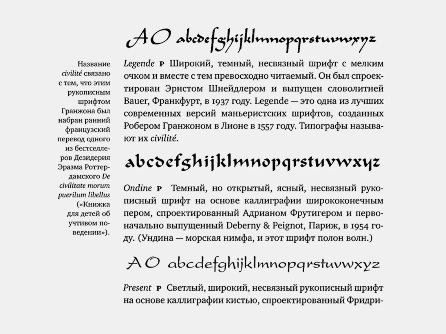
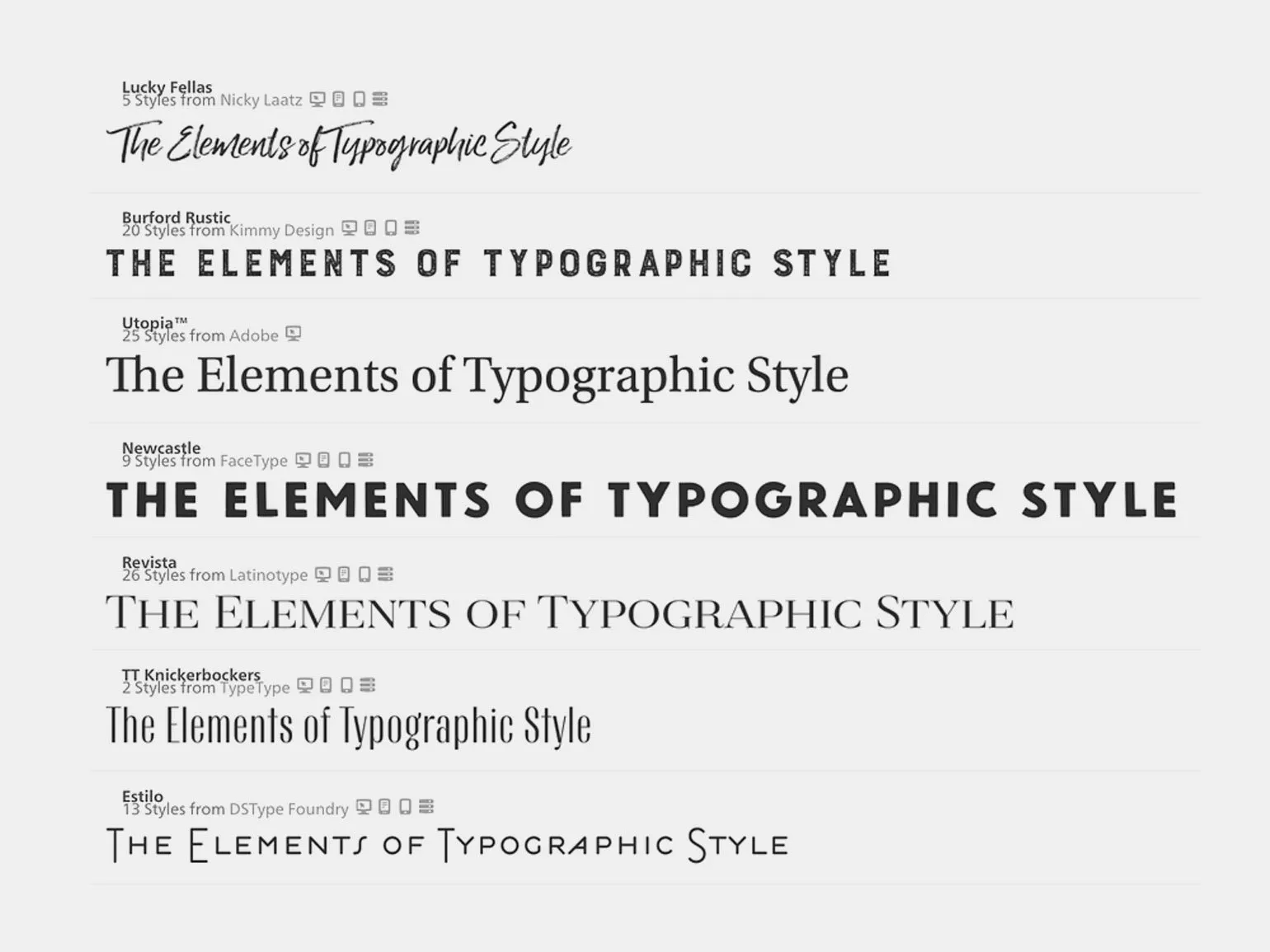
The choice of a font or group of fonts is an important step in the design of the text. A correctly selected font not only improves readability but also creates the necessary atmosphere for the perception of information. When choosing a font, consider its relevance to the subject matter of the text and the target audience. The typeface should harmonize with the content and convey the desired emotions. Using different weights, such as bold, italic, or underlined text, helps highlight important points and focus the reader's attention on key ideas. It is recommended to choose fonts that are easy to read on different devices and screens to ensure comfortable perception of information.
After the designer has studied the material and created a preliminary layout, the next step is choosing the typography for the pages. It is important to determine how fonts, sizes, and text styles will combine with the overall design to ensure readability and visual harmony. The correct choice of typography plays a key role in the perception of information and can significantly impact the user experience.
In the past, web designers and developers only used the fonts that were installed on users' computers. Websites were dominated by fonts such as Arial, Times New Roman, and Courier New. Modern technology has provided access to a wide range of web fonts, significantly expanding the possibilities for website design. It's important not only to choose a stylish font but also to select it correctly to achieve design harmony and improve user experience. Discovering new fonts and using them correctly can significantly improve the quality of web design and make it more attractive.
Typography is the art of arranging text information, which requires a careful approach and deep understanding. An experienced typographer considers text elements for their significance and visual perception. An incorrectly chosen font can distort the meaning of words and disrupt the visual harmony, leading to misunderstandings and distorted information. It's important to carefully select fonts so that they support and enhance the content, creating a unified and attractive text environment. Proper typography not only improves readability but also promotes deeper perception of information. Optimizing a text block is important for its readability and comprehension. Each sentence should logically flow into the next, creating a coherent and understandable flow of information. To achieve this, carefully structure the text, avoiding unnecessary words and phrases that could distract from the main idea. Try to use keywords naturally to improve SEO rankings, but don't forget about the quality of the content. Each paragraph should begin with the main statement, followed by a detailed explanation. This will allow readers to easily digest the information and find answers to their questions. Ensure the terms used are clear to your target audience and provide definitions or clarifications where necessary.
To improve comprehension, use active voice and avoid complex constructions. It's important that the text is not only informative but also easy to read. Use short, clear sentences to capture the reader's attention and promote a deeper understanding of the topic.
Thus, a well-designed text block will not only attract users' attention but also increase its likelihood of being found in search engines, which in turn will improve the visibility of your content online.
Designers have a unique opportunity to maximize traditional typography while also facing the challenge of implementing new solutions. Unlike printed materials, in a digital environment, it is often impossible to control the shape of a page. Therefore, it is crucial to consider how to properly design a text block so that it harmoniously adapts to different screens and devices. Effective typography in digital design not only ensures aesthetic appeal but also improves readability, which in turn contributes to increased user engagement. Optimizing text blocks for different screen resolutions and the peculiarities of online information perception is a key aspect of successful design.
Pay attention to every detail, even the smallest ones. This will allow you to create a higher-quality and more attractive product that will stand out from the competition. Attention to detail contributes to a better overall impression and builds consumer trust. Every detail matters and can play a key role in the success of your project.
After completing the layout and selecting the final font, it's important to double-check the content. You may have missed an important quote or a significant point in a table. Remember, careful verification of information makes your content more complete and informative. Paying attention to detail will help make your project more professional and high-quality.
Editions of great authors such as Plato and Shakespeare include secondary texts that play a vital role in the perception of the works. These include pagination, act and scene numbers, notes, copyright information, and the publisher's name and address. Favorable quotations on the cover also contribute to the formation of opinions about the book. Furthermore, additional materials that can be included in the text help readers better understand the context and meaning of the works. These elements make the publication more complete and informative, which is important for both researchers and lovers of classical literature.
From spacing to columns: basic rules for working with text
Once all the preparatory stages are completed, you can move on to choosing and adapting the typography. Robert Bringhurst emphasizes the importance of adhering to certain rules, but notes that the choice of each element depends on many factors, such as text type and size, font size, and line length. Designers should rely on their own taste and deeply understand the context to ensure harmonious perception of the text. Proper typography not only improves readability but also creates an emotional connection with the audience, a key aspect of successful design. Therefore, it's important to consider all the nuances and apply them in practice to achieve the best result.
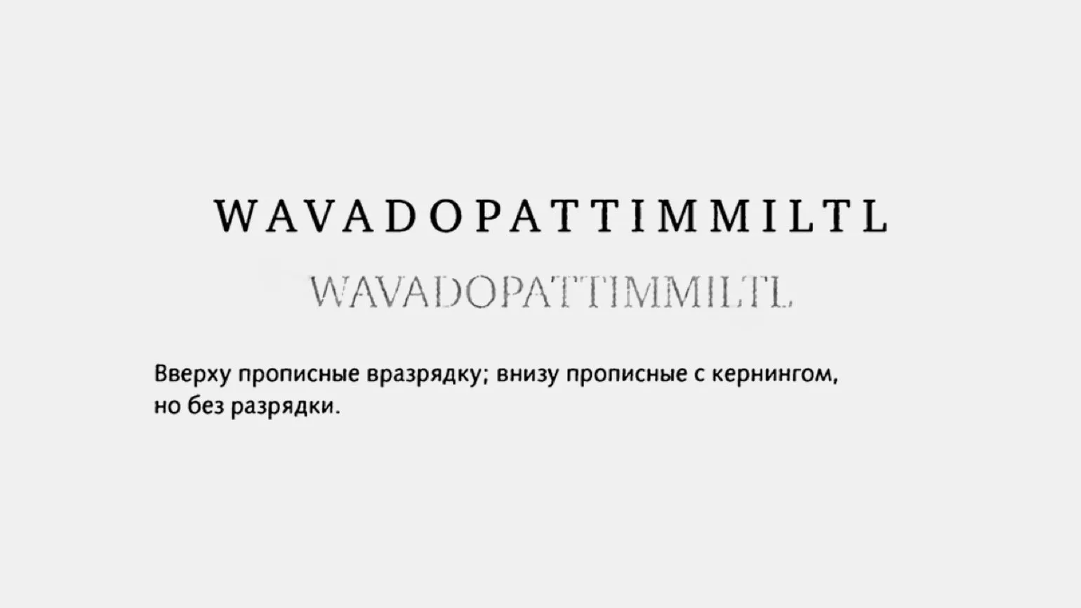
- Letter spacing should be optimal for a specific font and size. Sans-serif fonts range from 0.1 to 0.2, while serif fonts range from 0.2 to 0.3. For example, if the sans-serif font size is 30 pixels, then the letter spacing is 30 × 0.1 = 3.
- Make sure that the distance between letters is not more than the space or less than the internal letter spacing.
- The letter spacing for headings and subheadings can be increased to create a more effective visual image.
- When choosing letter spacing, it is necessary to consider the type of reading direction (left to right or right to left), the language used, and the typographic traditions of the country or region.
- Optimal line spacing provides enough space between lines to make the text readable. The average value is from 1.2 to 1.5. If the text has a large font - 1 or 1.1, and if it is small - 1.5 or even 2. This can be calculated in the same way as letter spacing.
- You should not use too much or too little line spacing: the first can make the text illegible, and the second - unsightly.

- It's worth leaving at least two characters per line and hyphenating at least three.
- You shouldn't leave the end of a hyphenated word or any word less than four characters long as the last line in a paragraph.
- It's better to avoid more than three consecutive hyphenated lines and breaking two consecutive lines with the same word.
- You shouldn't start a page from the last line of a multi-line paragraph.
You don't need to memorize all the rules right away. At the initial stage, it's enough to understand that all internal indents should be less than or equal to external ones. We talk about this in more detail in our article.
High-Quality Text Design - Checklist
A five-point checklist for checking text typography will help you improve the readability and perception of materials. Use it every time you work on text formatting:
1. Make sure the font is chosen correctly - it should be readable and match the style of the content.
2. Check the font size - it should be easy to perceive on different devices.
3. Pay attention to line spacing - sufficient space between lines improves readability.
4. Use appropriate indents and margins - this helps highlight important elements and makes the text more structured.
5. Check the color scheme - the contrast between the text and the background should be sufficient for comfortable reading.
This checklist will help you create high-quality text content that will be easily perceived by your readers.
- Focus on readability unless the format or idea dictates their own styling rules. The text should be easy on the eye.
- Use an appropriate font. Choose one that reflects the genre, semantic, and emotional content of the text.
- Maintain proportions. The overall appearance of the material depends on the correct layout.
- Don't be shy about leaving more open space. Don't fill every available cell on the page—open space helps focus attention on the main thing.
- Use line, prepositional, and paragraph rhythm: alternate long elements with short ones, observe pauses.
Learn more about design and current trends in our Telegram channel. Subscribe to stay up-to-date with useful tips and inspiration!
Book reviews for designers are an essential resource that helps design professionals and amateurs expand their knowledge and inspiration. In this category, you can find many book reviews covering various aspects of design, from graphic to industrial. These reviews provide insight into the key ideas and concepts presented by authors, as well as an understanding of which books may be most useful for developing skills and creativity. Studying such materials helps designers stay up-to-date with current trends and best practices. So, if you're looking for recommendations for literature that will help you in your design practice, pay attention to book reviews for designers.
- "Typography": the influence of form and color on letters
- "Modular systems in graphic design": the basics of Swiss layout
- "About font": simple principles of good typography
- "The art of color": optical effects that work in design
- "The art of form": abstractions, rhythm, and sensory understanding of things
- "Interface": the basics of designing user-friendly systems
Profession Graphic Designer PRO
You will learn how to create corporate identity elements and graphics for business. You will put together a portfolio that reflects your style and confirms your design skills. You can start a career in a studio or as a freelancer.
Find out more