Contents:

Try 4 top design professions. Free ➞ In 5 days, you will get acquainted with illustration, UX/UI, web, and graphic design. Add 4 great case studies to your portfolio and decide what direction to take next.
Learn moreOpening titles play a key role in the perception of a film. They not only create the initial atmosphere but also prepare the viewer for the further development of the plot. They introduce the key participants in film production, such as directors, screenwriters, and actors, which helps establish a connection between the viewer and the creators. Properly designed opening titles can significantly increase interest in a film and set the tone for the entire film.
The history of film titles dates back to the very beginning of cinema, but in the mid-20th century, attitudes toward this element of visual storytelling changed. In this article, we will consider the most impressive examples of film titles, analyze effective techniques for their creation, and pay attention to typography. Movie titles not only convey information, but also create an atmosphere, set the tone for the entire film, so their design and execution play a key role in the viewer's perception.
You will get information about:
- what the very first movie titles in history were;
- how to achieve dynamics without animation;
- what scary titles are created;
- how to create a mood using only typography;
- how cool titles were made, filmed in Zoom on a minimal budget.
Where it all began
The first film to be decorated with opening credits is considered to be "The Santa Claus" by British director George Albert Smith, released in 1898. This film came out just two years after the Lumière brothers' famous "Arrival of a Train." The introduction of intertitles in film was an important step in the development of cinema, allowing viewers to better understand the plot and context of what was happening on screen.
In "The Santa Clause," the intertitles are presented as a rotating set of captions that reveal the backstory of the plot. Information about the film itself is minimal—only the title, director's name, and year of release are indicated. This film established the tradition of end credits, from which viewers can learn about the team that worked on the film's creation. Notably, the text moves from bottom to top, which adds originality to the design.
The art of creating titles acquired the status of an independent genre in the 1950s, when graphic designer Saul Bass designed the titles for the film Carmen Jones, directed by Otto Preminger. Bass was one of the first to consider film titles as a separate direction in cinematography, emphasizing the visual identity of films and setting the tone for the narrative. This innovative approach led to the fact that titles are no longer just a technical element, but become an important part of the overall artistic concept, shaping the perception of viewers and enhancing the emotional impact. Film titles are now seen not only as a means of information, but also as an expressive tool that helps create a unique atmosphere in each film.
Important achievements of that time included the title sequences for the first Bond film, created by designer Maurice Binder, as well as Pablo Ferro's title sequences for Dr. Strangelove or: How I Learned to Stop Worrying and Love the Bomb. From this point on, motion design began to develop as an independent design discipline, bringing new visual solutions and innovations to the film industry. This era marked the beginning of a unique titles style that blended art and technology, which would go on to significantly influence the visual design of films.
Techniques: Freedom and the Absence of Rules
Motion designers employ a variety of techniques, including film, stop-motion animation, cartoons, and kinetic typography. Each designer chooses a specific method based on the content of the project, current trends, available technologies, and their artistic vision. This allows for the creation of a unique visual execution and titles concept that emphasizes the atmosphere and meaning of the film.
This unique genre combines film, animation, and graphic design. Credits have no strict design rules and can appear at any time, most often at the beginning, less often at the end of the film. In some cases, credits may be absent altogether, and there is no clear standard for their duration. Credits are an important element that can influence the viewer's perception and the overall mood of the film.
Series often use a technique in which full credits are shown in the first episode, and in subsequent episodes only a shortened version with the title is shown. This approach helps create a unique atmosphere and focus viewers' attention on key plot points. Shortened titles can also help move the action along more dynamically, allowing you to focus on the story itself.
We present nine significant design works that have influenced the film title industry from the 1960s to the present day. These works of art not only shaped the visual style of films but also set trends that continue to be used in modern cinema. Explore their influence on the development of identity and graphic design in film.
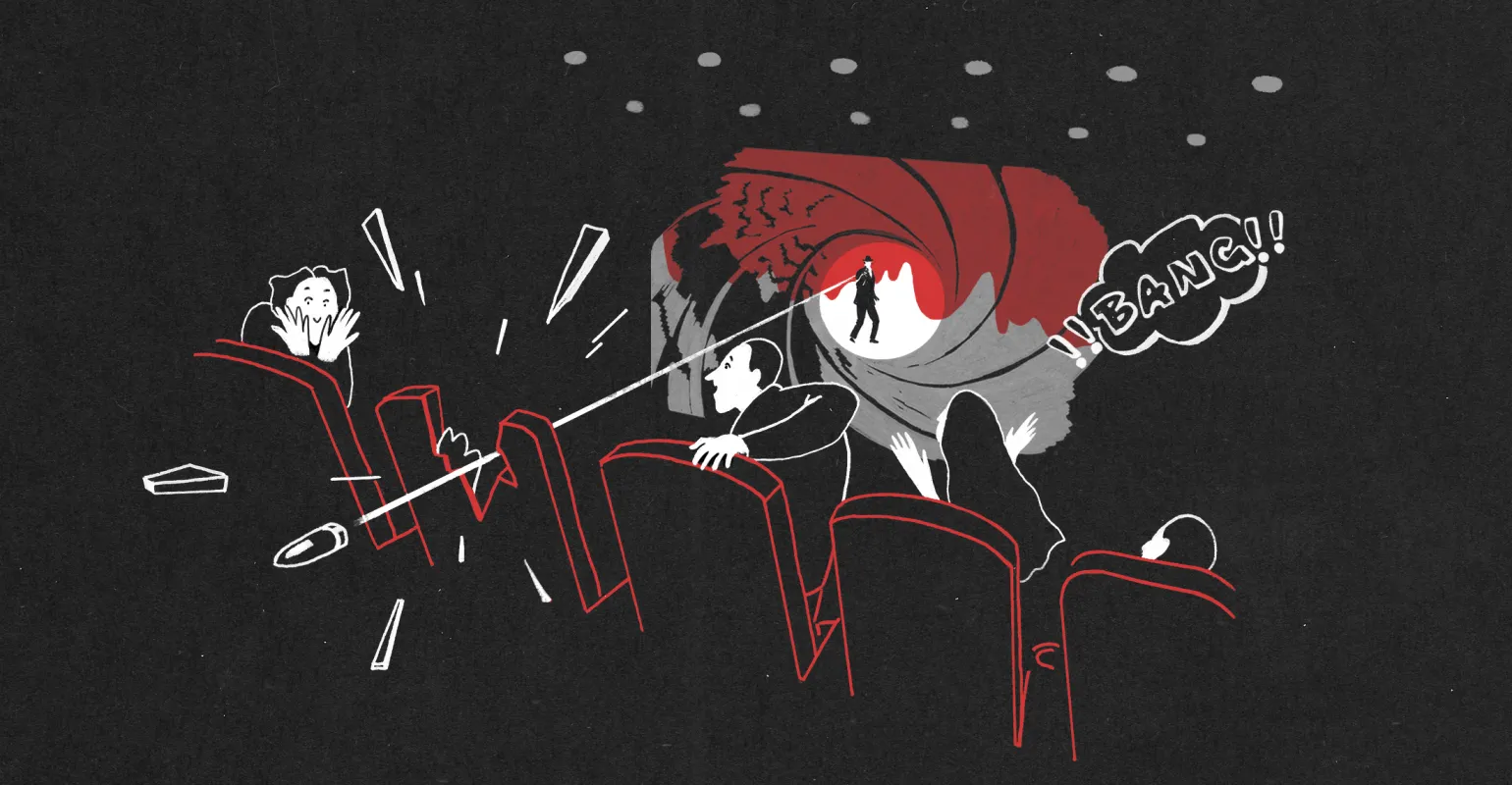
From Russia with Love / «From Russia with Love»
The year 1963 saw many significant events that influenced world history. This year marked an important stage in political, cultural, and scientific life. In politics, the Cold War continued, and contradictions between the USA and the USSR intensified. In this context, it is worth noting President John F. Kennedy's famous speech on the need for peaceful coexistence. In culture, 1963 is remembered for the release of iconic films and music albums that influenced the development of art. In science, important advances were also made in space exploration, foreshadowing future human achievements in this field. Thus, 1963 became a turning point that left a significant mark on history.
Designer Robert Brownjohn is known for his unique approaches and creative design solutions. His work is distinguished by originality and attention to detail, which allows him to create visually appealing and functional projects. Robert Brownjohn actively uses modern technologies and innovative methods, which makes his designs not only aesthetically pleasing but also user-friendly. His portfolio includes various projects, from graphic design to web design, confirming his versatility and professionalism in this field.
In the credits of the film "From Russia with Love," Brownjohn uses projection mapping to create a striking visual sequence on a dancer's body. He achieves dynamism without the use of animation, relying on the natural movements of the female body, onto which the static names of the film's participants are projected. This solution emphasizes the harmony between the art of dance and cinema, creating a unique experience for the audience and highlighting the director's creative approach to visual design.
The designer uses various angles, compositions, and textures to create a unique visual experience. Light signatures interact with the viewer, focusing attention on specific parts of the dancer's body. They illuminate her with a large, out-of-focus image and are also projected onto the wall behind her, highlighting her curves. This creates a memorable image that captures the spirit of the Bond film—"guns, girls, and smoke." Typography takes center stage in this context. Robert Brownjohn's work demonstrates a strong influence from László Moholy-Nagy, with whom he studied at the Bauhaus in Chicago, which is reflected in his approach to design.
The typography in Brownjohn's project uses more than ten colors from the light palette, creating bright and expressive letters that interact harmoniously with the dancer. The rejection of mixed shades can be explained both by the design decision and by technical requirements. The use of simple colors and grotesques ensures good readability against the model's background, and the palette is enriched by skin tones, clothing, and textures. This approach helps to emphasize the uniqueness and expressiveness of each element, creating a visually appealing and harmonious image.
Se7en/«Seven»
(1995) - this is a year that has left a noticeable mark on history, both in the cultural and technological spheres. This year saw significant events such as the release of popular films, technological advancements, and changes in the political situation.
In cinema, 1995 witnessed the premiere of such cult films as "Seven" and "Forrest Gump", which are still relevant today. This time was also marked by a rise in interest in computer games and the dawn of the internet era, which significantly impacted society and culture.
Furthermore, 1995 marked an important stage in the development of world politics. The end of the Cold War and changes in the global political landscape contributed to new approaches to international relations.
Overall, 1995 is a landmark year in various fields, and its influence is still felt today.
R/Greenberg Associates (R/GA) is a studio known for its innovative approaches to the design and development of digital solutions. The company offers a full range of digital marketing services, including strategy, creative, and technology. R/GA actively works with brands, helping them adapt to dynamic market changes and create unique user experiences. The studio focuses on integrating cutting-edge technologies and creative concepts, allowing clients to effectively engage with their target audience. R/GA is a leader in the industry thanks to its high-quality work and deep understanding of client needs. Designer Kyle Cooper is known for his unique approaches and creative solutions in graphic design. His work stands out for its originality and attention to detail, captivating viewers. Cooper creates visual concepts that are not only aesthetically pleasing but also effectively convey information. His style combines elements of contemporary art and traditional design, making his projects sought after in both the commercial and art sectors. Kyle Cooper continues to inspire a new generation of designers with his innovation and bold ideas, leaving a noticeable mark on the industry. src="//cdn.embedly.com/widgets/media.html?src=https%3A%2F%2Fwww.youtube.com%2Fembed%2F-BJkDyCdw0c%3Ffeature%3Doembed&display_name=YouTube&url=https%3A%2F%2Fwww.youtube.com% 2Fwatch%3Fv%3D-BJkDyCdw0c&image=https%3A%2F%2Fi.ytimg.com%2Fvi%2F-BJkDyCdw0c%2Fhqdefault.jpg&key=8d3909c69dfb4ee29c710191d8dd756a&type=text%2Fhtml&schema=youtube" width="854" height="480" scrolling="no" frameborder="0" allow="autoplay; fullscreen; encrypted-media; picture-in-picture;" allowfullscreen="true">
The film, released almost 30 years ago, continues to have a significant influence on the titling industry. The techniques used in this film borrow heavily from modern thrillers and horror films, confirming its relevance and importance in the field of cinema.
A key element of the film "Seven" is the credits, which give the viewer a glimpse into the psyche of a serial killer who appears on screen only in the third act. Interestingly, the credits do not precede the film, but begin after the first act, creating a sharp contrast with the leisurely beginning, when the viewer is introduced to the two detectives. This technique heightens the atmosphere of tension and anticipation, emphasizing the psychological complexity of the plot. The credits, therefore, not only frame the film but also serve as an important storytelling tool, revealing the inner world of the main antagonist and his motives.
The typography in the project is based on a contrasting combination of Helvetica font and handwritten elements. The names of the cast and crew were created by Kyle Cooper using a scratchboard technique and then transferred to film, mimicking the sloppy handwriting of the killer himself. The letters are positioned at the edge of legibility, and the jagged editing and film damage effects transform the opening credits into a visual representation of a serial killer's diary. This approach heightens the atmosphere of intrigue and tension, drawing the viewer into the dark story.
Enter the Void / «Enter the Void»
In 2009, the world faced many significant events and changes that impacted various areas of life. It was a year when the financial crisis continued to impact the global economy, causing rising unemployment and market instability. Furthermore, 2009 marked a significant moment in technology history, as mobile devices and the internet began to actively evolve. The emergence of new social media has changed the way people communicate and interact, opening up new opportunities for business and marketing. This year also saw significant events in culture, sports, and politics that left their mark on society. 2009 became a milestone that defined many modern trends and directions of development.
Tom Kam is a talented designer known for his unique approach to creating visual solutions. His work is distinguished by creativity and high quality execution. Kam actively uses modern technologies and design trends, which allows him to create attractive and functional projects. He pays attention to detail and strives for perfection, which makes his work in demand in the market. The designer constantly improves his skills and explores new directions, which helps him stay at the forefront of the design industry.
Tom Kam's work is a unique and captivating example of typography in titles. His approach to design emphasizes fonts and their interaction, creating visually appealing and informative titles. Each letter and word is carefully considered, achieving harmony between the text and its visual perception. This project stands out among others for its ability to convey meaning and mood through typographic elements alone, making it an important example in the world of graphic design and title animation.
The main technique of Gaspar Noé's film Enter the Void is that the credits create a feeling of discomfort in the viewer from the very beginning. The vibrant, flashing typography against the black background is etched into the mind, while the musical track "Freak" by the British electronic group LFO, combined with the visuals, allows the viewer to experience the intense rhythm of a heavy drug experience. This approach creates an immersive atmosphere that provokes reflection on the deeper aspects of addiction and its impact on the mind.
The choice of typefaces was organic and unfussy. We carefully selected typefaces, taking into account the atmosphere of the film, that best suited the characters and the individual personalities of the team members. Gaspar strove to ensure that each title reflected the personality it represented, emphasizing the uniqueness of each participant.
Tom Kam is a renowned title designer who has made significant contributions to the world of graphic design. His work is distinguished by a unique style and creative approach, which allows him to stand out among other professionals in this field. Tom Kam creates titles that not only inform but also attract attention, making visual content more memorable. His experience and skills allow him to work on a variety of projects, from film and television to commercials and digital media. With his talent and attention to detail, Tom Kam continues to inspire new designers and set high standards in the titling industry.
The typography is divided into two parts. The first part, tense thanks to the endless shimmering of color, uses a simple grotesque font. It is saturated with information, comparable to the final part of the film. The second part is dynamic: here the typefaces change one after another, creating associations with flyers, film titles and neon signs. This approach to typography enhances visual perception and attracts the attention of the audience, creating an effective ending.
True Detective / «True Detective»
In 2014, many significant events occurred that influenced various areas of life. In the political sphere, changes in international relations were observed, which affected the economy and security of countries. The world of technology continued to experience rapid growth, particularly in the development of mobile devices and social media. In culture, 2014 was marked by breakthrough film and music album releases that left their mark on history. Sporting events such as championships and tournaments also captured the attention of spectators and fans around the world. This year marked a significant milestone in a number of areas, setting trends and defining directions for future change.
Creative Director Patrick Claire.
Raoul Marx is a talented designer known for his unique approaches and creative solutions in the world of design. His work spans a wide range of styles and genres, making him a sought-after specialist in the industry. Raoul Marx has a knack for combining aesthetics and functionality, creating projects that not only attract attention but also solve clients' problems. His portfolio includes both commercial and custom projects, highlighting his versatility and skill. In the world of design, Raoul Marx has established himself as a professional who can inspire and surprise.
Production by Elastic Studio.
The credits of the first season of the TV series "True Detective" introduce the double exposure technique, which has gained recognition in the design world. This original graphic solution attracted attention and became especially popular among designers, inspiring new creative projects and visual concepts. Double exposure in the credits not only enhances the atmosphere of the series, but also demonstrates the art of combining images, which makes them memorable and unique.
In subsequent seasons of the series, credits, made according to a similar principle, did not undergo any changes in graphic design and look like a repetition of the previously successful format.
In the main technique of the series, the characters are revealed through the locations where they experience significant moments in their lives. Multiple exposures allow graphic human figures to serve as a backdrop to the dark and sometimes disturbing Louisiana landscapes. This creates an atmosphere in which the characters' inner experiences are intertwined with the surrounding environment, heightening the emotional weight and immersion of the viewer.
The designer's compositional decisions draw inspiration from the detached beauty of Richard Misrach's photography, incorporating deserted landscapes, industrial zones, and the wildlife of the Gulf Coast. The series' titles harmoniously integrate with the overall mood, emphasizing that the landscape serves not only as a backdrop but as a character in its own right alongside the actors.
The typography in these titles, while less dramatic than the images, possesses depth and blends harmoniously with the overall landscape thanks to the focus shift effect and subtle parallax. The combination of serif and original sans-serif typefaces gives the text blocks a modern look and emphasizes the idea of duality that is the foundation of the series. This combination of fonts not only attracts attention but also enhances visual perception, creating a unique atmosphere.
The Young Pope / «The Young Pope»
The year 2016 saw many significant events that impacted various areas of life. Political changes, economic crises, and cultural achievements became important milestones of this year. The field of technology saw a rapid growth of innovation, and social media continued to develop actively, changing the way people interact. Sports were also not left aside, with memorable moments that were memorable for many. This year has become a landmark in history, leaving behind many lessons and memories.
Production was carried out by Elastic Studio. This team of professionals ensures a high level of quality and originality in each project. Elastic Studio is actively developing unique content that meets modern requirements and audience expectations. Their experience and creative approach allow them to create memorable visual and audiovisual solutions.
Director Paolo Sorrentino views paintings not as simple scenery, but as key elements of his narrative. These paintings are filled with metaphors that help emphasize points and further explore the characters' thoughts. Elastic Studios uses motion graphics in the credits to transform paintings into dynamic narrative elements, imbuing them with movement and new life. This approach contributes to a unique visual aesthetic, making Sorrentino's work particularly memorable and multilayered. A key technique, familiar to many professionals, "animating" paintings in the credits of the series "The Young Pope" appears harmonious and appealing. While the history of Christianity unfolds through biblical motifs in the canvases, the viewer is invited to familiarize themselves with the "neon signs" with the actors' names and enjoy the image of Jude Law as the pontiff. The image on the screen is formed into a three-part composition, and a subtle parallax effect adds additional depth. This creative approach not only highlights the aesthetic value of the work but also enhances the perception of the plot, creating a unique atmosphere.
Typography with shimmering inscriptions imitating the lights of neon signs creates a vivid visual and semantic contrast with the religious theme. The use of an antique typeface is reminiscent of classic examples of Roman capital fonts, emphasizing the depth and historical significance of the plot. This approach allows us to combine modern design elements with traditional symbols, attracting attention and generating interest in the content.
Dark / «Дьма»
The year 2017 saw significant events that impacted both society and various spheres of activity. This year was key for technology, politics, and culture. In the field of technology, we saw the rise in popularity of mobile applications and social networks, which changed the way people communicate and interact. Political events, such as elections in various countries, have also become the subject of active discussion and analysis. In the cultural sphere, 2017 gave the world many striking works of art, music, and cinema. These events and achievements have shaped the context in which we live today and continue to influence our future.
Designer Lutz Lemke is a professional in his field, creating unique and original design solutions. His work is distinguished by creativity and attention to detail, which makes his style recognizable and in demand in the market. Lutz Lemke successfully implements projects in various fields, including graphic design, web design, and branding. His approach to each project is based on a deep understanding of client needs and contemporary design. Lemke's works are distinguished by the harmony of forms and colors, which allows them to attract attention and leave a vivid impression. Contacting Lutz Lemke is a step towards creating a professional and memorable design that will help you stand out from the competition.
In the series' credits, the complex plot unfolds before the viewer like a mirror kaleidoscope filled with diverse places and events.
The main technique of the work is the kaleidoscope effect, which transforms familiar objects into abstract blobs, reminiscent of a Rorschach test, or into frightening images. The continuous cutting of mirrored fragments not only anticipates the development of the plot but also evokes a feeling of discomfort. To deepen visual perception, designer Lutz Lemke applies the double exposure effect, which gained popularity three years ago. This approach adds complexity and layering to the presented images, attracting viewers' attention and enhancing the emotional impact.
Typography: font compositions placed over the images create the impression of staticity. However, the use of two colors applied by the designer enhances the effect of duality and gives the work dynamism. The right combination of fonts and colors can significantly enhance the visual appeal and readability of content.
Split/«Слит»
The year 2017 saw significant events that impacted the global arena. Political changes, economic fluctuations, and cultural trends became the main factors shaping public opinion. This year, the world faced a number of challenges that require attention and solutions. Technological development continued to accelerate, opening up new opportunities for business and everyday life. Social media played a key role in communication and the dissemination of information. 2017 was a time of change, when old habits began to give way to new approaches and ideas.
Production is carried out by Filmograph studio, known for its high quality work and professionalism in the creation of visual content. Filmograph studio specializes in the development and production of films, commercials, and multimedia projects, providing a full cycle from idea to implementation. Using innovative approaches and cutting-edge technology, Filmograph creates unique projects that capture audience attention and stand out from the competition.
The company's Creative Director is Aaron Becker. His experience and unique approach to creative strategies contribute to the development and promotion of the brand. Focused on innovation, Aaron creates original concepts and solutions that help the company stand out in the market. Under his leadership, the team achieves high results in the implementation of creative projects, which helps strengthen the brand's position and attract new audiences.
The Split title sequence is a modern reimagining of the minimalist style of Saul Bass's iconic Psycho (1960) title sequence. Both works are based on three key elements: a black background, contrasting white typeface, and Helvetica sans serif. This combination creates a striking visual harmony that emphasizes the atmosphere of tension and mysticism inherent in the original film. This new approach to title sequence design not only preserves the spirit of the classic but also gives it a fresh look, making it relevant for modern viewers.
The main technique is to present the team members' names using 24 identical modules, each of which replicates the title multiple times but in a smaller font. This approach, based on fragmentation and repetition, symbolizes the fragmented mind of the film's protagonist. The inclusion of color frames complicates the tempo, breaking the monotonous alternation of text blocks. The titles create an ominous and oppressive atmosphere, and the visuals are harmoniously complemented by the corresponding musical composition. This method not only attracts the viewer's attention but also enhances the emotional perception of the action on screen.
The typography, seemingly simple and familiar Helvetica, creates tension on the blank black screen. The chaotic shots at the beginning of the film, breaking up the black-and-white compositions with bright splashes of color, not only do not disrupt the established mood but actually enhance it. This interaction of typography and visual elements becomes a key aspect of perception, emphasizing the emotional atmosphere and enhancing the impression of the work.
Glow / «Блеск»
In 2017, many significant events occurred that influenced various spheres of life. This year was remembered for important political decisions, economic changes, and cultural events. In the political sphere, many countries faced challenges requiring a new approach to governance and international relations. The economy continued to adapt to new conditions, which led to changing market trends and the emergence of new business opportunities. In the cultural sphere, 2017 was a year of vibrant releases in film, music, and art, which contributed to an active discussion of social topics and public issues. These events not only shaped the year but also influenced subsequent years, setting the stage for further change.
The production was carried out by Shynola Studio, known for its innovative approaches and high-quality work. Shynola Studio has established itself as a leader in creative content creation, combining artistic vision and modern technology. The studio's engaging projects attract viewers and contribute to the development of visual art.
The concept, developed by Liz Flahive and Carly Mensch, represents an innovative approach that focuses on key aspects of modern design and interaction. These ideas are aimed at improving the user experience and creating unique visual content that stands out from the competition. Liz Flahive and Carly Mensch use advanced techniques and modern technologies to ensure the maximum effectiveness of their solutions. Their concept combines creativity and functionality, which allows for effective problem-solving in various fields.
The designer is Richard Kenworthy. He is known for his innovative design approaches, making his work unique and memorable. Kenworthy strives to create designs that not only attract attention but also solve real-world problems for users. His style combines contemporary trends and functionality, achieving harmony between aesthetics and usability. Richard Kenworthy continues to be an influential figure in the design world, inspiring a new generation of creators.
The opening credits for the TV series "GLOW" are a prime example of high-quality graphic stylization. The titles, like the rest of the series, use the visual language of the 1980s without being an exact replica. This design creates a unique atmosphere and captures the spirit of the time, making the series appealing to viewers who appreciate nostalgia and a creative approach to visual content.
The style immerses the viewer in the atmosphere of the 80s, harking back to the themes of sports and strength. It evokes nostalgia while remaining discreetly attractive and unobtrusive.
Liz Flahive co-authored the concept, which explores key aspects and innovative approaches. Her input in developing ideas and strategies is instrumental in the successful implementation of the projects. Specializing in creating effective solutions, Liz actively researches emerging trends and analyzes current issues. Her experience and professionalism allow her to offer unique perspectives and recommendations, making her an invaluable asset to the team.
The main visual language of the title sequence is based on the graphics of television sporting event intros from the 1980s. The dynamic of the sequence is achieved by rotoscoping wrestling footage from the popular series, lending the figures a realism and vibrancy that would be difficult to replicate from scratch. Simplified forms, vibrant geometric elements, and a moving echo effect are reminiscent of the neon signs that became emblematic of the era. With Patti Smith's classic rock ballad "Warrior" serving as the soundtrack, "Glitter" is a vibrant homage to a bygone era and its aesthetics. Typography plays a key role in the title sequence, where the designer utilizes a variety of display typefaces, a characteristic trend of the 1980s. A simple sans-serif with an outline and echo effect, used for the title, becomes the series' symbol. This short animation will be used as the title sequence in future episodes, and the neon style will be applied to the film's trailers and posters. This attention to typography not only highlights the uniqueness of the visual style but also creates a memorable image that will attract viewers.
Playgrounds Festival 2020 / Playgrounds Festival
In 2020, the world faced many challenges and changes. The COVID-19 pandemic changed everyday life, impacting health, the economy, and social interactions. Many countries introduced restrictions and quarantine measures, leading to an increase in remote work and online education. Brands and companies adapted to the new conditions, implementing digital technologies to maintain communication with customers.
Against the backdrop of the global crisis, attention to environmental and sustainable development issues has also increased. People have become more conscious of their consumption and the environment. In 2020, there was an increase in interest in eco-friendly products and services, which influenced the business strategies of many companies.
Social movements such as the fight against racism and inequality have also gained significant attention, highlighting the need for societal change. Overall, 2020 has been a time of transformation, with technology and social initiatives playing a key role in shaping a new world order.
The Panics Studio produces high-quality content. Our team of professionals creates unique projects that meet the highest standards and market demands. We specialize in a variety of formats, including video, animation, and graphic design. Our goal is to provide clients with creative solutions that help them stand out from the competition. Contact The Panics Studio for custom projects that will help your business grow and develop.
Festival pre-credits are a unique hybrid genre that combines elements of classic film credits and teasers. These pre-credits highlight the most interesting participants in the program, while the graphic design helps to maintain and develop the visual identity of the event. Dutch studio The Panics created some of the most striking pre-credits of the 2020 quarantine season, which captured the attention of viewers and became a symbol of the times.
The Playgrounds festival pre-credits were developed entirely in a Zoom conference and demonstrate the key rule of effective design: achieving maximum expressiveness with minimal resources. To create a vibrant title sequence that reflects current topics, the studio used 962 printed pages, eight printer cartridges, and a team of 22 people. This project highlights how simple yet thoughtful design decisions can achieve impressive results.
The typography in this video uses colorful elements to enliven the screen and reflect a youthful spirit. The stretched letterforms create the desired mood, and the sequential animation of the text attracts attention and makes it stand out against the mosaic screens of Zoom conferences. This makes the content more engaging and memorable for viewers. The color palette and dynamic typography enhance visual perception, which contributes to better information absorption and increases interest in the material.
If you're inspired to create your own title sequences, learn how to animate text in After Effects. This powerful tool allows you to add dynamic and creative elements to your projects. In this article, we'll cover the basic text animation techniques that will help make your title sequences more engaging and memorable. Master the key features of After Effects and create unique visual effects that will enhance the atmosphere of your film.
Profession Graphic Designer PRO
You will learn how to create corporate identity elements and graphics for business. You will put together a portfolio that reflects your style and confirms your design skills. You can start a career in a studio or as a freelancer.
Find out more