Table of Contents:
- What is Typography: The Art of Visually Arranging Text
- What is Typeface Design and Who is a Typeface Designer?
- Why is Good Typeface Design Important?
- Frequently Asked Questions About Typeface Design
- The Evolution of Typography: From Manuscripts to Digital Technologies
- Overview of Typeface Classification: From Antiqua to Grotesques
- The Art of Combining Typefaces for Design
- How to Legally Use Typefaces Without Infringing Copyright
- Where to find high-quality fonts for your projects
- Key terms in typography

Graphic Designer PRO: Course with Employment in 3 Months
Learn MoreWhat is Typography: The Art of Visually Designing Text
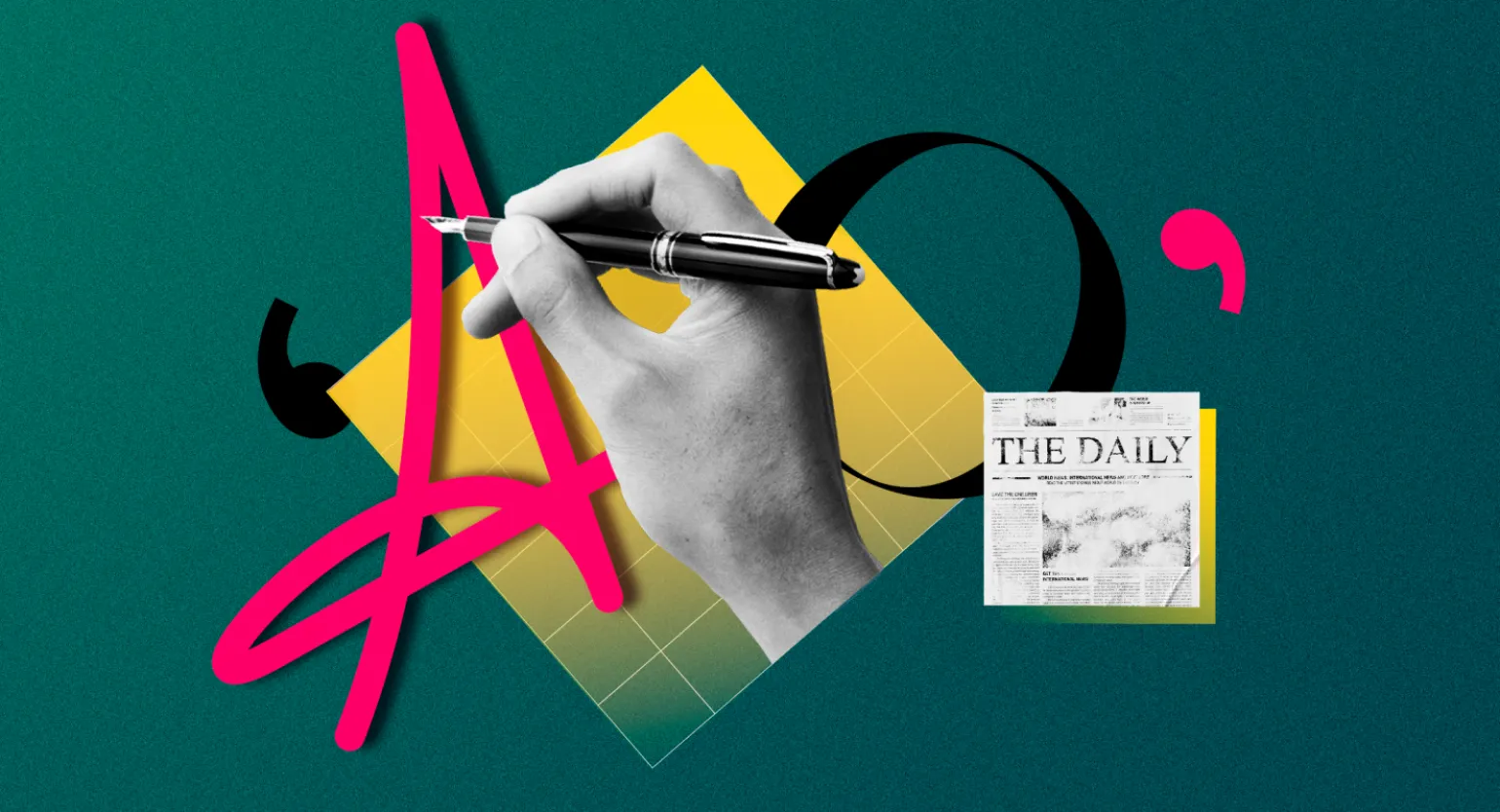
Typography is more than just a collection of letters and symbols; it is an art that gives text expressiveness and aesthetic appeal. Derived from the Greek words τύπος (imprint) and γράφω (write), this concept encompasses both the creation of fonts and the work with large volumes of text, including books and magazines. Effective typography improves readability and perception of information, playing a key role in page design and visual communication. The correct choice of fonts, spacing, and alignment gives the text harmony and depth, which ultimately contributes to better interaction with the reader.
With the development of digital technologies, the possibilities of typography have significantly increased. It is now used not only in printed publications, but also in logo design, advertising materials, and urban navigation systems. We encounter typography every day when designing presentations or creating content for social media. Effective use of fonts and compositions helps attract attention, convey information, and create a unique brand style. It is important to understand that competent typography not only improves visual perception but also facilitates better comprehension of information.
Robert Bringhurst, a renowned typographer and author of "The Essentials of Typographic Style," argues that typography is the art of visually representing human language. This emphasizes the importance of the correct choice of fonts and their combinations in design. Proper typography not only improves the readability of text but also creates an emotional connection with the reader, making information more accessible and appealing. Skillful use of fonts can significantly impact the perception of content, making typography a crucial aspect of creating high-quality content.
When working with typography, designers address a number of important issues, including the following: They select fonts that match the style and mood of the project, ensure legibility, and create harmonious compositions. Designers also consider size, color, and line spacing to ensure text is visually appealing and easy to read. Furthermore, they adapt typography to different screens and media, which is especially important in the digital age. It is important that typographic solutions are consistent with the overall design concept and help convey information to the audience in the most effective way.
- selection of fonts, their styles and weights;
- working with font compatibility and size ratios;
- distribution of text in the layout and selection of sizes;
- formation of the arrangement of text blocks and free-standing font elements;
- creation of font compositions;
- development of unique fonts.
In the modern world, knowledge of the basics of typography is an essential skill for anyone who strives to create high-quality visual content. Typography is the art of text arrangement, which plays a key role in both design and effective communication. It helps achieve harmony between text and visual perception, improving the perception of information and attracting the attention of the audience. Mastering typographic principles helps you create materials that are not only aesthetically pleasing but also functional, which is especially important in an environment where content quality is highly demanding.
Typography plays a vital role in the effective presentation of information. It not only improves the perception of text but also helps create a visual hierarchy, making content more accessible to readers. For an in-depth study of typography, we recommend visiting resources such as A List Apart and Smashing Magazine. These platforms offer articles and materials covering modern typographic practices and trends, which will help you improve your skills and enhance the quality of information presentation.
What is typeface design and who is a typeface designer?
Typeface design is a unique field of typography that goes beyond the simple arrangement of text in graphic layouts. It is the art of designing and creating new character types, including letters, numbers, punctuation, and special symbols. Typeface design plays a vital role in visual communication, enhancing the readability and perception of information. Well-designed typefaces can significantly impact the overall impression of a piece, emphasizing its style and atmosphere. Typeface creation requires a deep understanding of both artistic and technical aspects, making this discipline in demand in contemporary design.
Typography plays a key role in the perception of text, ensuring not only ease of reading but also the conveyance of the depth of ideas contained within the words. As Michael Bierut, renowned designer and partner at Pentagram, emphasizes, high-quality typography can inspire and open new horizons for creativity. The correct choice of fonts, spacing, and alignment creates a harmonious environment for information perception, allowing the reader to more deeply understand and appreciate the content. In contemporary design, successful typography is becoming an integral part of communication, facilitating effective interaction between the text and its audience.
Font designers working in specialized studios create both universal typefaces and unique corporate typefaces. Brands commission custom fonts to shape their visual identity, helping them stand out in a competitive market. The development of unique fonts helps create a memorable company image and improves brand perception among the target audience.
The importance of font design continues to grow in today's world, as visual content plays a key role in attracting audience attention. Uniquely designed fonts can significantly change brand perception and shape its image. A well-chosen font not only improves readability but also conveys emotional coloring, creating a memorable visual style. In an increasingly competitive environment, it is important to consider that fonts can become a vital element in shaping a brand's identity and its connection with the target audience. Therefore, a competent approach to font selection is an integral part of a successful visual strategy.
Why is good font design important?
Choosing the right font plays a key role in increasing the readability and appeal of the text, which directly affects reader engagement. Research confirms that fonts that are harmoniously integrated into a website's overall design can increase the time users spend on a page by up to 20%. The right font not only improves information comprehension but also creates a positive impression of the resource, promoting visitor retention and return.
Frequently Asked Questions about Font Design
A font designer creates and develops typography, giving fonts a unique style and functionality. They research and design each letter, considering proportion, shape, style, and readability. Their work includes both creating new fonts and adapting existing ones for different platforms and media. They also test fonts on different devices to ensure their correct display and use in various contexts. Font designers play a vital role in visual communication, as a well-chosen font can significantly improve the perception of information and the aesthetic appearance of text.
A font designer develops unique character styles used in various visual communications. This specialist creates fonts with aesthetic and functional characteristics in mind, improving the perception of text in both print and digital environments. A font designer's work includes typographic research, the selection of proportions and character shapes, and testing fonts in various contexts. The result of their work is fonts that are not only aesthetically pleasing but also easy to read, which is essential for the effective communication of information.
Font designers work in various fields related to graphic and web design. They may be employed in printing houses that develop and produce fonts, as well as in design studios that create unique fonts for brands and advertising materials. Many font designers also work freelance, providing their services to various companies and individual clients.
In recent years, there has been a growing demand for fonts for digital platforms, opening up new opportunities for designers. They can collaborate with app and website developers to create fonts optimized for screens. Additionally, font designers sometimes work in educational institutions, teaching students the basics of typography and design.
The work of font designers also includes participation in research projects, where they can study new technologies and methods of font creation, as well as develop solutions to improve the readability and accessibility of text. Thus, font designers have many opportunities for professional growth and self-realization in various fields.
Font designers primarily work in specialized font studios that create and release new fonts. These studios focus on developing unique fonts that meet the needs of various clients and the market. High-quality fonts are becoming an important element of brand visual identity and are used in printed materials, web design, and advertising materials.
Fonts play a key role in brand perception. They not only convey information but also create a company's visual identity. A well-chosen font can strengthen a brand's image and evoke certain emotions and associations in consumers. For example, formal fonts can convey reliability and professionalism, while more creative and playful fonts can emphasize innovation and friendliness.
The choice of font should match the target audience and the overall style of the brand's communication. Using the same font across various channels—on the website, in advertising, and in packaging—helps create a consistent and memorable image. It is also important to consider the legibility of the font, as this affects the perception of information.
Therefore, fonts are not just design elements, but a powerful tool for shaping a brand's image and perception. The right choice of font helps establish an emotional connection with consumers and distinguishes the company from its competitors.
Unique fonts play a key role in creating a memorable company image and contribute to increased brand recognition. A well-chosen font can convey a brand's character and values, as well as distinguish it from its competitors. Using original fonts in logos, advertising materials, and on a website helps create a harmonious visual style that is memorable to customers. An effective font can not only attract attention but also improve the perception of information, making a brand more accessible and attractive to the target audience.
The Evolution of Typography: From Manuscripts to Digital Technologies
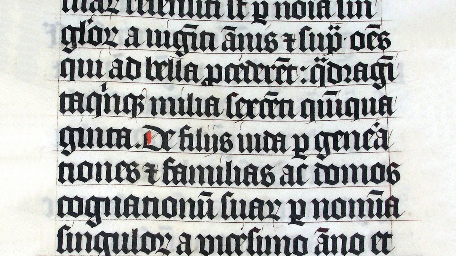
Typography is the art of text formatting, which began to develop in the 11th century with the advent of Gothic script and Blackletter. These fonts were based on the calligraphic traditions of the time. Handwritten books were rare and perceived as true works of art. Their design was distinguished by rich decoration and uniqueness. Drop caps and basic letterforms depended on the writing technique used, which gave each work a unique character. With the development of printing, typography evolved, becoming an important element of graphic design and communication.
In the mid-15th century, a significant breakthrough in the history of printing occurred with the invention of the first printing press by the German master Johannes Gutenberg. This innovation marked the transition to mechanical typesetting using lead letters, making mass production of books possible. The first printed book—the Bible—became a symbol of this new era in typography and marked the beginning of a revolution in the dissemination of knowledge and information. Gutenberg's invention opened the door to cultural and educational progress, making books accessible to a wider audience and changing the face of society.

With the beginning of the 20th century and the rise of personal computers, typography underwent significant changes. The advent of desktop publishing made font creation accessible to a wider audience, not just professionals. As a result, fonts began to adapt to screens, requiring a new approach to their development and text formation. This led to the evolution of not only font design but also the principles of their use in digital media, which has positively impacted readability and information perception. Now everyone can create high-quality text content that meets modern typographic requirements.
Modern typographers face new challenges associated with the development of the internet and changing user preferences. Choosing a font for web pages has become an important task, as its display can vary across devices and browsers. Different operating systems use different fonts, which creates difficulties for users when reading. However, since the early 2010s, new technologies have made it possible to embed custom fonts on websites, significantly changing the digital typography landscape. For example, this text is written in Graphik, which may not be installed on your computer, but thanks to modern web technologies, it displays correctly. Thus, typography on the web has become more flexible and accessible, allowing designers and developers to create unique and attractive visual solutions for users.
Overview of Font Classification: From Antiqua to Grotesque
Font classification is an important aspect of design and typography. Understanding the different font categories allows you to choose the most appropriate option for a specific project. In this article, we analyze the main font groups, their unique characteristics and areas of application. The correct choice of font significantly affects the perception of the text, its readability and the overall style of the design. Let's take a closer look at which fonts are best suited for different types of projects and how their use can change the visual perception of information.
Typefaces are ideal for large volumes of text, including books, articles, and longreads. They provide high legibility and have a neutral style, making reading comfortable and enjoyable. This category includes text fonts that retain their legibility even at small sizes, which is important for easy information comprehension. The use of typesetting fonts improves readability and makes the text more accessible to a wider audience.
Antique fonts, or serif fonts, are a category of serif fonts inspired by Roman letters. These fonts play an important role in typography and became staples with the development of printing. Their elegant and classic appearance makes antiqua fonts sought after in modern design, particularly for books, magazines, and advertising materials. The popularity of antiqua fonts remains due to their ability to provide excellent legibility and aesthetic appeal in a variety of formats.
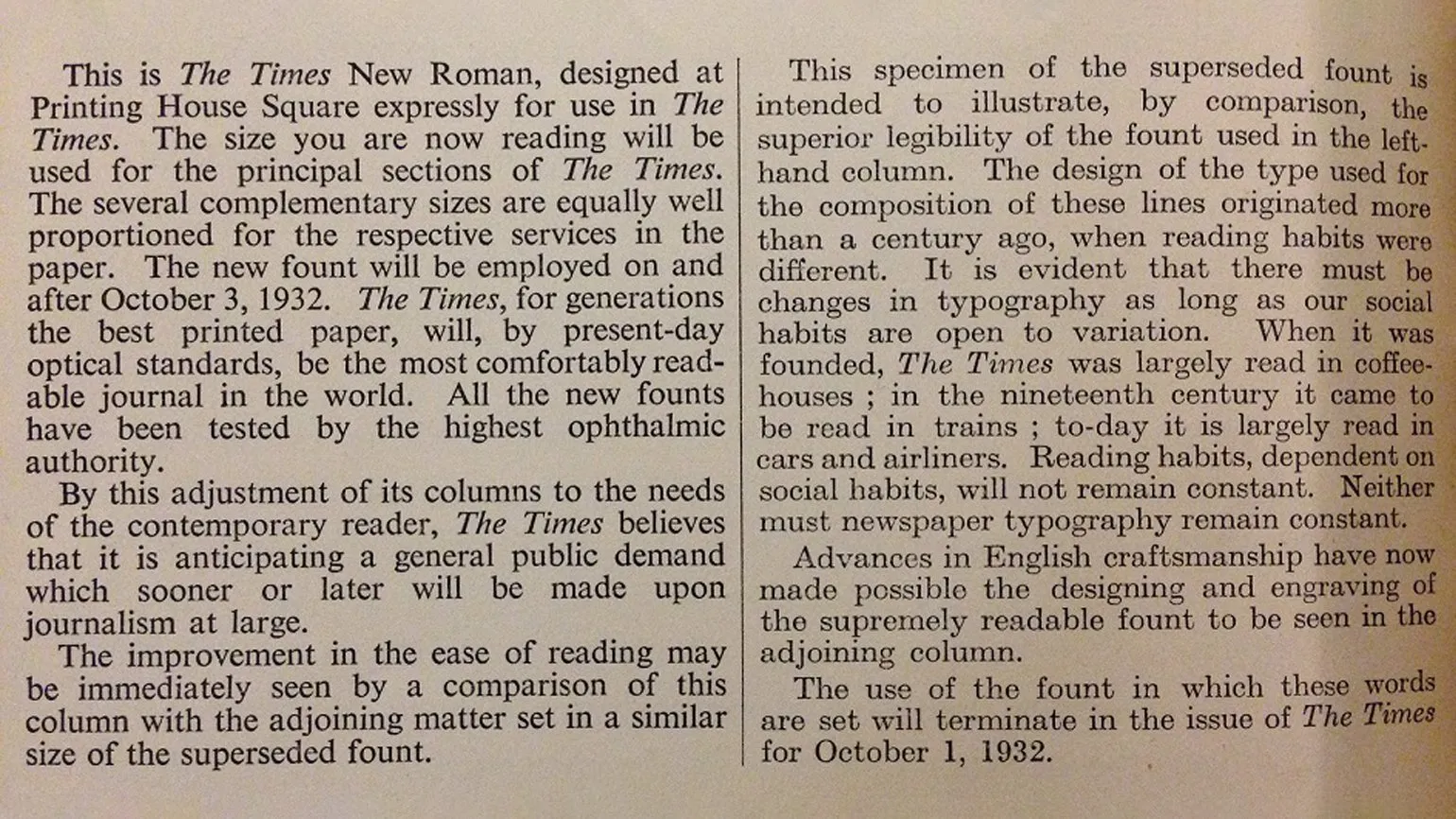
Times New Roman is one of the most famous antiqua fonts, designed in 1931 by Stanley Morison and Victor Landert. It gained widespread popularity due to its integration into Microsoft Word, making it a standard for word processing and printing. This font is characterized by its elegant design and high legibility, making it an ideal choice for a variety of print and digital materials. As a result, Times New Roman has become an integral part of the typographic world and continues to be used in a variety of settings, from academic writing to business documents.
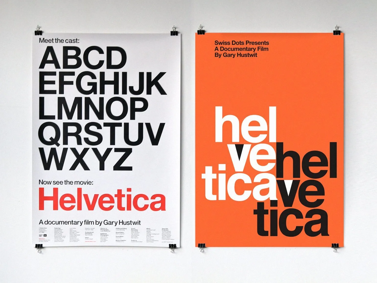
Grotesque fonts are characterized by the absence of serifs, which gives them a modern and uncluttered look. The first grotesque typeface is considered to be the one created by William Caslon IV in 1816. Since then, grotesque typefaces have gained popularity, especially after World War II, when designers sought new visual solutions. Their use became popular in various fields, such as graphic design, web design, and advertising, due to their ability to provide easy-to-read information and a modern style. Today, grotesque typefaces remain trendy, used in both print and digital media, making them a versatile tool for designers.
Helvetica, designed by Max Miedinger in 1957, is an iconic typeface of Swiss typography. This typeface is widely used in various fields, including logos and urban navigation systems. Helvetica is known for its versatility and clean lines, making it a popular choice for designers and brands around the world.
Display fonts, or decorative fonts, are specifically designed to draw attention to short passages of text. These fonts are often used in logos, advertising materials, and other visual communications where information needs to be emphasized and a memorable image created. Using display fonts helps to emphasize the uniqueness of the brand and make it more noticeable among competitors.

Lettering is the art of hand-crafting unique letterforms, making it similar to calligraphy. This process allows for the creation of original and expressive fonts, which is especially useful for logos and posters. Lettering gives each project its own unique character, allowing it to stand out from standard fonts and attract audience attention. In modern design, it is actively used to create brand identities and design various graphic materials, emphasizing the uniqueness and creativity of each project.

Some display fonts can imitate lettering, but manual reproduction of these symbols is impossible. Lettering requires an individual approach and creative process, which makes it unique. Unlike display fonts, which are created using predetermined forms, hand lettering allows for originality and expressiveness in each character. Therefore, despite the existence of fonts similar in style, hand lettering remains indispensable in design and graphic art. Choosing a font for text is an important aspect of design that influences the perception of your project. For printed materials, it is best to use typefaces that ensure good legibility. For headlines, grotesques or display fonts are suitable, as they attract attention and create expressiveness. Fonts can be divided into two main types: serif and sans-serif. Serif fonts, known as antiques, have a traditional and formal character, making them ideal for official documents and books. At the same time, sans-serif fonts, or grotesques, have a modern and minimalist look, making them popular in web design and advertising materials. Choosing the right font will not only enhance visual perception but also help convey the desired message to your audience.
The Art of Font Combinations for Design
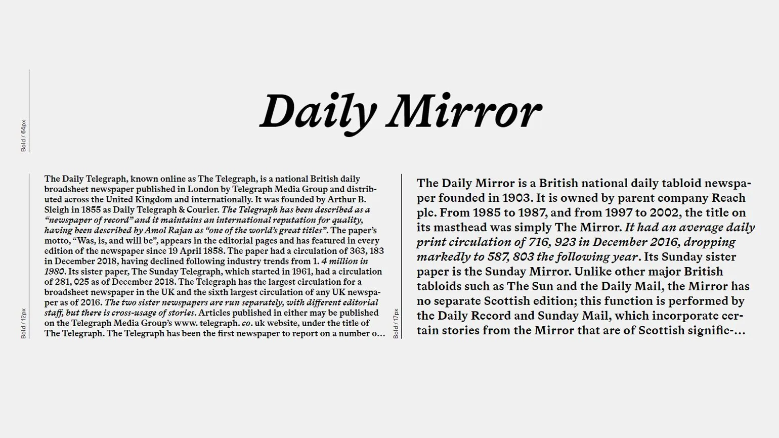
When creating an attractive and effective design project, it is important to combine fonts correctly. Experienced designers advise limiting a design to two or three fonts. A skillfully chosen font pair, or font combination, significantly affects visual harmony. The correct combination of fonts not only improves the appearance of a project but also increases its readability and perception. Choosing contrasting or complementary fonts can create the right mood and highlight important design elements.
Combining fonts is an important aspect of web design and typography. There are several effective approaches to this task. The most popular methods are using fonts that are similar in style and creating contrasting pairs. For example, combining different weights of the same typeface, such as regular, bold, and italic, can significantly enhance the visual appeal of the text. Furthermore, using contrasting fonts helps highlight important elements and improve readability. Proper combination of fonts not only attracts attention but also creates harmony on the page, which contributes to better perception of information by users.
Creating contrasting pairs of fonts requires a certain skill. For example, serif fonts can be effectively combined with sans-serif fonts, but it is important that they harmonize with each other, avoiding visual dissonance. For beginning designers, there are many online services available to help them find successful font combinations. These tools allow you to experiment with different styles and find the perfect combinations, which significantly simplifies the design process and improves the quality of the final product. Choosing the right fonts not only improves legibility but also enhances visual perception, making it an important aspect of any project.
Check out our collection of free online services for creating font pairs. These tools will be a useful addition to your design practice and will help improve the quality of your projects.
How to Legally Use Fonts Without Copyright Infringement
In the field of graphic design, a significant portion of fonts are available for a fee. To legally use these fonts in your projects, you must purchase the appropriate license. Simply downloading and installing a font on your computer can lead to legal consequences. To avoid problems, it's important to carefully check licensing terms and only use fonts for which you have the rights. This ensures the protection of your projects and respects copyright.
Fonts can be purchased from specialized stores, as well as from independent designers and studios. When purchasing fonts, it's important to carefully review the licensing terms, as they determine where and how the font can be used. For example, a Desktop license allows the font to be used in most cases, with the exception of online projects. However, usage terms can vary, and some companies require a separate license for using fonts in logos. Make sure you understand the licensing to avoid copyright infringement and ensure the legal use of your chosen fonts in your projects.
There are many free fonts, including system fonts that come with operating systems, as well as fonts from specialized libraries. One of the most popular sources of free fonts is Google Fonts. These fonts can be used without any cost, making them especially attractive to web designers and developers. Using free fonts not only saves money but also allows you to enhance the visual appeal of your projects thanks to the variety of styles and formats available in such libraries.
Free fonts have their drawbacks. Their prevalence is often driven by cost, which leads to a decrease in the uniqueness of your design. To avoid using standard fonts, it's worth considering the latest free fonts that have just appeared on the market. These fonts can add originality to your project and make it stand out from the crowd.
We've compiled a current selection of free fonts that are perfect for your next project. These fonts will help improve visual perception and make your design more appealing. Explore our recommendations and choose the perfect font for your creative work.
There are several main types of font licenses, each defining the terms of use. Font licenses can vary depending on the purpose, number of users, and location of use. Commercial licenses allow you to use fonts in commercial projects, including advertising and branding. Web font licenses allow you to integrate fonts into websites, ensuring correct display on various devices. Personal use licenses limit the use of fonts to private purposes only. There are also open licenses that allow free use and modification of fonts, subject to certain conditions. Choosing the right license is important to comply with copyright and optimal use of fonts in projects.
- Desktop - suitable for a variety of programs, documents, logos, and social networks.
- Webfont - allows you to integrate fonts into a website; the price depends on the resource traffic.
- App - designed for mobile applications; the license price varies depending on the number of downloads.
- Digital Ads - for using fonts in online advertising; The more impressions, the higher the license price.
- Server — allows you to host the font on the company's server and use it on multiple devices.
To understand the nuances of font licensing and choose the right option, we recommend reading our detailed guide.
Where to find quality fonts for your projects
Fonts are an important element in design and can significantly affect the perception of a project. To create a unique visual style, you need to know where to look for inspiration and purchase fonts. We've compiled a list of the best resources where you can download or purchase fonts, as well as explore the work of professional designers, learn about font creators, and their creative approaches. These platforms will help you not only find the perfect font for your project but also expand your knowledge of typography and its impact on design.
Since its founding in 1999, Paratype has established itself as one of the leading font companies in Russia. The company's portfolio includes Cyrillic fonts created by talented Russian designers. In addition to offering high-quality fonts, Paratype also publishes a typography magazine offering useful information about fonts and their use in various projects.
In her interview, Anna Yakubova, the company's director, discusses the future of Cyrillic fonts and the issue of piracy in the design industry. She emphasizes the importance of copyright protection and the need to support the legal use of fonts. Anna also highlights trends in the development of Cyrillic fonts, emphasizing their growing popularity and importance in modern design. Discussing piracy, she encourages professionals and users to make informed choices to promote the development of quality content in the industry. Letterhead Studio, founded by talented designers Yuri Gordon and Valery Golyzhenkov, offers a wide selection of both traditional and experimental typefaces. The studio's portfolio includes work for renowned brands, including Vogue and Cosmopolitan, highlighting the team's high level of professionalism and creativity. Thanks to its unique approach to typeface design, Letterhead Studio attracts the attention of both large companies and individual designers seeking to stand out in the market. Yuri Gordon shares his experience in an interview, emphasizing the importance of corporate typefaces and their impact on a company's image. He notes that the right choice of typeface can significantly strengthen a brand's visual identity and increase its recognition. Corporate typefaces not only reflect a company's style and philosophy but also build trust with customers. It is important to consider that a typeface should not only be aesthetically pleasing but also functional, ensuring legibility across various platforms. Yuri also focuses on how fonts can influence the perception of information and evoke an emotional response in the audience. Brownfox Studio, founded by Gayane Baghdasaryan and Vyacheslav Kirilenko, provides unique fonts that can form the basis for successful design projects. The studio's clients include such renowned organizations as Gorky Park and the Gulag History Museum. Brownfox fonts are distinguished by their high quality and original style, making them an ideal choice for a variety of fields, including graphic design, web design, and branding. Using Brownfox fonts will help emphasize the individuality of your project and attract the attention of your target audience.
Gayane Baghdasaryan analyzes current trends in the Cyrillic font market, emphasizing the growing demand for unique and exclusive designs. She emphasizes the importance of adapting fonts to modern design and typography requirements, which contributes to the creation of more appealing visual solutions for various projects. In an increasingly competitive environment, having original fonts is becoming a key factor in distinguishing brands and improving user experience.
The type.today store, founded by Ilya Ruderman and Yuri Ostromentsky, offers a wide selection of modern fonts specially selected for designers. In addition, type.tomorrow presents bold, experimental fonts that meet current design requirements and trends. The selection of fonts in our store allows you to create unique projects that highlight individuality and style. We strive to meet the needs of both professionals and amateurs by providing only high-quality, modern typography solutions.
Adobe Fonts offers a vast collection of high-quality fonts, each accompanied by detailed information about its creator. Designers have the opportunity to create a profile where they can showcase their work and biography. This not only increases user trust but also improves interaction with the content by offering valuable information about each font. Using Adobe Fonts allows designers to easily find and select fonts that suit their projects, as well as be inspired by the work of other creative professionals.
Explore the biographies of famous female designers to understand how typography evolved throughout the 20th century. Their contributions to design and influence on modern trends play a vital role in shaping visual culture. Explore their work and discover how their ideas and approaches changed the world of typography. This will allow you to gain a deeper understanding of how historical events and social changes have influenced graphic design and typography.
Canadian studio Pangram Pangram, consisting of eight talented professionals, offers unique typefaces, each with its own story. The Font in Use section demonstrates how these fonts are applied in real projects, allowing you to better understand their visual features. All fonts are free to download, but a license is required for commercial use. Pangram Pangram is an excellent solution for designers and creative professionals who need high-quality fonts with an original style.
California-based studio OH no Type, founded by James Edmondson, offers a variety of experimental typefaces that attract the attention of designers. Each font is accompanied by animation and examples of use in real projects, allowing you to better appreciate their potential and functionality. The studio strives to inspire creative professionals by providing unique solutions for typography and design. This makes OH no Type a significant player in the font market and a trusted resource for those seeking original, high-quality fonts for their projects.
Key Terms in Typography
Typography is an important area of design, rich in unique terms and concepts. In this article, we have collected key terms that will help you better understand type compositions, page layout, and the everyday tasks of designers. Learning the basics of typography will allow you to improve your design skills and create more effective and attractive visual solutions.
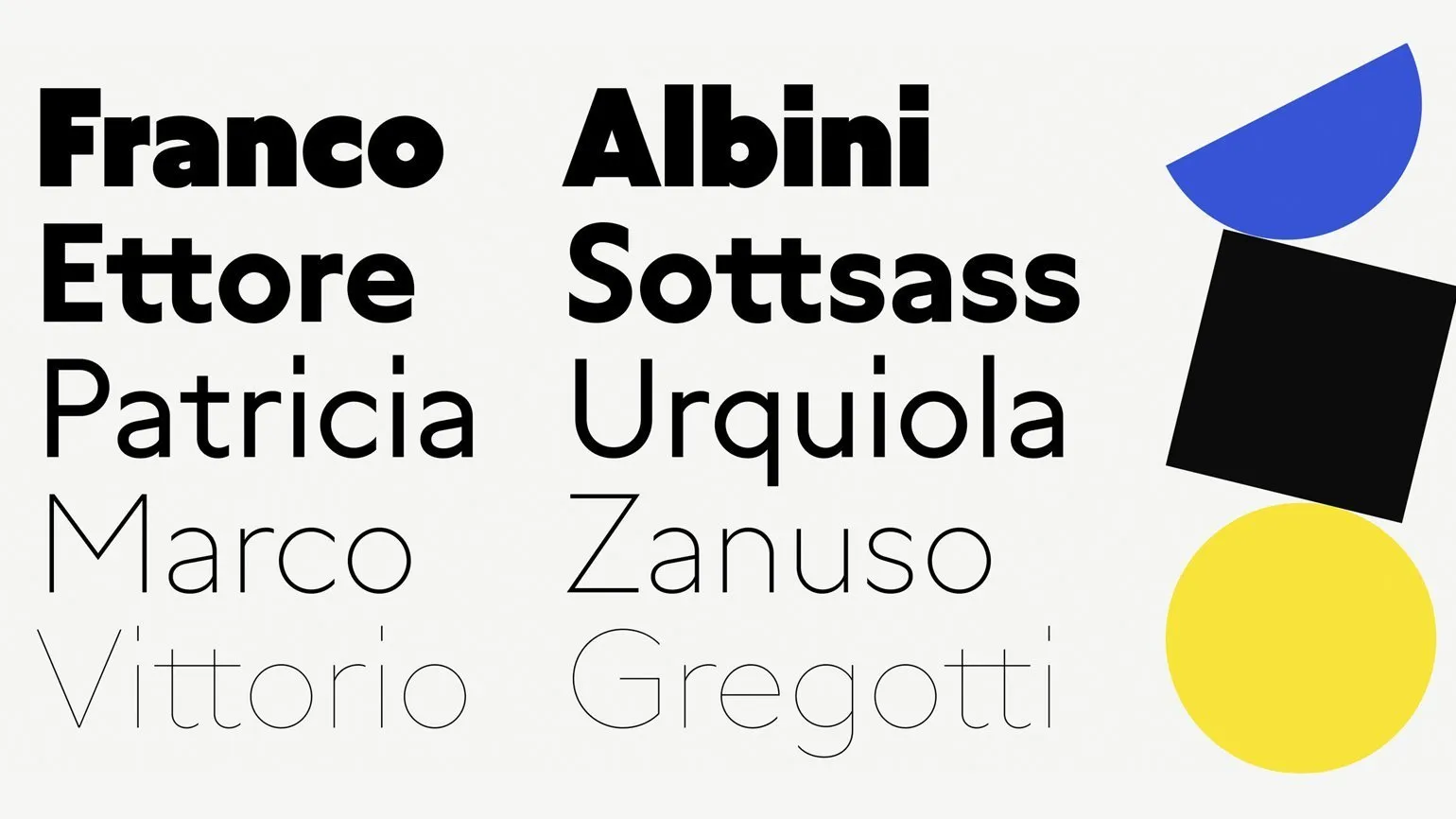
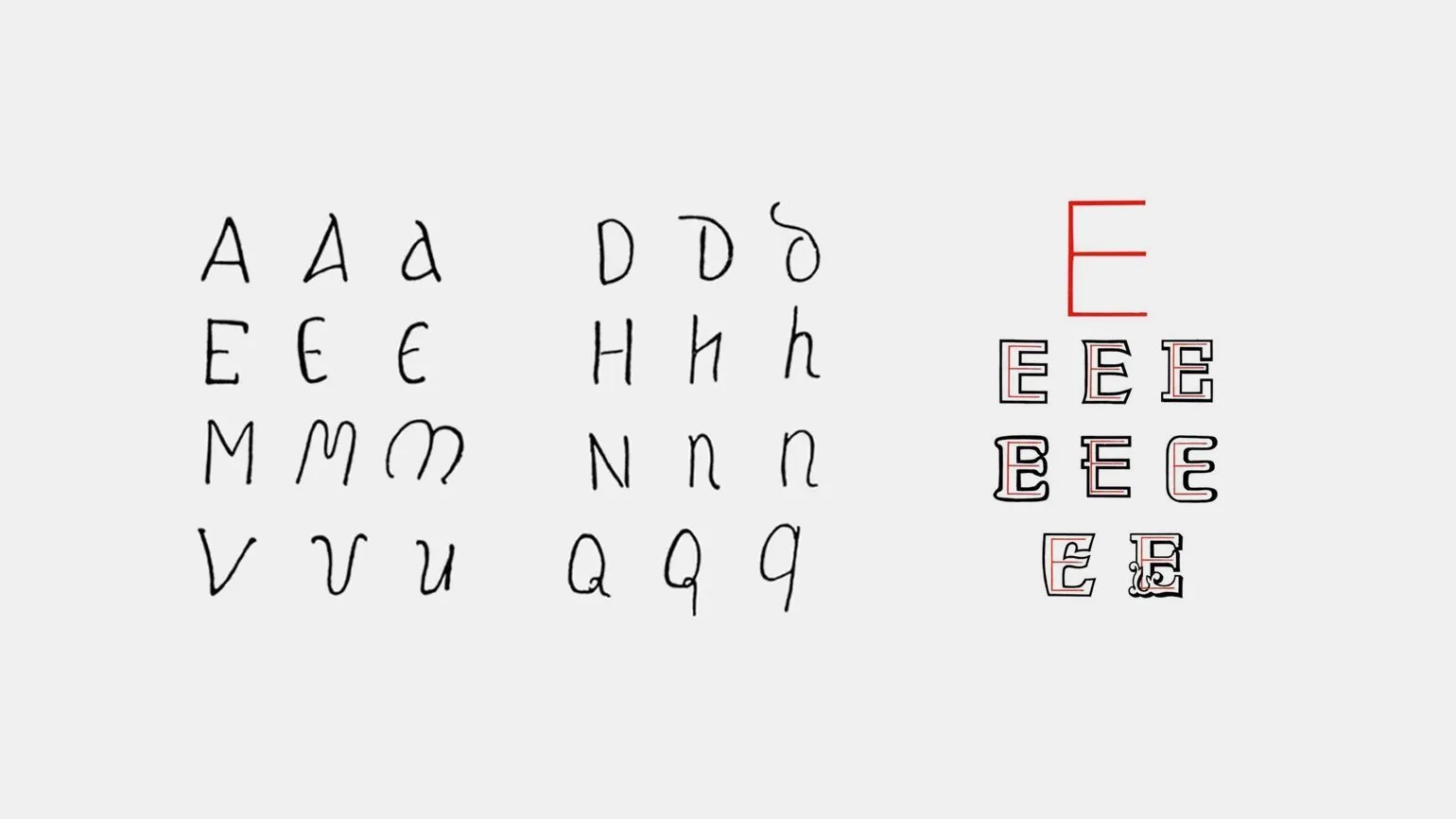
A typeface is a set of font styles that, despite a single stylistic design, vary in thickness and slant. All fonts in a typeface have the same set of characters. In some cases, the term "typeface" is used as a synonym for font family. The correct choice of typeface plays a key role in design and typography, as it affects the perception of the text and the overall aesthetics of the project.
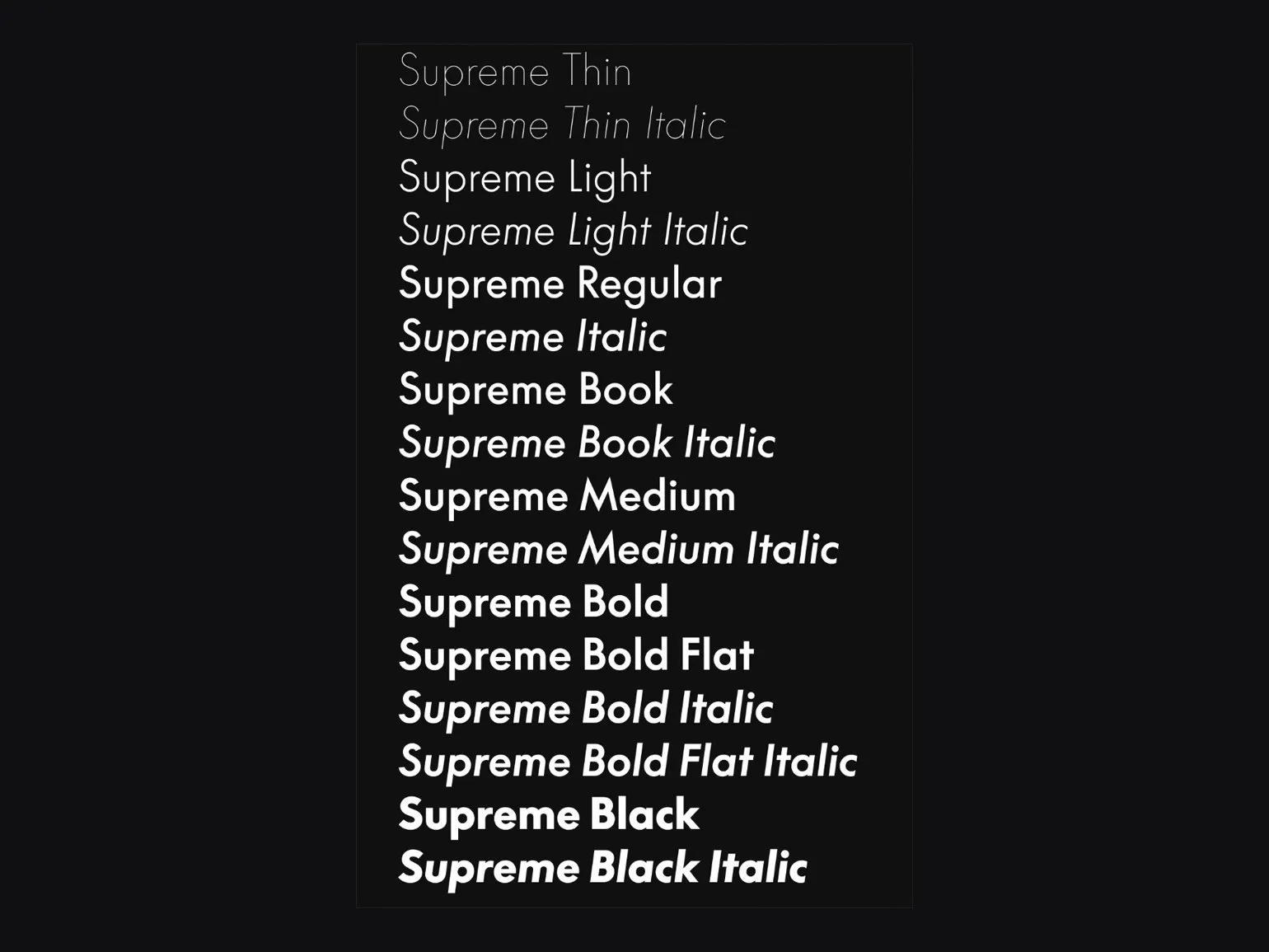
A font is a specific typeface that is part of a typeface and has certain characteristics, such as height, weight, and slant. In everyday speech, the term "font" is often used to refer to an entire typeface, but in professional settings, it refers specifically to a single typeface. Understanding the difference between a font and a typeface is important for designers, typographers, and anyone who works with text, as it affects the perception and readability of the material. The optimal choice of font can significantly improve the visual design and effectiveness of communication.
A grapheme is a basic unit of writing that serves as a kind of "base" for a letter or sign and maintains an unchanged form regardless of the font. Although different fonts may visually differ, graphemes play a key role in letter recognition and text readability. Understanding graphemes is important for language learning and typeface design, as they determine how letters are perceived and interpreted by readers.
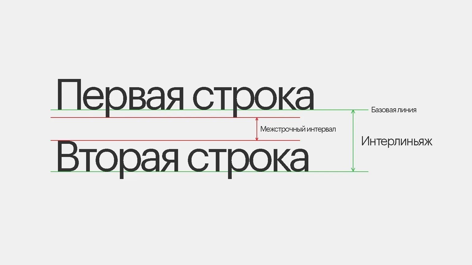
Line leading is the distance between lines of text, measured from the baseline of one line to the baseline of the next. The baseline is an imaginary line that the bottom of most letters joins. Optimal line spacing significantly improves the readability of text, making it easier to perceive information. Correctly selected space between lines helps avoid merging lines and makes the text more structured, which is especially important for web content and printed materials.
Font size is the vertical size of a font, typically measured in typographic points (pt). In digital design, it can be represented in pixels (px), relative units (em), or conventional units (dp). Choosing the right font size plays a key role in the perception of text, ensuring readability and aesthetic appeal. The optimal font size helps users perceive information more easily, which is especially important for web design and user interfaces. The font size should be selected taking into account the target audience and context of use to ensure maximum communication effectiveness.
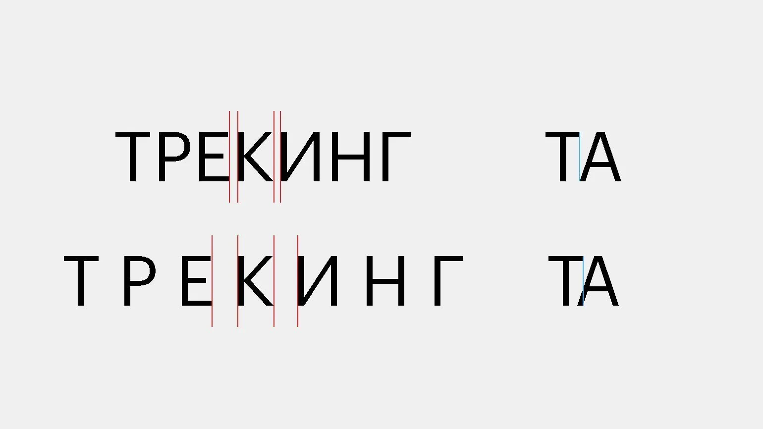
Tracking, or spacing, is the distance between letters in a line of text. Increasing tracking creates a light and airy feel to text, while decreasing it makes the text denser and more compact. Kerning, in turn, regulates the distance between pairs of specific characters and often requires manual adjustment, as some letter combinations require special attention. For example, in the combination ‘AT’, the kerning is reduced, creating the effect of the letter ‘T’ hovering over ‘A’. Correct use of tracking and kerning significantly affects the readability and aesthetic perception of the text, making it more harmonious and attractive to the reader.
Graphic Designer PRO: 5 Steps to a Successful Career
Want to become a graphic designer? Learn 5 key steps to a successful career and creating a unique portfolio!
Learn more