Learn: Font in design
Learn more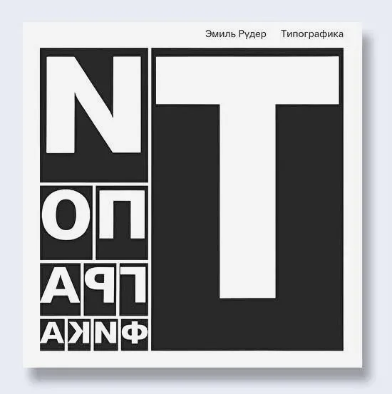
In his definition of type design, Emil Ruder emphasizes that the main task of fonts is to effectively convey written information. This principle is key in typographic design, where every detail of the font should contribute to the clarity and readability of the text. It is important that fonts not only attract attention, but also ensure ease of perception of information. The correct choice of font, its style and design play a significant role in communication with the reader, making the text more accessible and understandable. In contemporary typeface design, the emphasis on functionality and aesthetics remains relevant, emphasizing the importance of a competent approach to typography.
In Typography, Ruder shares his 25 years of experience in the field of typography. He examines the form of letters, their interaction with meaning, and the technical aspects of working with words. This book will be a useful resource for designers, typographers, and anyone interested in a deep understanding of the art of typography.
Publisher: Dmitry Aronov.
Dmitry Aronov is an experienced publisher who specializes in the creation and distribution of high-quality content. His portfolio includes various projects covering a wide range of topics. Aronov strives to ensure high publishing standards, focusing on relevance and reliability of information. In his work, he actively uses modern methods of promotion and content optimization, which allows him to achieve significant results in the publishing industry.
Emil Ruder is a renowned Swiss typographer and graphic designer who has made significant contributions to the development of typography. From 1942, he taught general typography at the Basel School of Art, later becoming its director. In collaboration with designer Armin Hofmann, Ruder developed an integrated approach to teaching typography, which formed the basis of the curriculum. His work and methods continue to influence contemporary practices in graphic design and typography.
In this text, we will discuss the principles Ruder used when working with words and suggest ways to apply them in your practice. These principles will help improve the quality of your content and make it more appealing to your audience. By applying Ruder's methods, you can increase the readability and effectiveness of your texts, which in turn will increase their visibility in search engines. You will learn how to create structured and informative materials that will meet the interests of your target audience.
Function and Form
The legibility of a text directly depends on the fundamentals of typography, such as kerning, leading, spacing, and justification. Ruder emphasized that a typographer must not only be aware of these elements but also skillfully apply them in practice. Ignoring these aspects can lead to an imbalance between function and form, as a result of which the text loses its primary purpose - to be understandable and accessible to the reader. The correct use of typographic techniques contributes to improving the perception of the text and increasing its effectiveness.
With the invention of printing and the increase in reader demand, the relationship between function and form became more complex. There were periods when typographic form prevailed over content, as can be seen in the examples of Baroque title pages or the constructivist typography of the Bauhaus era. At the same time, the first editions of Goethe and Schiller demonstrate how form-making can be adapted to suit legibility. These examples highlight the importance of balancing aesthetics and functionality in book design, which remains relevant in contemporary publishing.
Emil Ruder was a prominent Swiss graphic artist and typographer who had a significant influence on the development of modern design. His work in typography and graphic design became the foundation for many modern approaches. Ruder emphasized the importance of legibility and the aesthetics of typefaces, which contributed to the creation of new standards in typography. His books and publications, including "Typography: Fundamentals" and "Font and Form," serve as essential resources for designers and typographers worldwide. Ruder's work continues to inspire a new generation of designers, emphasizing the importance of harmoniously combining form and function in graphic design.
To understand how form influences legibility, consider the word "buch" (German for "book") in various layouts. Studying different styles and formats of text presentation reveals how they affect information perception. Different fonts, sizes, line spacing, and other design elements can significantly alter the readability of text. The correct choice of layout improves visual perception and facilitates the process of information comprehension by the reader.
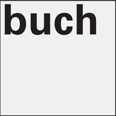
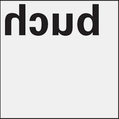


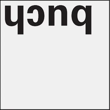


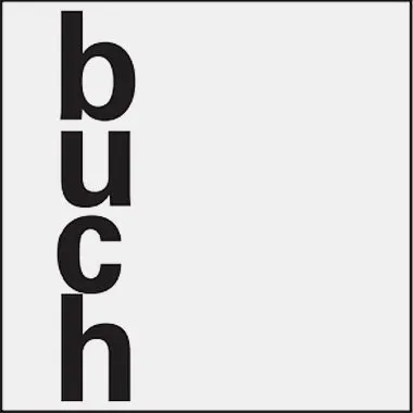
Images: Emil Ruder, "Typography" / Publisher Dmitry Aronov, 2017
Emil Ruder is an outstanding A designer and typographic theorist whose work continues to influence contemporary graphic design. His book, "Typography," is an essential resource for designers, typographers, and anyone interested in the art of typography. In this book, Ruder shares his principles and methods for creating harmonious and legible text compositions. Studying his approaches to typography will significantly improve your design skills and visual perception. Publisher Dmitry Aronov took an important step in releasing this work, which remains relevant in the world of graphic design.
Ruder believed that form and function can coexist harmoniously without compromising the legibility of texts. In his works, he emphasized form, making them difficult to read without additional effort. This highlights the importance of balancing aesthetics and functionality in design, especially in the context of creating readable content.
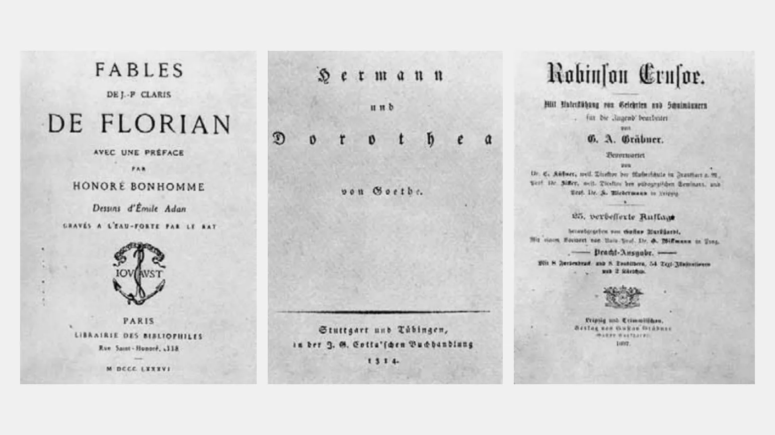
Ruder described these covers as examples of "uncreative and bland design" that are off-putting in their dullness. Such designs fail to attract attention and generate interest, which negatively impacts product perception. An effective cover should inspire and make people want to learn more, while similar options only worsen the impression and can lead to the loss of potential customers.
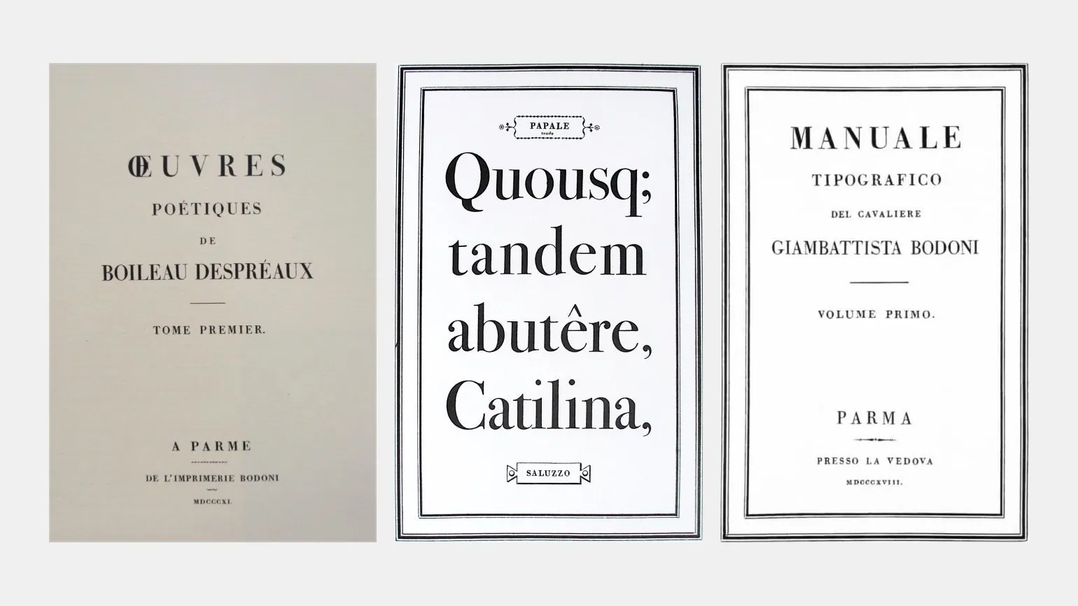
Ruder highlights Giambattista's late works Bodoni's works are striking examples of the harmonious combination of form and function in typography. These works demonstrate how aesthetic elements can effectively support the readability and perception of text, making them relevant in contemporary design. Bodoni, renowned for his mastery of typeface design, skillfully used various graphic techniques to emphasize the expressiveness of the printed word while preserving its functional qualities.
Of course, I am happy to assist you with text editing. Please provide the source text you wish to revise.
Typographic masterpieces represent the perfect unity of the word and its typographic form. In 16th-century Venetian editions and in the late works of Giambattista Bodoni, the high culture of typography not only does not interfere with, but actually contributes to the profound semantic revelation of the text. These works demonstrate a harmonious blend of functionality and aesthetics, making them exemplary examples of typographic art.
Emil Ruder is a prominent Swiss typographer and designer who has had a significant influence on modern graphics and typography. His works are characterized by strict forms and clear structure, making them relevant today. Ruder developed numerous typefaces and typographic systems that are widely used in print and digital environments. His approach to design is based on the principles of functionality and aesthetics, allowing him to create harmonious and readable text blocks. The application of his typographic techniques helps improve the perception of information and increase its accessibility to a wider audience. Emil Ruder remains a key figure in the world of typography, and his legacy continues to inspire designers and graphic artists around the world.
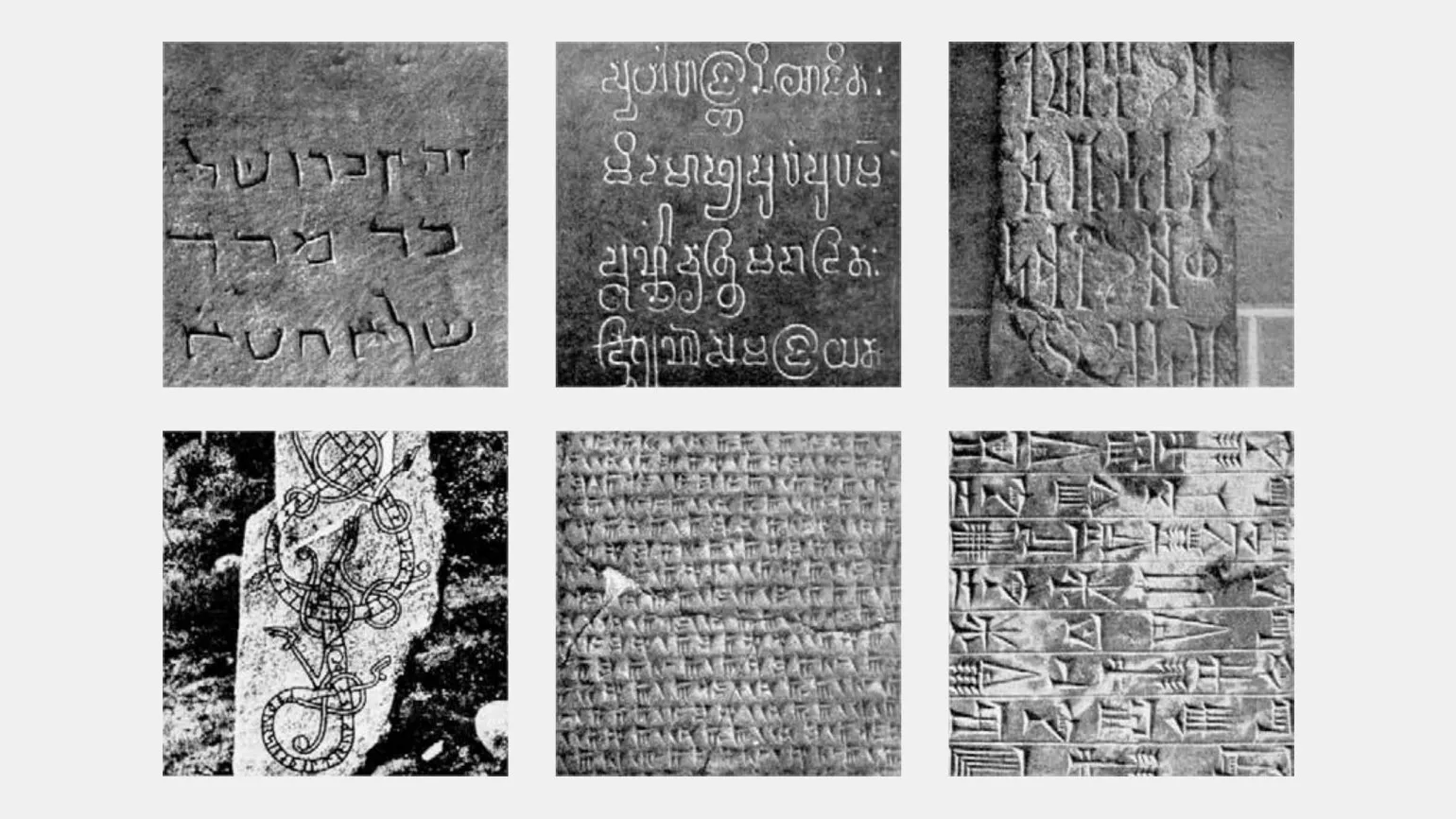
You've probably noticed how long you can study posters with text in an unfamiliar language. This curiosity, according to Ruder, arises from unfamiliarity and misunderstanding of the language, which makes foreign typography particularly appealing. This interest applies to both modern typographic works and ancient rock carvings. Such texts not only attract attention with their design but also arouse a desire to unravel their meaning, immersing us in a unique cultural environment, reflecting the diversity of languages and styles. The visual component of foreign inscriptions creates an atmosphere of mystery and intrigue, making them a subject for study and discussion.
Foreign and unusual fonts attract our attention, evoking admiration for their forms, just as it does with works of art. If we could read these signs, we might lose interest in their visual aesthetics. As Chesterton remarked while gazing at the lights of Broadway at night in New York City, "What a fantastic, enchanted garden would open to one who was fortunate enough to be illiterate!" Thus, typefaces not only convey information but also create a visual experience that inspires and enchants. Emil Ruder was a prominent Swiss typographer and graphic designer who had a significant influence on the development of typography in the 20th century. His work is known for its rigorous approach to typefaces and composition, making him one of the most respected professionals in the field of graphic design. Ruder actively promoted the idea of functionality and clarity in typography, which was reflected in his books and teaching courses. He was also an advocate of the use of modern technology in design, which facilitated the integration of traditional methods with innovation. His legacy continues to inspire designers around the world, emphasizing the importance of harmony between form and content in graphic design.

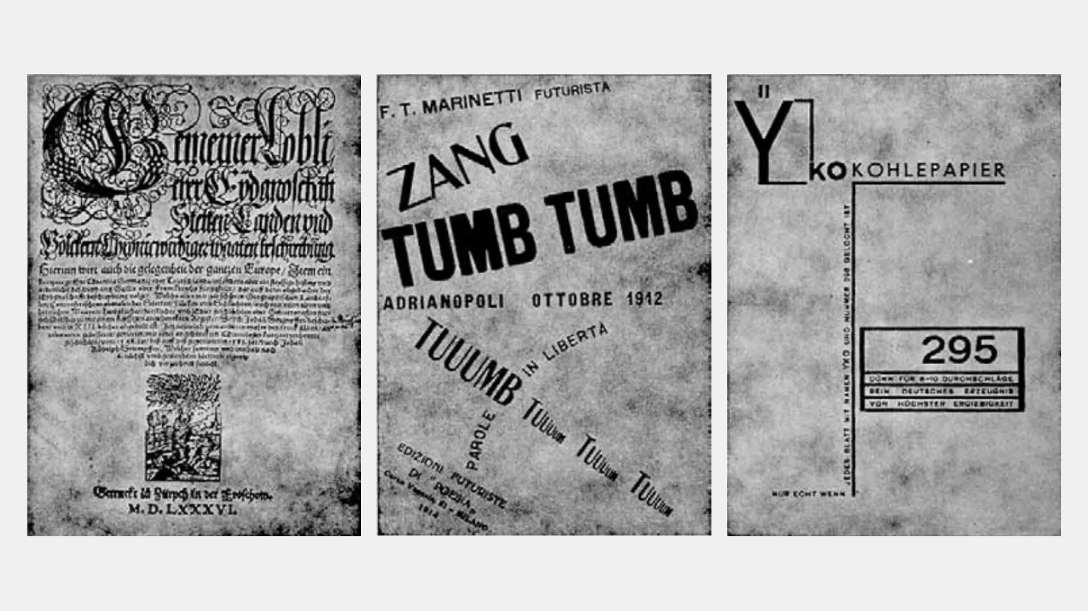
With the invention of printing and the rise of readership, the relationship between function and form became more complex. Historically, there have been periods when typographic form was exaggerated, losing touch with content. Baroque title pages and the constructivist typography of the Bauhaus era are striking examples. At the same time, first editions of Goethe and Schiller demonstrate how form can be adapted to enhance legibility. This emphasizes the importance of harmony between visual design and textual content, which remains relevant in contemporary design.
Emil Ruder was a prominent Swiss typographer and designer, known for his significant contributions to the development of graphic design and typography. His works are distinguished by the rigor of form and the harmony of typefaces, which made him one of the most influential design experts of the 20th century. Ruder paid particular attention to typographic space and the interaction of text with graphic elements, which allowed him to create visually appealing and readable compositions. His books and publications on typography remain relevant and in demand among designers and typographers, providing a deep understanding of the fundamentals of typography. Emil Ruder continues to inspire new generations of designers, emphasizing the importance of a careful approach to the selection of typefaces and their application in various media.
Typographic masterpieces represent the perfect combination of words and typographic form. In 16th-century Venetian editions and the later works of Giambattista Bodoni, the high culture of design does not interfere with the thoughtful disclosure of content. These works demonstrate a harmonious interplay of function and form, emphasizing the importance of both visual and textual components in typography.
Emil Ruder is a prominent Swiss typographer and designer known for his significant contributions to the development of typography and typeface design. His works are distinguished by their high quality, attention to detail, and innovative approaches to composition. Ruder actively explored the interaction of text and space, making his work unique and sought-after. He designed numerous typefaces that are used in print and digital products worldwide. Emil Ruder also taught at various educational institutions, sharing his knowledge and experience with new generations of designers. His legacy continues to inspire designers and typographers, highlighting the importance of quality typography in modern visual communication.
Foreign and obscure typefaces capture our attention like works of art, captivating us with their forms. If we could read these scripts, we might lose interest in their aesthetics. As Chesterton remarked, looking at the lights of Broadway at night in New York: "What a wonderful, enchanted garden it all would appear to one who is happily illiterate." This paradox highlights how visual perception can be more valuable than understanding text.
Emil Ruder was a prominent Swiss graphic artist and typographer known for his contributions to the development of modern typeface design and typography. His work has had a significant impact on visual communication, combining simplicity and functionality. Ruder actively explored the interaction between text and image, which made his work relevant and in demand across various design fields. His approach to typography was based on the principles of clarity and readability, which allowed for more effective communication. Emil Ruder left a legacy that continues to inspire designers and typographers around the world.
Geometric, Optical, and Organic
Ruder argued that it is impossible to create a geometrically perfect letter that would not be perceived by people as unsuccessful. This is due to the fact that the human eye distorts the perception of forms, and therefore the typographer must take these distortions into account in their work. The ability to adapt letters to the viewer's perception is a key aspect of typographic design, which allows for the creation of harmonious and readable fonts.
The eye tends to exaggerate horizontal lines and perceive vertical elements less effectively. Optical illusions cannot be ignored, as they can significantly affect the perception of a design. Every designer must take these aspects into account to avoid mistakes and create a harmonious visual perception. Understanding the characteristics of visual perception will help improve the quality of design and make it more effective.
Emil Ruder was a prominent Swiss typographer and graphic designer, known for his significant contributions to typography and print design. His works were distinguished by a unique style and high functionality, which made him one of the most influential representatives of his generation in the field of design.
Ruder actively used modern technologies and methods, which allowed him to create works that combined both aesthetic appeal and practical value. He also focused on education, sharing his knowledge and experience with future generations of designers. His legacy continues to inspire modern professionals in the fields of graphic design and typography.
Studying the work of Emil Ruder provides valuable information on the development of design and typography, as well as the importance of innovation in this field.
Optical illusions in typography are varied and fascinating. They have the ability to surprise and attract attention, creating unconventional visual effects. This article presents some popular typographic illusions that demonstrate how text and fonts can deceive our perceptions. These illusions can be used in design to create original and memorable projects.




Emil Ruder is one of the key figures in the world of typography. His work, presented in the book "Typography," published by Dmitry Aronov in 2017, serves as an essential source of knowledge for designers and typographers. Ruder focuses on the meaning of fonts and their role in visual communication. He explores how the right choice of typography affects the perception of information and the reading experience. The book covers the basic principles of typographic design and offers practical tips for creating harmonious and readable texts. Studying Ruder's work will help every designer deeper understand the art of typography and improve their skills in this field.
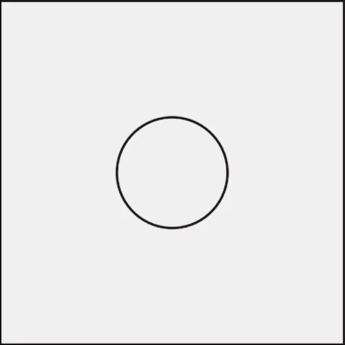
Explore the original drawing of the letter O from the Universe font. A circle is drawn around the letter, which helps to visually identify deviations from geometric accuracy. This allows for a better understanding of the design features of the font and its impact on the perception of the text.
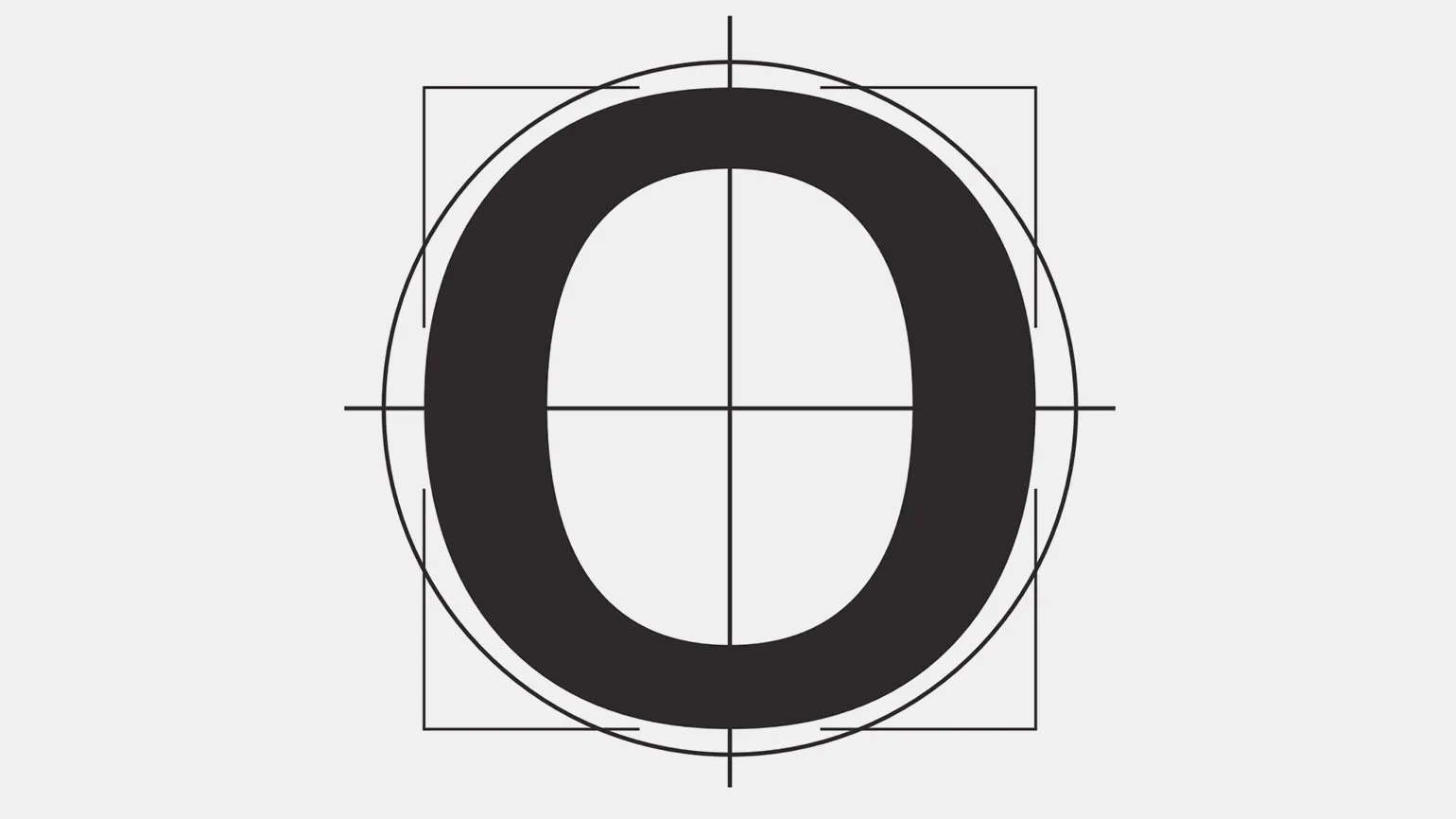
To achieve high-quality letterforms from geometry alone, it is not enough to simply use a compass to add lateral projections to straight strokes. The projections of the strokes are formed from the inside out, and to ensure the stability of the letters, the upper projections should be smaller than the lower ones. Also, the transitions from arcs to straight lines require additional refinement to create a harmonious and balanced visual perception. Correct design of these elements helps achieve clarity and expressiveness of the font, which is especially important in typography and design.
Emil Ruder was a renowned Swiss graphic artist and typographer, renowned for his outstanding works in the field of font and design. His creative approach to typography had a significant influence on graphic design of the 20th century. Ruder became a pioneer in the use of modern fonts and developed unique techniques that made his works recognizable and in demand.
Emil Ruder's works are characterized by clarity, simplicity, and functionality. He sought to create fonts that are not only aesthetically pleasing but also easy to read. His book "Typography: Fundamentals and Principles" has become a desk tool for many designers, providing valuable guidance on typeface use and text layout.
Modern designers continue to draw inspiration from Ruder's legacy, applying his principles to their projects. His contributions to typography and graphic design remain important to this day, and his work remains relevant in the context of modern visual communication. Emile Ruder is a name that will forever be associated with high-quality typography and design.
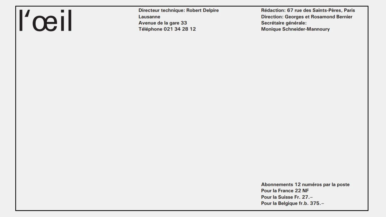
A designer can effectively use the principle of geometric contrast to create visually appealing solutions. A striking example is the L'oeil magazine logo, where the letters l and i are executed with geometric proportions, while the oe ligature demonstrates an organic combination that takes into account the perception of rounded shapes. This creates a striking contrast that enhances the visual perception of the logo and makes it memorable. Using geometric contrast in design helps attract attention and increase brand recognition.
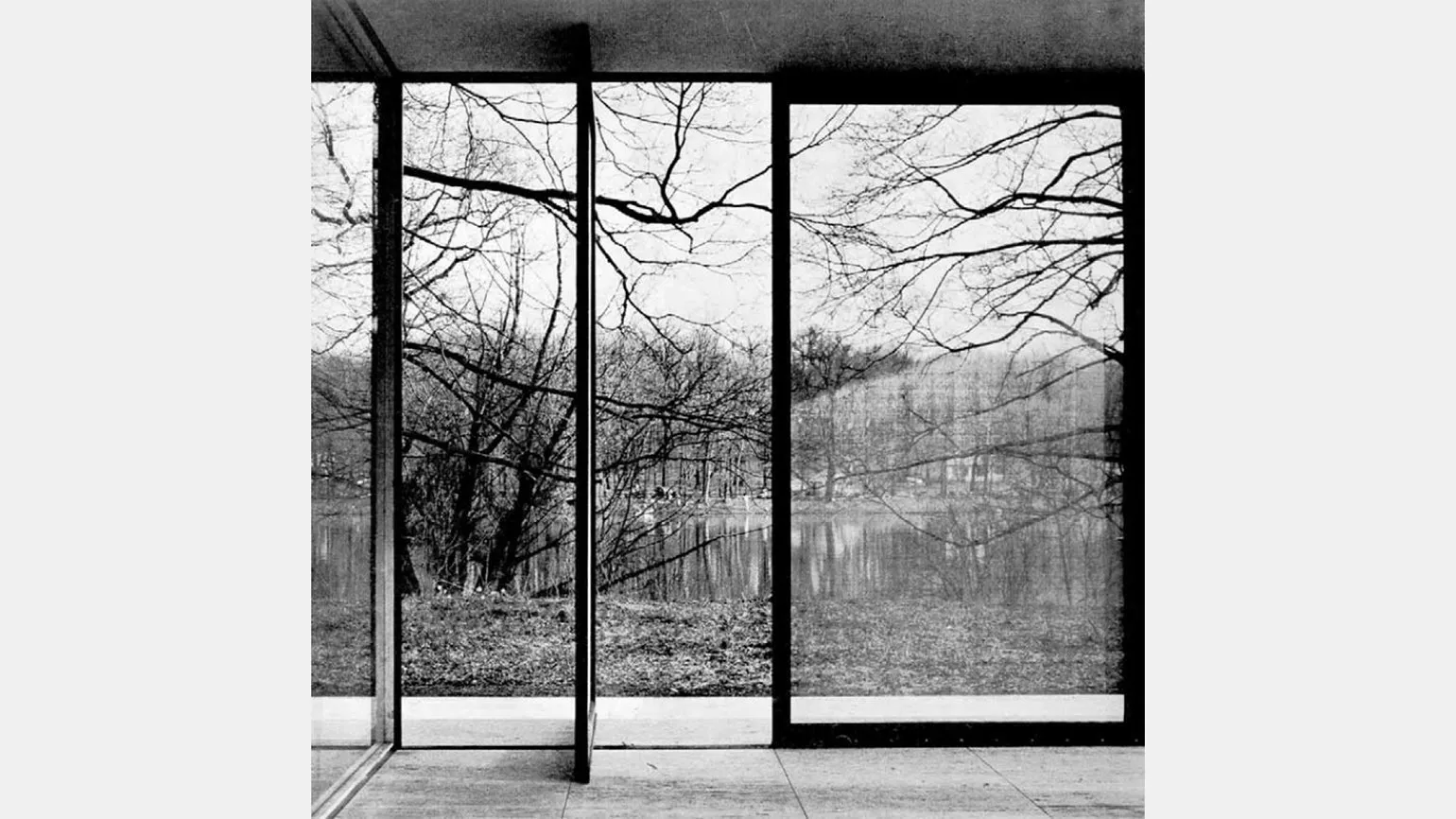
The effect of contrast between the structural and technical forms of the building and Natural elements can be seen not only in typography. In the case of the Fox River house, the trees stand out vividly against its geometric lines. This creates a striking contrast between the strict architectural forms and the organic contours of nature. This visual effect emphasizes the harmony between the artificial and the natural, making the environment more attractive and interesting to perceive.
The eye tends to exaggerate horizontal elements, while the perception of vertical objects becomes less pronounced. Optical illusions should not be considered unimportant; they play a significant role in design and engineering. Every designer needs to be aware of these aspects in order to effectively solve problems and create harmonious visual compositions. Understanding the peculiarities of perception will help avoid common mistakes and improve the quality of projects.
Emil Ruder was a prominent Swiss graphic artist known for his significant achievements in the field of typography and design. His work had a profound influence on the modern understanding of typefaces and composition. Ruder actively explored the interaction between text and image, paying particular attention to readability and aesthetics. He developed unique methodologies that became the basis for many designers and typographers. His contribution to typography is not limited to theory alone; Emil also created practical works that demonstrated his ideas in practice. Through his innovations, he continues to inspire a new generation of designers around the world, remaining a key figure in the history of graphic design.
To achieve high-quality letterforms, geometry alone requires more than simply using elements such as a compass to add lateral cusps to straight strokes. Stroke cusps must be formed from the inside out, ensuring their harmonious combination with the main elements. To ensure the stability of the letters, the upper cusps should be smaller than the lower ones. Likewise, all transitions from arcs to straight lines require additional refinement to create an aesthetically pleasing and functional typeface design.
Emil Ruder is a renowned Swiss typographer and designer who has had a significant influence on modern art and typography. His works are characterized by strict forms, clarity, and functionality. Ruder is one of the founders of the Swiss style in design, which emphasizes simplicity and conciseness. His working methods included a combination of traditional typographic techniques with modern approaches, which made his work unique. Emil Ruder was also actively involved in teaching, passing on his knowledge and experience to new generations of designers, thereby contributing to the development of typography and graphic design. His legacy continues to inspire designers around the world, making him a key figure in the history of visual communication.
Dot, Line, Plane
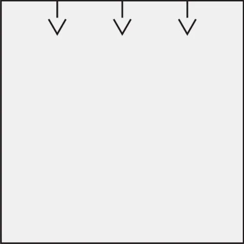
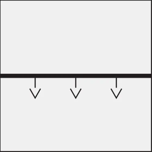
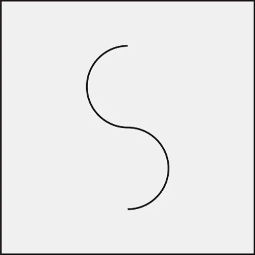
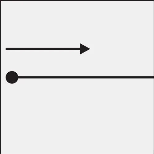
The fundamental elements of typography include the dot, line, and plane. According to Ruder, all objects are in constant motion, and every form has the potential to form new ones. For example, a dot can create a line, and lines can create a plane. These interactions form the basis for further development and complex compositional solutions in design.
This section presents examples of the basic forms in typography and their application to the designer. Typography plays a key role in visual communication, and understanding the different forms will help create more effective and attractive designs. Designers can use various typographic elements, such as fonts, sizes, leading, and kerning, to convey the desired message and create a harmonious composition. By using a variety of forms, a designer can emphasize important elements and improve the readability of the text, which, in turn, contributes to a better perception of information by users. Correct use of typographic forms allows you to create a unique style and enhance the aesthetics of any project.












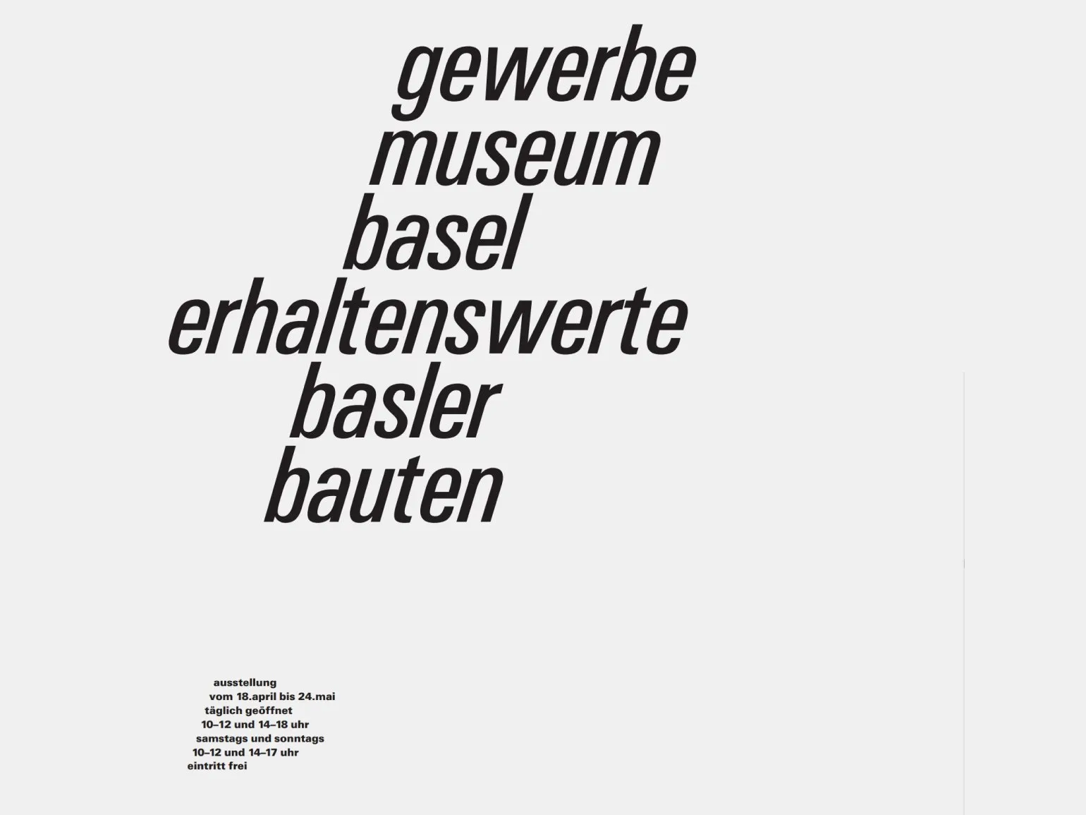
In the poster for the Museum of Crafts in Basel, the designer uses italics, shifting each line. This adds dynamism to the composition and turns it into a single line, which enhances visual perception and focuses attention on the content. This approach allows us to create a harmonious and memorable design that reflects the essence of the museum and its collections.
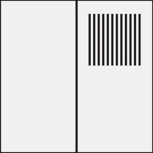
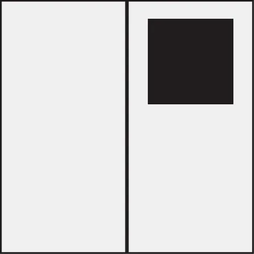
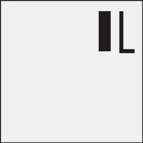
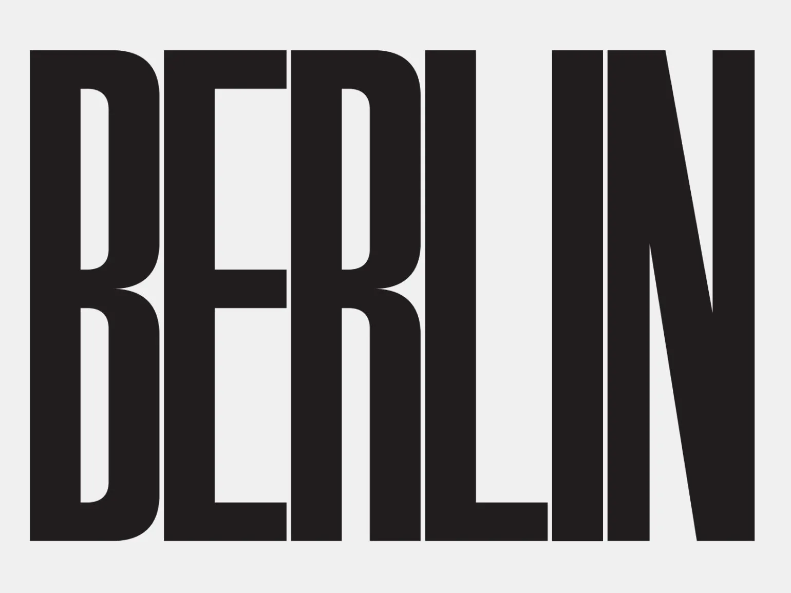
The inscription "BERLIN" is designed in such a way as to create a contrast between linear and planar elements. The bold font creates a plane that contrasts sharply with the white lines. This design emphasizes the modern style and draws attention to the name of the city.
Contrasts
Understanding the properties of objects is difficult without comparison with other objects. Some terms and concepts become meaningless without the presence of opposites. For example, pairs such as up and down, horizontal and vertical, light and dark require context to understand their significance. Comparison helps form a more complete understanding of the world and facilitates better assimilation of information. Modern man perceives the world through the prism of opposites. For him, categories such as plane and volume, distant and near, external and internal are not mutually exclusive. He recognizes that in life both aspects are often present simultaneously, and instead of choosing between "either/or," he prefers a "both/and" approach. This flexibility of thinking allows him to better adapt to change and find harmony in diversity.


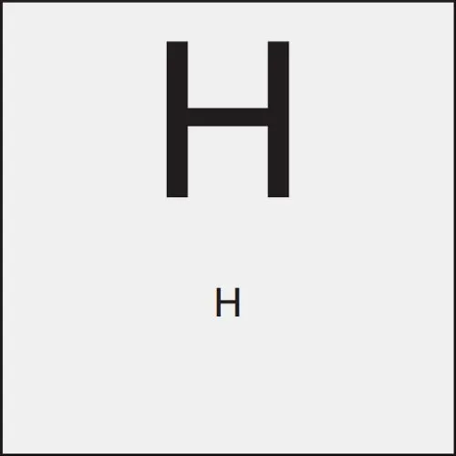
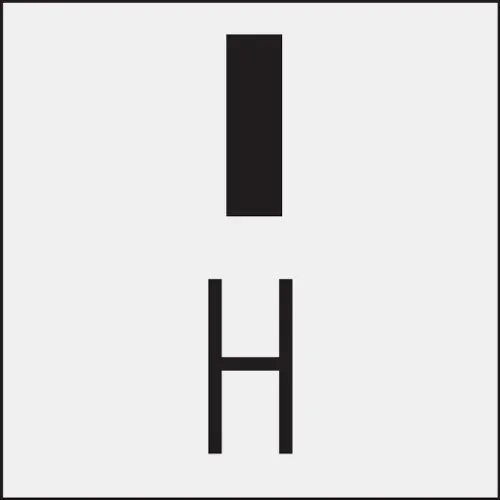

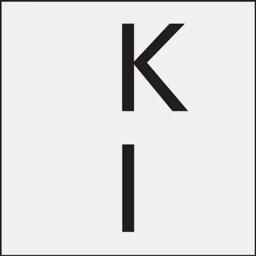
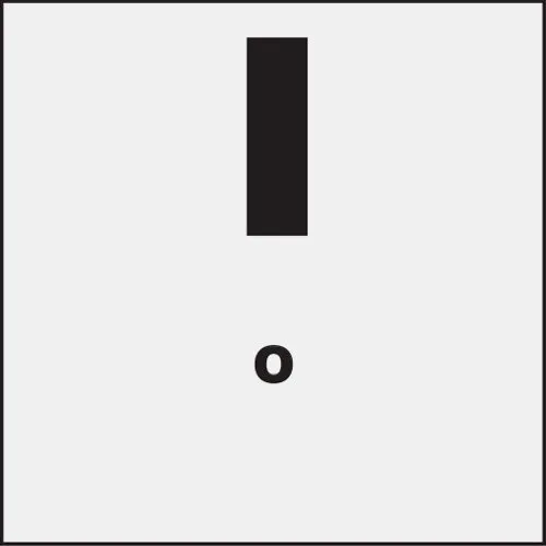
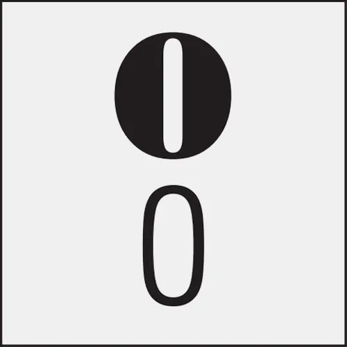
Images: Emil Ruder, "Typography," published by Dmitry Aronov, 2017. Emil Ruder is a key figure in the field of typography, and his work has had a significant influence on modern design. "Typography" is an essential source of knowledge about the principles of text design and perception. It examines key aspects of typographic art, such as font selection, layout, and the interaction of text with images. Studying these principles helps designers create more effective and engaging visual communications.
To maintain harmony in composition, Ruder recommends avoiding extreme contrasts. For example, note the black logo in this birth announcement. It fits perfectly into the overall design, emphasizing the importance of the event and creating visual integrity. Avoiding excessive contrasts helps maintain balance and avoid visual overload, making the message more pleasant to perceive.
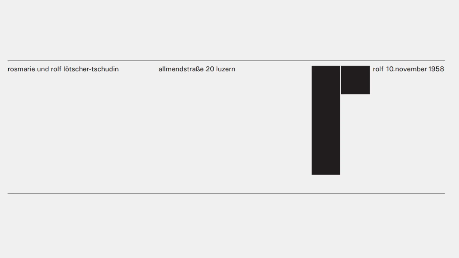
The relationship between large and small elements, as well as between dark and light areas have reached their limits, disrupting the visual balance of the layout. This affects the overall harmony of the design, creating discomfort for the reader. The correct ratio of sizes and contrasts is key to creating an aesthetically pleasing and functional page.
When juxtaposing opposites, it is important to maintain the overall impression of integrity. Too sharp a contrast, for example, between light and dark or large and small, can lead to one element being significantly outweighed. This disrupts the balance between the opposites, making the composition less harmonious. To achieve balance, it is important to consider not only the contrast but also the interaction of the elements so that they complement each other and create a single, holistic picture.
Contrast should be organized so that both opposing elements have room to grow and develop.
Emil Ruder was a prominent Swiss typographer and designer whose contribution to graphic design is hard to overestimate. Born in 1914, he became known for his innovative approaches to typography and typeface design. Ruder actively worked on issues of readability and visual aesthetics, which made his work a benchmark for many designers. His books, such as "Typography: Basic Principles" and "Typography and Its Influence", have become essential teaching materials for students and professionals in the field. Ruder also actively participated in international exhibitions, where he showcased his ideas on the interaction of text and image. His legacy continues to inspire a new generation of designers and contributes to the development of modern graphic design.
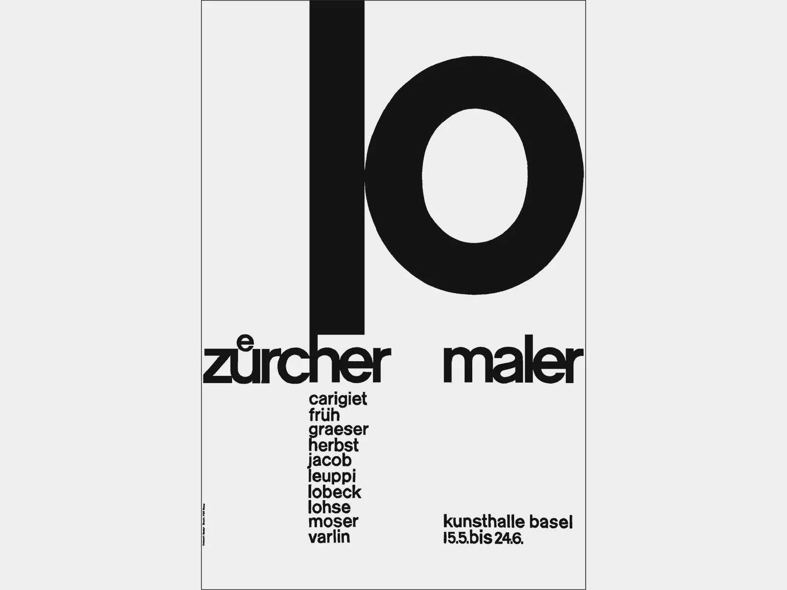
In this poster for an art exhibition, the composition is based on contrasts, such as straight and round shapes, hard and soft elements. The small font gives the rounded shapes a monumental feel, while the vertical line of the number 1 and the small lettering create a dynamic that is broken by the line «zurcher maler». This approach allows us to focus on the interaction of various visual elements, emphasizing the uniqueness of the exhibition.
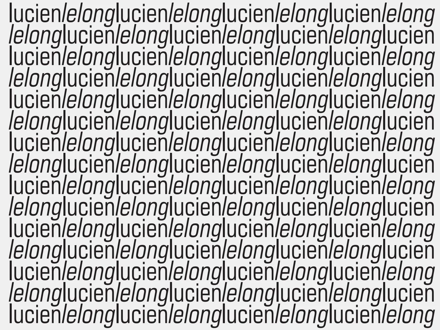
Lucien Lelong's wrapping paper clearly shows a striking contrast between oblique and straight lines. This design element lends the paper uniqueness and style. The slanted lines create dynamism, while the straight lines add formality. This visual effect makes wrapping paper an ideal choice for gift wrapping, highlighting their elegance and originality. Lucien Lelong, known for his exquisite textiles, continues to bring unique solutions to the world of fashion and design that fascinate and inspire.
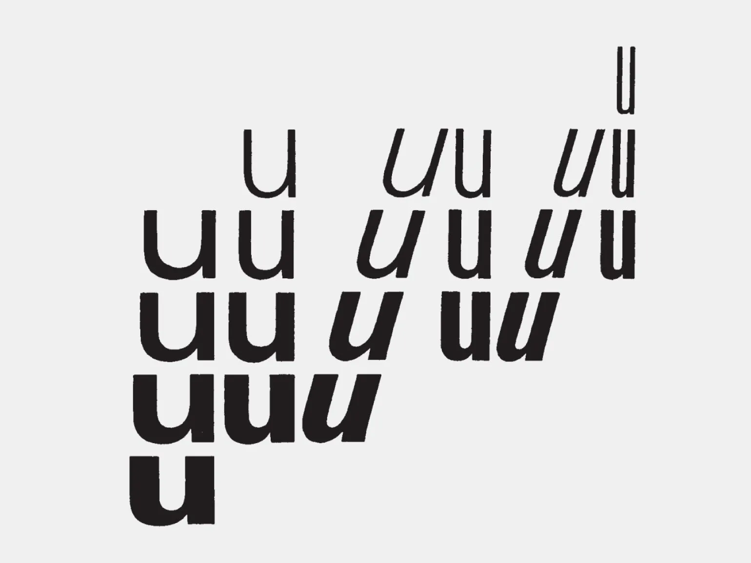
Striking contrasts are also evident within the fonts themselves. For example, in the composition with the letter «u», one can see how the typographer utilizes the contrasts of the Universe font within a single typeface. Thin and thick lines, flat and voluminous elements, narrow and wide shapes, light and dark shades, as well as straight and oblique lines, static and dynamic elements are featured. These contrasts give the design depth and expressiveness, which makes the typography more interesting and attractive.
Modern people perceive the world through the prism of opposites. For him, categories such as plane and volume, distant and near, external and internal become mutually complementary. He is no longer limited to a simple choice between "either-or," but strives to understand how to combine different aspects of reality. This allows him to comprehend the world around him more deeply and find harmony in contrasts.
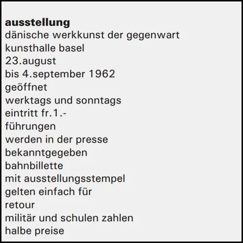
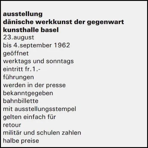
When juxtaposing opposites, it is important to maintain an overall sense of harmony. An excessively sharp contrast, for example, between light and dark or large and small objects, can lead to one element becoming dominant, thereby disrupting the balance with the opposing element. To achieve visual and semantic unity, it is necessary to carefully consider the relationship of contrasts to ensure balance and integrity of the composition.
Contrast should be created in such a way as to allow for the development of both opposites. This not only helps maintain balance but also promotes the harmonious interaction of various elements. It is important that each side has room to grow and evolve, which in turn enriches the overall context.
Emil Ruder is an outstanding Swiss typographer, designer and educator who has had a significant influence on the development of modern type and typography. His works are characterized by strict minimalism and attention to detail, which makes them a model for many designers. Ruder emphasized the importance of harmony between text and space, which contributed to improved readability and perception of information. He also actively shared his knowledge, teaching a new generation of designers and typographers. Emil Ruder remains a significant figure in the world of graphic design and typography.
Color
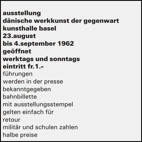
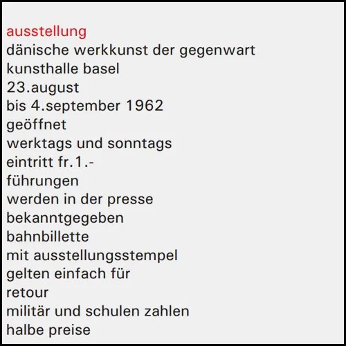
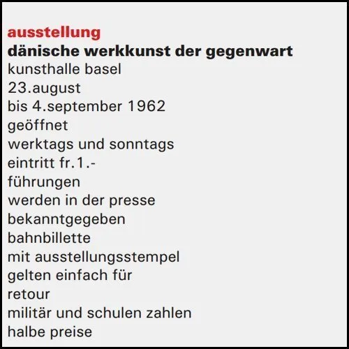
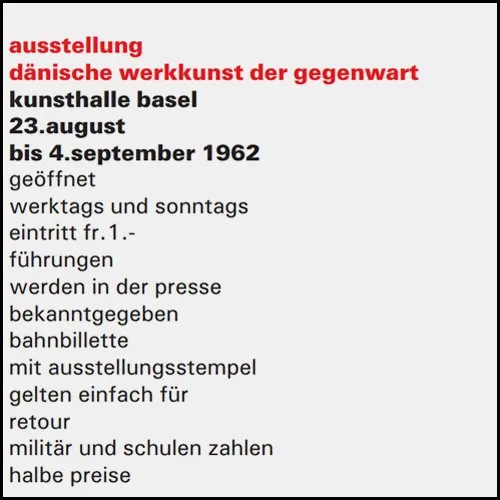
In typography, black and its shades of gray traditionally occupy a leading position. These colors combine beautifully with bright shades, especially red. In early printed books, black was used predominantly, and red served to emphasize important thoughts. This contrasting use of colors not only highlighted key ideas but also created an interesting composition with minimal use of design elements. This approach remains relevant in contemporary design, allowing it to convey meaning and attract the reader's attention.
Bright colors should contrast harmoniously with black, as is already evident from the first sketch of the printed work. Red can dominate, reflecting its inherent essence—authority and reluctant submission to other shades. However, in small quantities, red, surrounded by black, acquires special value and brightness. This interaction creates visual interest and enhances the emotional impact on the viewer, making such compositions particularly appealing.
Emil Ruder was a prominent Swiss graphic artist and typographer, known for his contributions to the development of modern typeface design and typography. His works are distinguished by a unique style and attention to detail, which made him one of the most influential designers of the 20th century. Ruder was actively involved in teaching, teaching students the principles of typography and design. His books and articles on fonts and their use in print continue to be relevant and in demand in the world of graphic design. Emil Ruder left a significant legacy that inspires new generations of designers.
Images: Emil Ruder, "Typography" / Publisher Dmitry Aronov, 2017
Emil Ruder's book "Typography", published by Dmitry Aronov in 2017, is an important work in the field of graphic design and typography. It examines key aspects of typography, including typeface selection, text layout, and visual hierarchy. Ruder shares his insights on how typography influences the perception of information and the overall impression of a design. This work is an indispensable resource for designers, students, and anyone interested in the art of typography. The book helps better understand the significance of typography in the modern world and its role in effective communication.
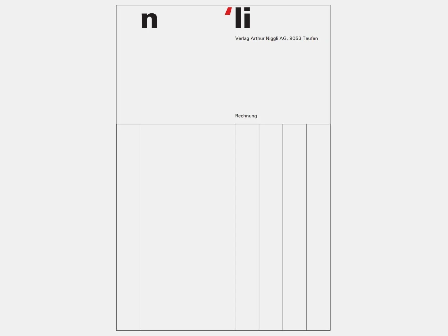
The invoice form for Arthur Neagley AG uses red sparingly, allowing it to stand out and lend special value to the design. The designer has harmoniously combined three primary colors—red, gray, and black—to create a visually appealing and balanced image. This color scheme not only attracts attention, but also emphasizes the professionalism and style of the publishing house.
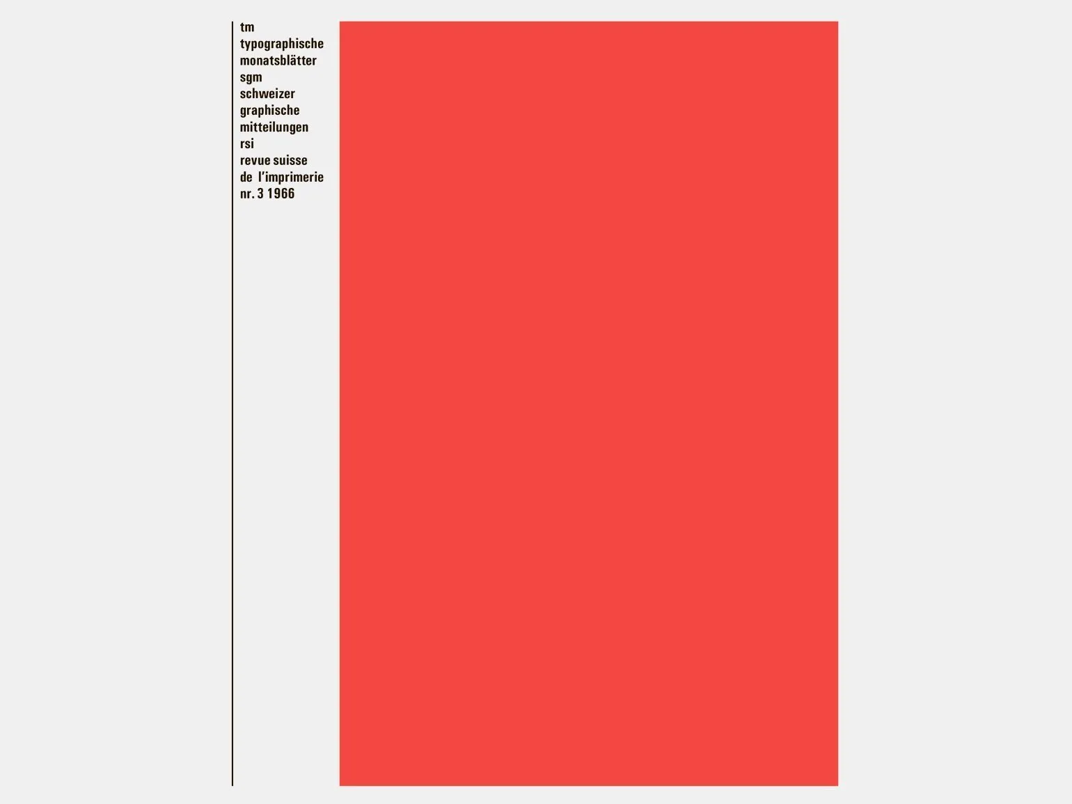
The cover of the Typographische Monatsblätter magazine is dominated by red, which attracts attention. A compact black spot on the background enhances the saturation of the red, creating contrast. It is interesting that if you close the text, the red color loses its brightness and becomes less expressive.
Bright color should be in Contrasting relationships with black, which is evident from the initial sketch of the work. Red can dominate, which corresponds to its inner essence—it is powerful and reluctant to submit to other colors. However, in small quantities, red, surrounded by a large mass of black and closely juxtaposed with it, acquires additional value and brightness. Such color contrast creates dynamism and attracts attention, making the composition more expressive and memorable.
Emil Ruder is an outstanding Swiss typographer and designer, whose influence on the world of typography is difficult to overestimate. He was born in 1914 and became known for his innovations in the field of graphic design and typography. Ruder paid special attention to the interaction of type and space, which made his works particularly attractive and functional.
He designed many typefaces and taught, passing on his knowledge and experience to new generations of designers. In his works, Ruder sought to create harmony between text and visual perception, which contributed to improved readability and aesthetics. His approach to typography continues to inspire designers worldwide, making Emil Ruder one of the key figures in the history of graphic design.
When reprinting an 18th-century book, there are two main arguments against using a typeface from that era. First, the new edition is a product of the 20th century and should reflect the specifics of modern times, despite the fact that its content refers to the past. Second, a typographer should not interpret literature at their own discretion. Literature speaks for itself: the content either attracts the reader or it does not.
Emil Ruder is a prominent Swiss typographer and designer, known for his work in the fields of graphic design and typography. Ruder played a key role in the development of modern typeface art and became a model for many designers. His approach to typography combines aesthetic and functional aspects, which makes his work unique. Emil Ruder was also actively involved in teaching, passing on his knowledge and experience to a new generation of designers. His influence on design and typography is still felt today, and his work remains relevant for study and inspiration in the world of graphic design.
In advertising, the importance of the content of a word or text is often determined through typography, as public perception occurs first visually and then through reading. A typographer must strive for harmony between the meaning of a word and its typographic representation to ensure maximum communication effectiveness and attract the attention of the target audience. The correct choice of fonts, sizes, and spacing can significantly enhance the perception of a message and its memorability.
Emil Ruder is a prominent Swiss typographer and designer whose work has had a significant influence on the development of modern type and typography. Working in the mid-20th century, Ruder strove for harmony between form and function, making his work iconic in the art of typography. His approach to type design emphasizes the importance of readability and aesthetics, which is relevant to this day. Emil Ruder is also known for his work in the field of education, where he shared his knowledge with future generations of designers. His achievements remain significant in the world of graphic design and typography, inspiring new creators to create unique and functional solutions.
Font in Design
You will learn the intricacies of choosing fonts in design, understand licenses - and get a new effective working tool.
Learn more