Contents:
- 1. Lack of a Clear Purpose
- 2. Incorrect Structure
- 3. Monotonous Slides
- 4. Minimum Text for Maximum Effectiveness
- 5. Structure of Thoughts on a Slide
- 6. Errors with Slide Sizes in PowerPoint
- 7. Optimal Use of Colors in Presentations
- 8. Text Readability: The Key to a Successful Presentation
- 9. Poor Design: How to Avoid Visualization Problems
- 10. Lack of Explanations for Illustrations: The Importance of Context
- 11. Avoid meaningless images
- Basic principles for creating effective presentations

Making Money Giving Presentations: 5 Steps to Success
Learn More1. Lack of a Clear Goal
Before you start creating slides, you need to define a clear goal for your presentation. This will allow you to focus on the main points and effectively convey the information to the audience. Goals can include: informing about a new product, training employees, presenting research results, or convincing in the need for change. A clearly formulated goal will help structure the content and make the presentation more focused and memorable.
- "Demonstrating sales growth or cost reduction"
- "Confirming the benefits of a partnership"
- "Highlighting the importance of a specific problem"
- "Illustrating the effectiveness of a team"
When formulating goals, it is important to be as specific as possible. Instead of a general phrase like "Show how profitable our services are," use a more precise and measurable definition, such as "Demonstrate how much money a company can save by using our services and attract potential clients to request a free consultation." This will not only clearly define the direction of work but also improve the effectiveness of marketing strategies.
2. Incorrect structure
Every type of content, regardless of its format, requires a clear structure and logical order of presentation. Without a clear organization, information becomes difficult to perceive and is poorly remembered. Proper structure helps readers more easily digest the material and navigate the content, which ultimately increases the effectiveness of communication.
Creating an effective and structured presentation starts with a clear plan. Such a plan can include important elements, such as defining the purpose of the presentation, analyzing the target audience, developing key messages, and a logical structure of the content. You should also pay attention to the visual design of your slides, including the use of graphs and images to make the material more visual and memorable. Using these elements will help make your presentation more professional and persuasive, which in turn will increase its effectiveness and engage your audience.
- Introduction. This is the introductory part that prepares the audience for the main topic. For example, here you can talk about how your company attracts customers.
- Problem definition. This is an appropriate place to discuss the decline in sales over the past month and its consequences.
- Proposed solutions. In this block, you can list new advertising channels for attracting new customers and supplement the information with graphs or charts to visually demonstrate a possible increase in sales.
- Conclusion. Repeat the main ideas of your presentation, summarizing the most important points.
3. Monotonous Slides
Monotonous slides, where only titles and text vary, can quickly lead to audience fatigue and a loss of interest in your content. To maintain engagement, it is important to diversify visual elements and use different formats for presenting information. This will not only help hold viewers' attention but also make the presentation more memorable and informative. To avoid monotony, it is worth incorporating graphics, animations, and different design styles, which will make your project more attractive and effective.
For best results, it is recommended to use a variety of formats and techniques in your presentation. You can place text on one slide, an image on another, and a diagram on a third. It is important to maintain a unified design so that frames, styles, and fonts are consistent. This will help create a harmonious visual perception and improve the effectiveness of information transfer.
4. Minimal Text for Maximum Effectiveness
An effective presentation is an essential tool for a speaker, helping the audience better absorb the information. It should support, not distract, the audience's attention. The best approach is to keep the text on your slides to a minimum, presenting only the key points. This will allow the audience to focus on the main content and ensure a deeper understanding of the topic.

If it is not possible to shorten the text, it is recommended to split it into several slides. In addition, the use of visual elements, such as graphs and images, significantly improves the perception of information. This helps make the content more accessible and understandable for the audience, and also improves overall interaction with the material. Visual elements not only attract attention but also help people digest complex information, making it more visual and memorable.
5. Organizing Thoughts on a Slide
Follow the basic rule: "One slide - one key idea." Don't try to fit all important aspects onto a limited number of slides. If necessary, add additional slides to cover the topic more fully. This will ensure that the information is clear and easy to perceive for your audience.
The optimal number of slides in a presentation depends on many factors, and there is no universal solution. It is important to focus on the content of your presentation and take into account the characteristics of your audience. Use common sense to ensure clarity and accessibility of information. Keep your audience's attention in mind and strive for a logical and consistent presentation of the material to maintain interest throughout the presentation.
When developing landing pages, it is important to adhere to the "one site - one product" principle. This approach allows you to focus on the key offer and minimize content clutter. This makes it easier for users to absorb information and make a purchasing decision. Focusing on a single product increases conversion and improves user experience, which is an important aspect of successful online marketing.
6. PowerPoint Slide Size Errors
When creating presentations in PowerPoint, the default aspect ratio is 4:3. This can cause problems when displayed on widescreen screens, as black bars may appear along the edges. This negatively impacts the perception of the content and can be distracting to the audience. To avoid such situations, it is recommended to pre-configure your slide settings to an aspect ratio of 16:9, which will ensure optimal display on modern screens and improve the visual perception of your presentation. Setting the aspect ratio before you start will help you create a more professional and attractive product.


Before creating a presentation, it is important to figure out what device it will be shown on. This will help you prepare it in a suitable format and avoid display problems. For modern monitors, the optimal choice is the 16:9 format, which provides high image quality and ease of perception. Make sure the format you use meets your hardware requirements to ensure your presentation looks professional and appealing.
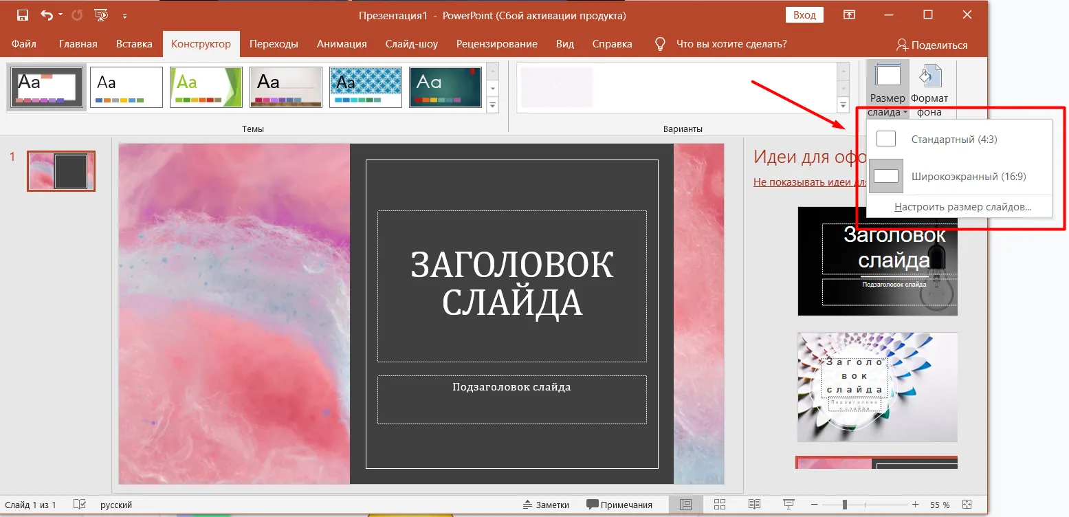
To change To change the slide size in PowerPoint, open the Design tab and select the Slide Size option. This will adapt your presentation to different screen formats. The correct aspect ratio is an important aspect that contributes to the successful perception of information during a presentation. Make sure you choose the appropriate slide size for your audience to ensure high-quality display of the content.
7. Optimal Use of Color in Presentations
Creating an attractive presentation requires careful selection of a color palette. Black and white slides can look bland and bore viewers, while too bright colors can be distracting and make it difficult to perceive the information. Optimal colors should be harmoniously combined, emphasizing key points and creating visual interest. An aesthetically designed presentation not only holds the audience's attention but also promotes better understanding of the material being presented. Choosing the right colors helps create the right mood and highlight important elements, which ultimately improves the effectiveness of communication.
Avoid extremes in color schemes. Instead of completely avoiding monochrome solutions if they don't align with your brand, choose two or three harmonious colors. These shades will help highlight key points and make your content more engaging. Effective use of a color palette not only improves visual aesthetics but also helps your users better perceive the information.
8. Readability of Text: The Key to a Successful Presentation
Minimalism in text is the key to effective perception of information. The text should be sufficient to convey the main idea, but it should be clear and concise enough on each slide. Clarity and conciseness help retain audience attention and ensure better comprehension of the material presented.
Research confirms that sans-serif fonts such as Arial, Tahoma, and Verdana provide better readability than serif fonts such as Times New Roman. To improve readability, it's important to avoid overlapping text with complex images, as this can make it difficult to read and absorb information. Proper font selection and placement within the content are key to creating readable and engaging text.
If the text within an image is difficult to read, consider retyping it on the slide. This will significantly improve clarity and comprehension. Clear and readable text helps convey key ideas and messages better, which in turn promotes more effective engagement with the audience.
9. Poor formatting: how to avoid visualization problems
The quality of photos and videos plays an important role in the perception of content. Poor image or video quality can negatively affect the user experience. This is especially noticeable when text overlaps images, leading to confusion and making it difficult to understand the information. For best results, ensure clarity and quality of visual content and avoid overlapping text on images. This will help create a more harmonious and understandable presentation of information.

Situations often arise when screenshots look like they "Hanging" in the air can create an impression of unprofessionalism and reduce the quality of the visual content. Properly formatting screenshots, including the use of shadows, frames, or backgrounds, can significantly improve the perception of information and increase the level of trust in the material presented.
To improve the visualization of content It's a good idea to use mockups, which are high-quality renderings of mobile devices. This solution will not only give your content a professional look but also increase its appeal to the target audience. Mockups help better convey ideas and concepts and facilitate more effective information comprehension. Using such graphic elements can significantly increase user engagement and improve the overall user experience.
There are many free mockups available online, and we have already reviewed various resources. However, to edit these mockups, you will need basic Photoshop skills. Once you master these skills, you will be able to customize the mockups to suit your needs and improve the visual presentation of your projects.
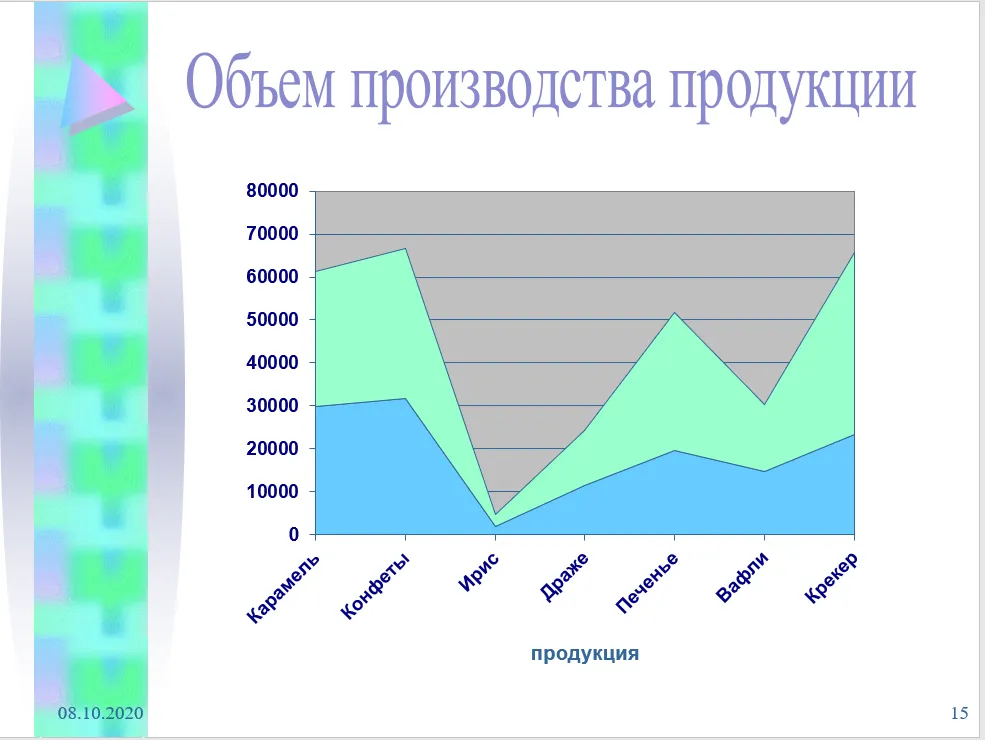
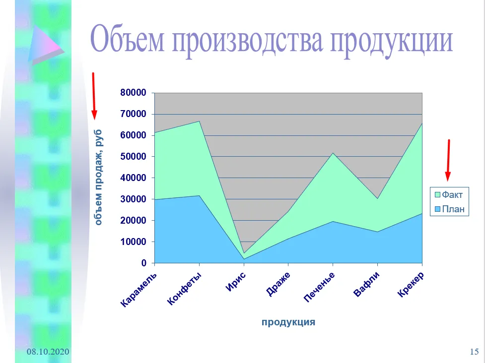
10. Lack of Illustration Explanations: The Importance of Context
Effective information visualization ensures rapid data comprehension. It is important that the information presented is not only visual but also understandable to a wide audience. High-quality visualization helps improve the understanding of complex data, making it more accessible and easier to analyze. The right choice of graphs, charts, and other visual elements can significantly improve the effectiveness of information communication.
Label graphs and charts to avoid misunderstandings. Clear explanations help your audience better understand the information presented. This improves data comprehension and facilitates a more accurate interpretation of the results. Proper labeling of visual elements is a key aspect of effective communication.
11. Avoid meaningless images
Every image in your presentation should not only enhance the appearance of your slides but also play a meaningful role. Visual elements should emphasize the main idea, not just fill space. Properly selected images can make information more accessible and memorable, and increase audience engagement. Use graphics that illustrate key points and promote understanding of the topic. Remove unnecessary images that don't add value to your content. This will help make your presentation more structured and compelling. Optimizing visual content improves information comprehension and increases audience interest. Focus on high-quality images that support the main ideas and messages of your material.
Basic Principles of Creating Effective Presentations
When creating a presentation, the key is to clearly understand its purpose and follow a structured outline. Avoid monotonous black-and-white slides, but also avoid overloading them with bright colors, complex fonts, or excessive text. A minimal amount of text that's easy for the viewer to digest is ideal. Remember that each slide should present only one idea, and the size of elements matters. All design elements should be neat and professional, and charts and graphs should be labeled for clarity. Use only relevant and useful illustrations, avoiding irrelevant images that could distract from the main topic. Aim for simplicity and clarity to make your presentation effective and memorable. In today's world, the ability to create high-quality presentations is becoming an important competitive advantage. The "Master Strong Presentations: PowerPoint and Google Slides" course from Skillbox provides a unique opportunity to master the skills of creating engaging and effective presentations. These skills will not only improve your career prospects but also open the possibility of additional income, as presentation design services are in demand by many companies. The training includes practical exercises, allowing you to immediately apply the knowledge you've gained. Join the course and learn how to create memorable presentations.
During the course, you'll gain access to ready-made templates and learn how to create engaging slides. You'll also learn how to find projects and successfully freelance. Over the course of a month, you'll acquire the necessary skills for remote work and earn money using platforms like Upwork and Freelancer. This course will help you develop your freelance career and master in-demand design and presentation skills.
Making Money with Presentations: 5 Effective Tips
Want to make money with your presentations? Learn 5 simple ways to do it effectively!
Learn more